Component families
Grouped by the page they belong to, from the base primitives to the modules.
Smootify 2.0 is in public beta. Your 1.x store keeps working. Move when you want.
What changedEvery page and component a Smootify store needs, as a Figma file. Duplicate it, hand it to your agent, or design on it yourself.
Free, no email required.
Grouped by the page they belong to, from the base primitives to the modules.
Every state drawn: loading, empty, sold out, error, signed in or out.
Each at desktop, tablet and mobile, built only from the kit’s components.
Layer names match the markup contract, so the build is traceable.
Wireframes, not a theme. Neutral on purpose, so the design direction stays yours.
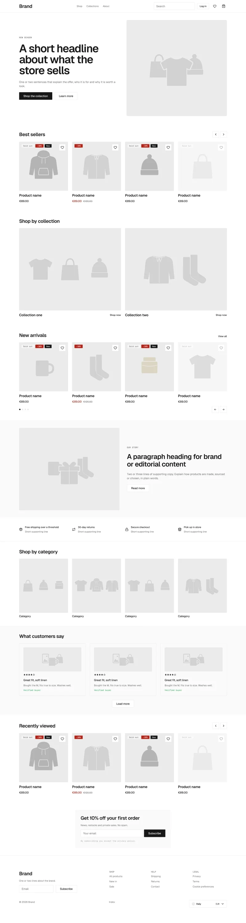
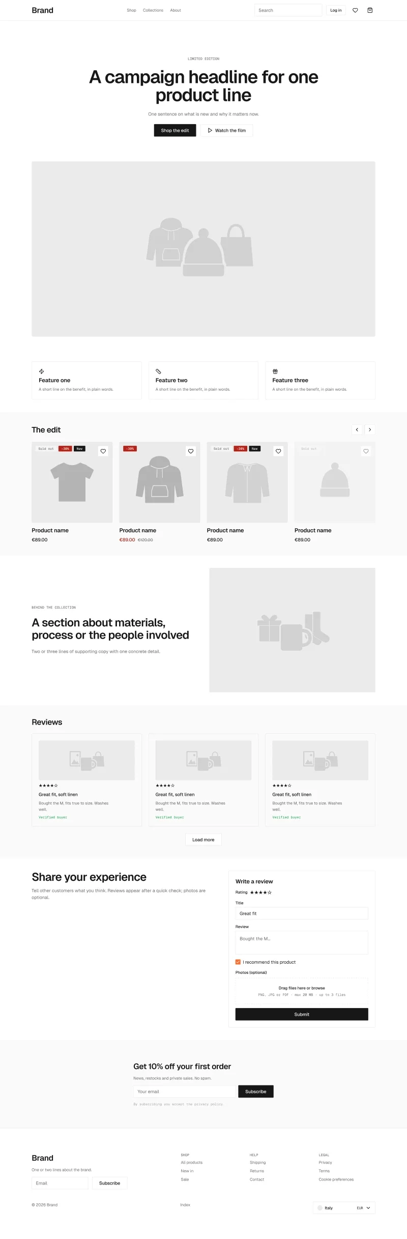
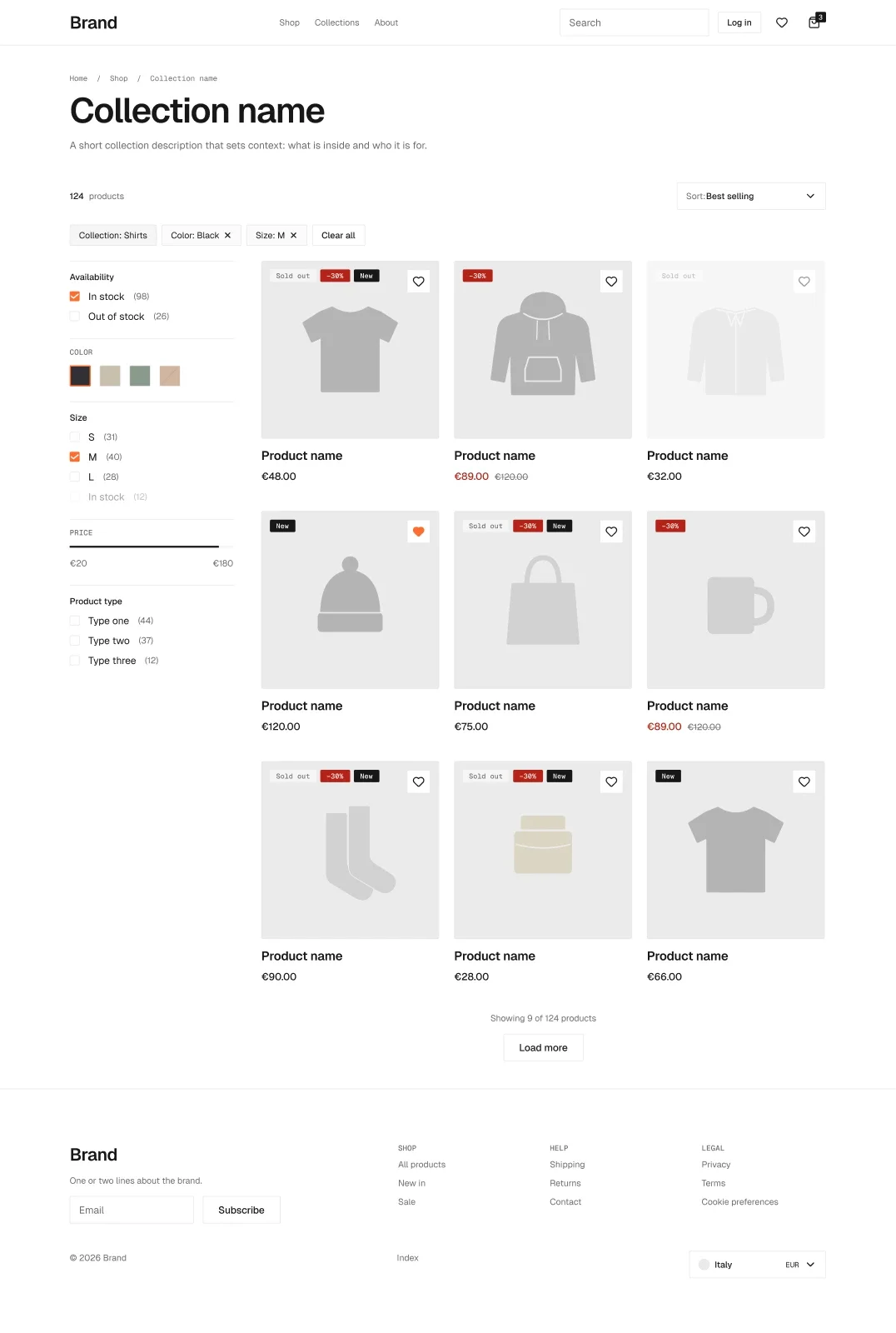
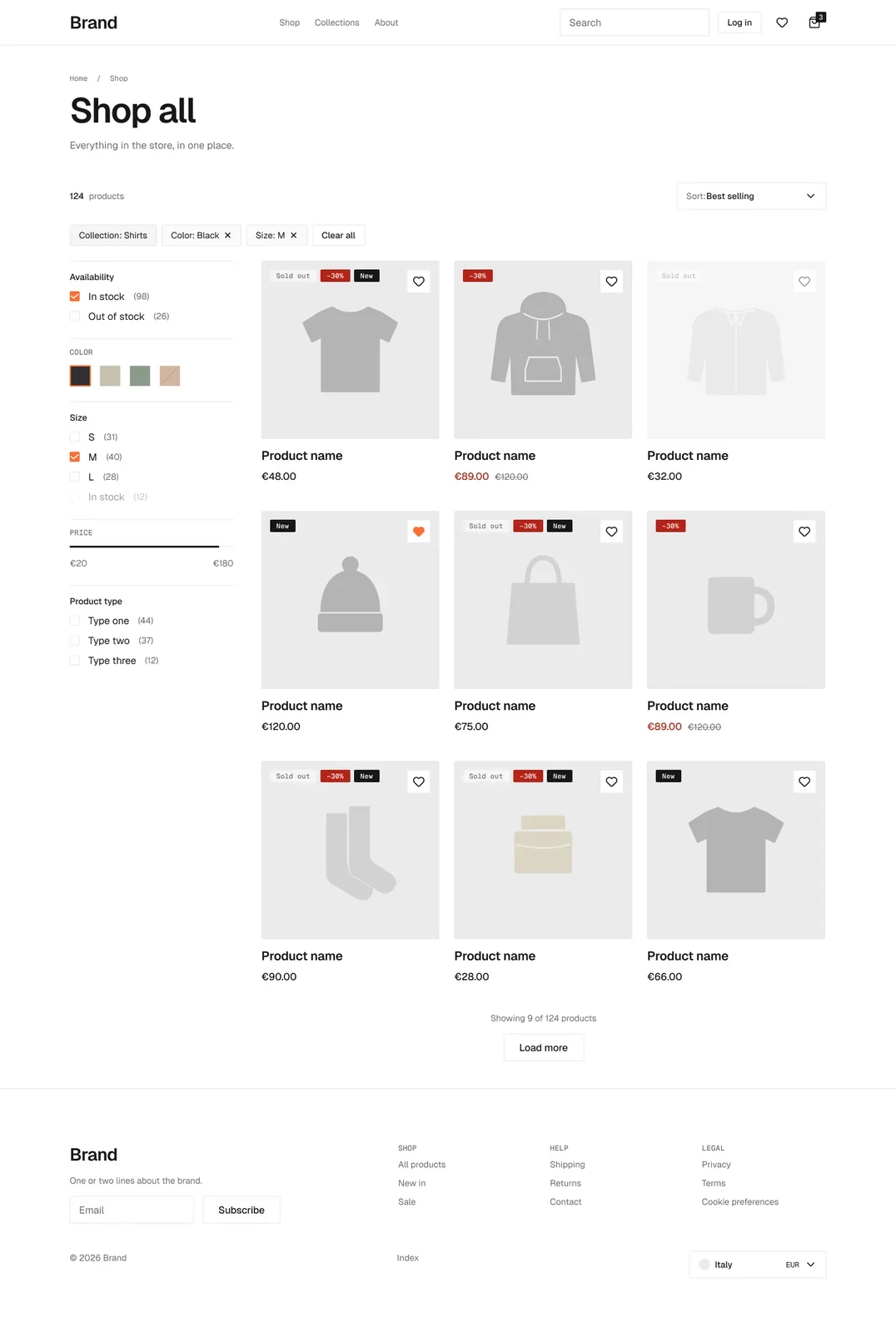
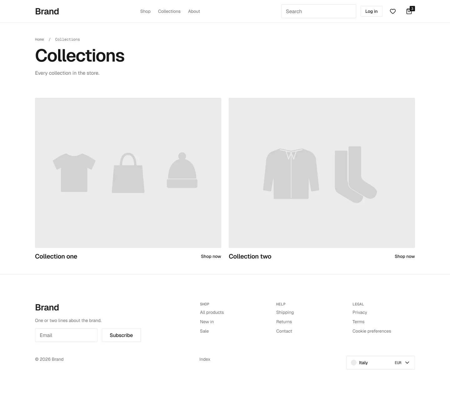
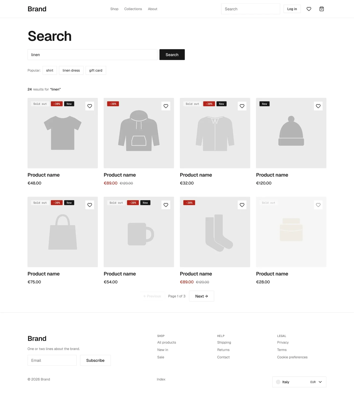
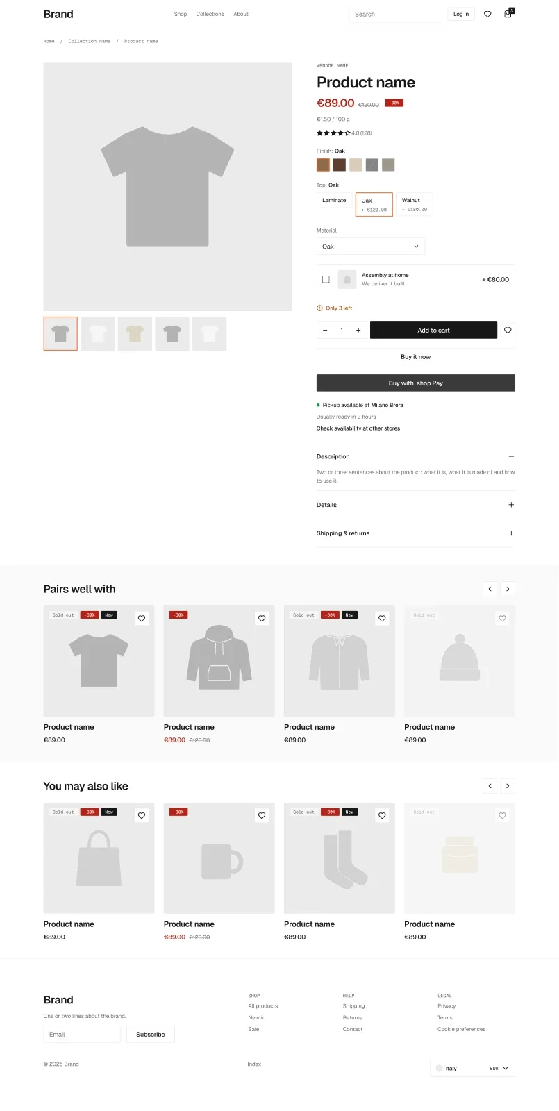
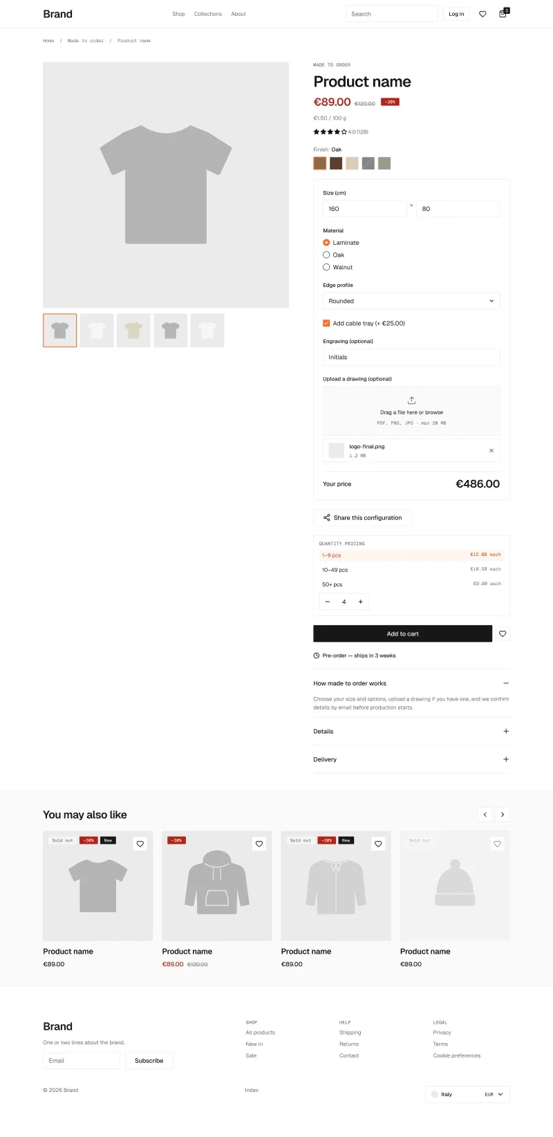
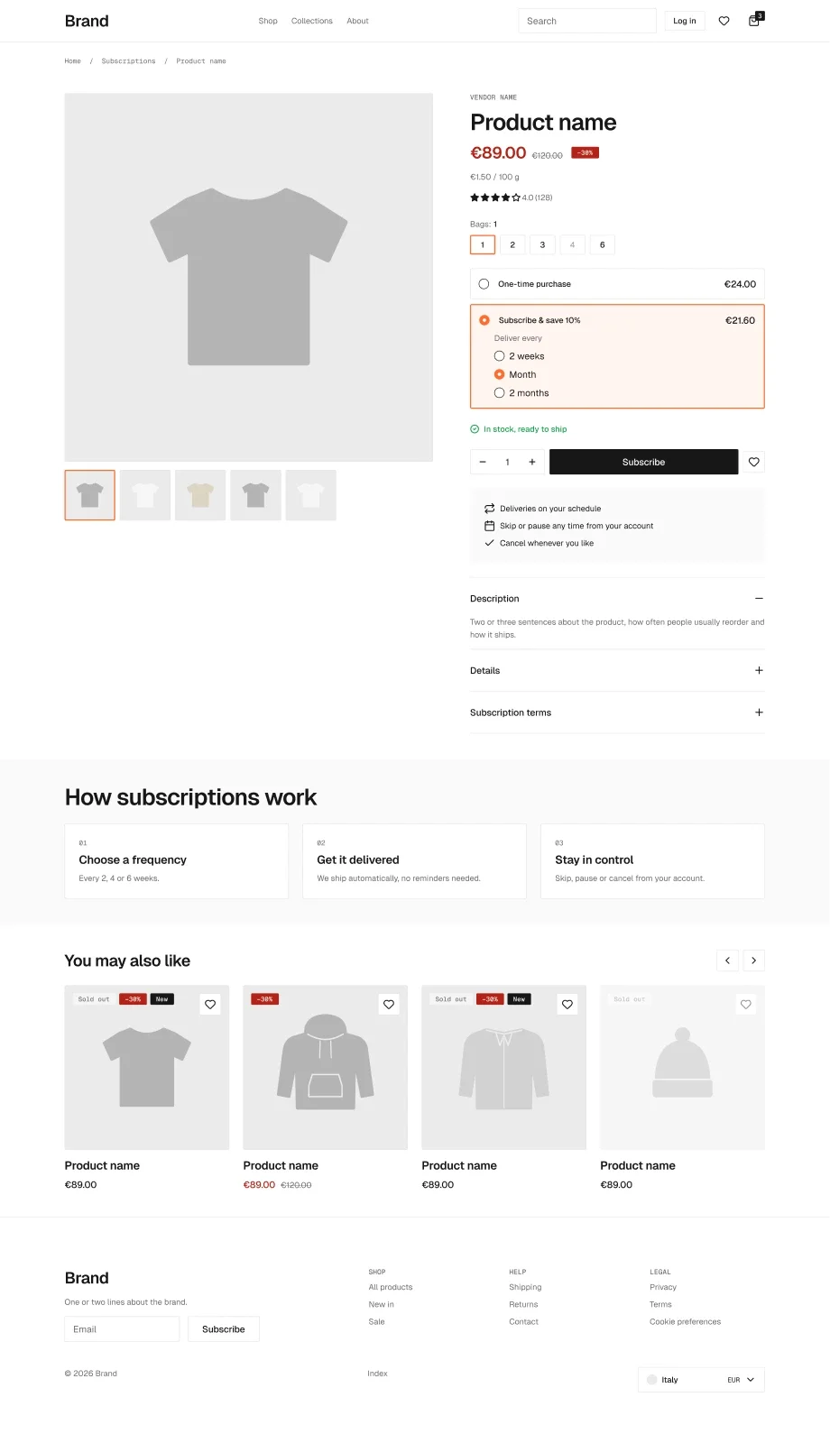
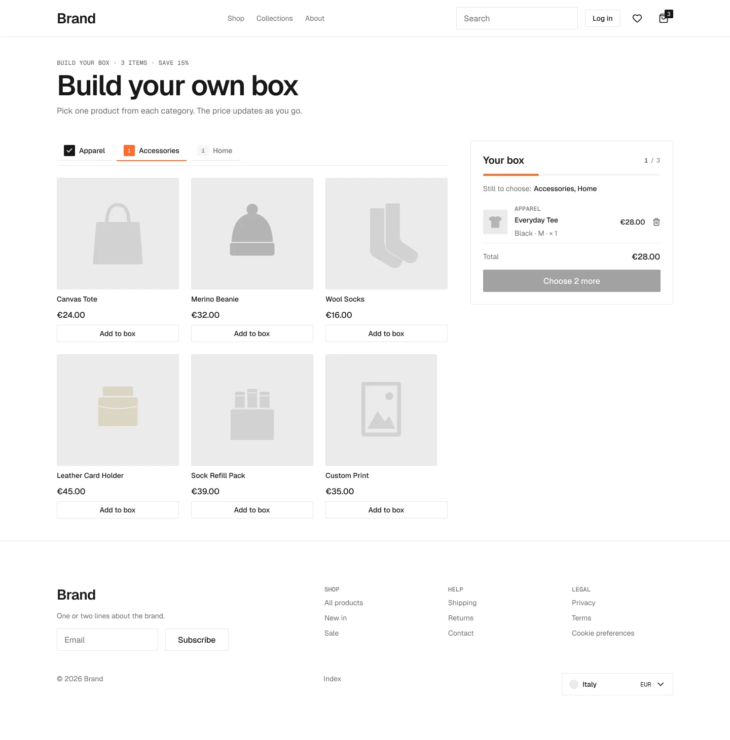
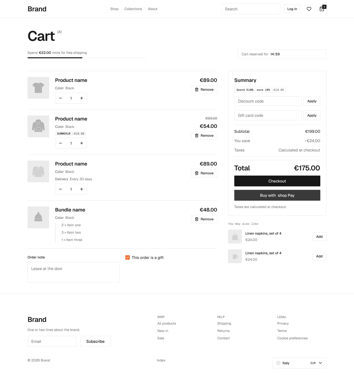
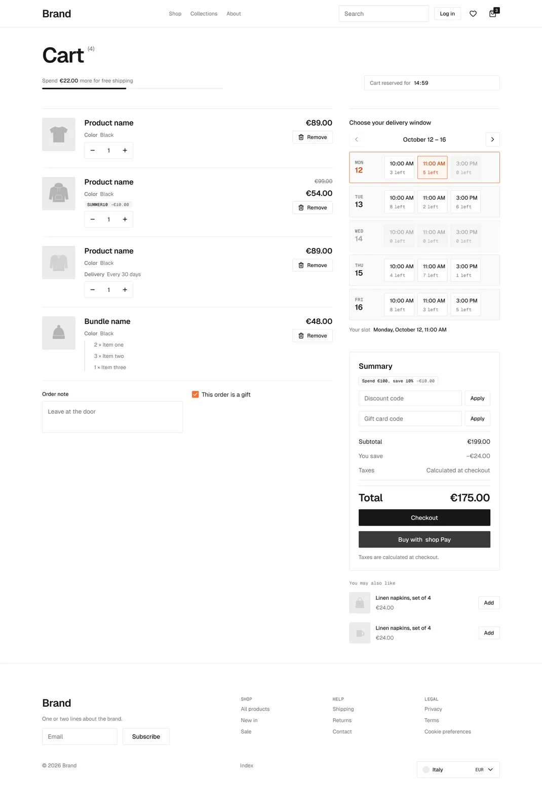
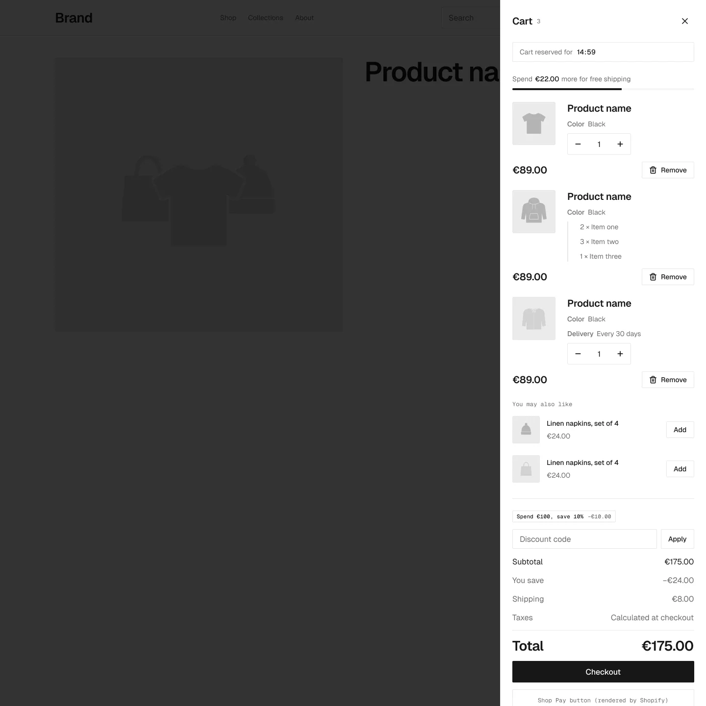
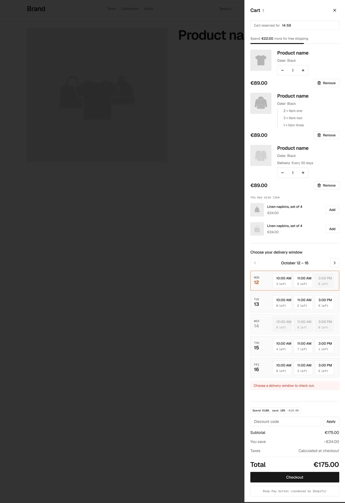
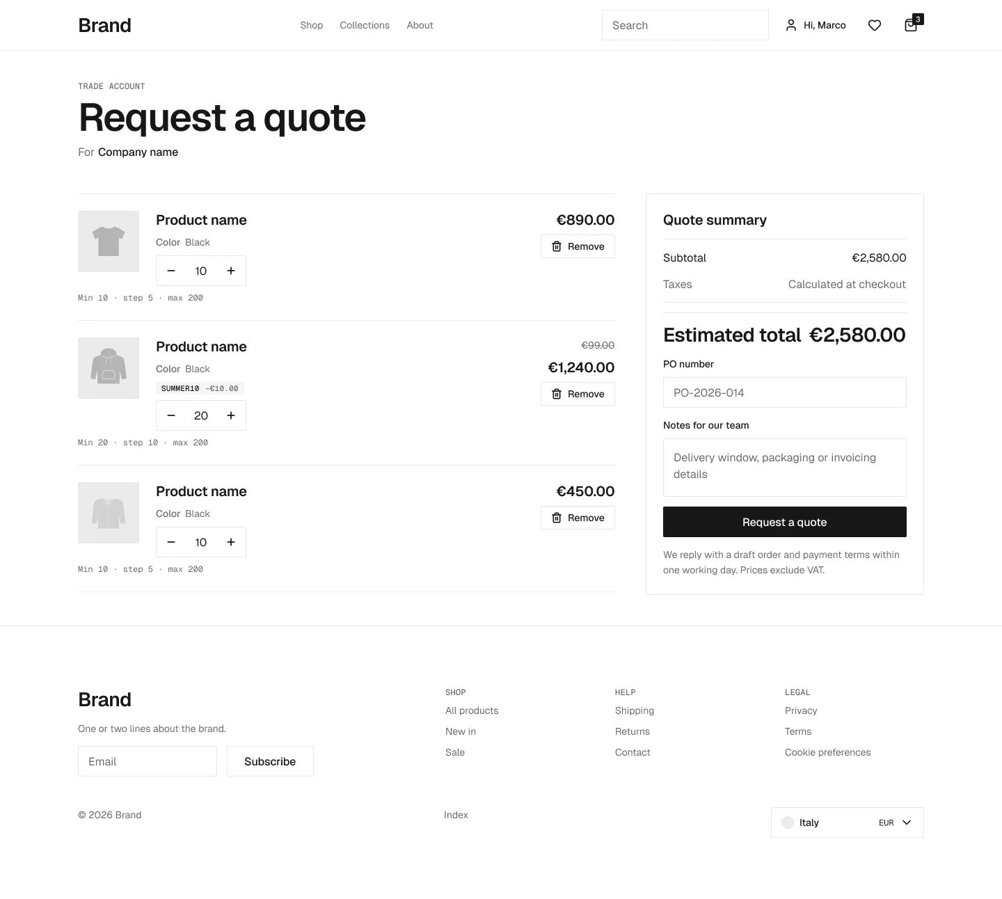
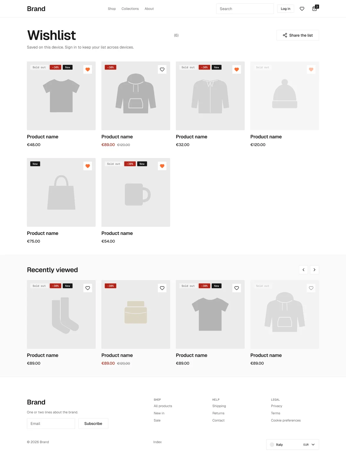
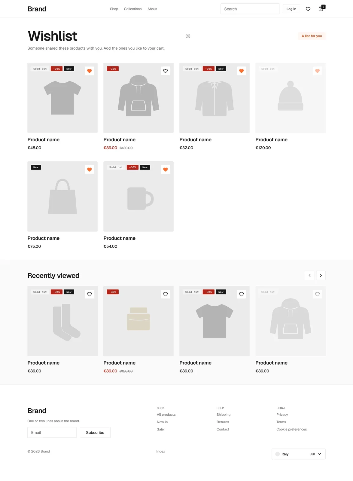
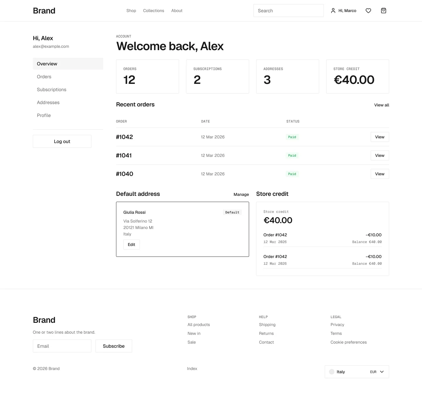
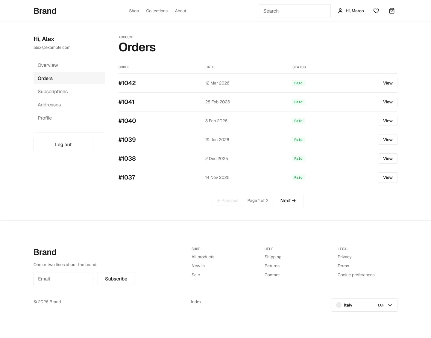
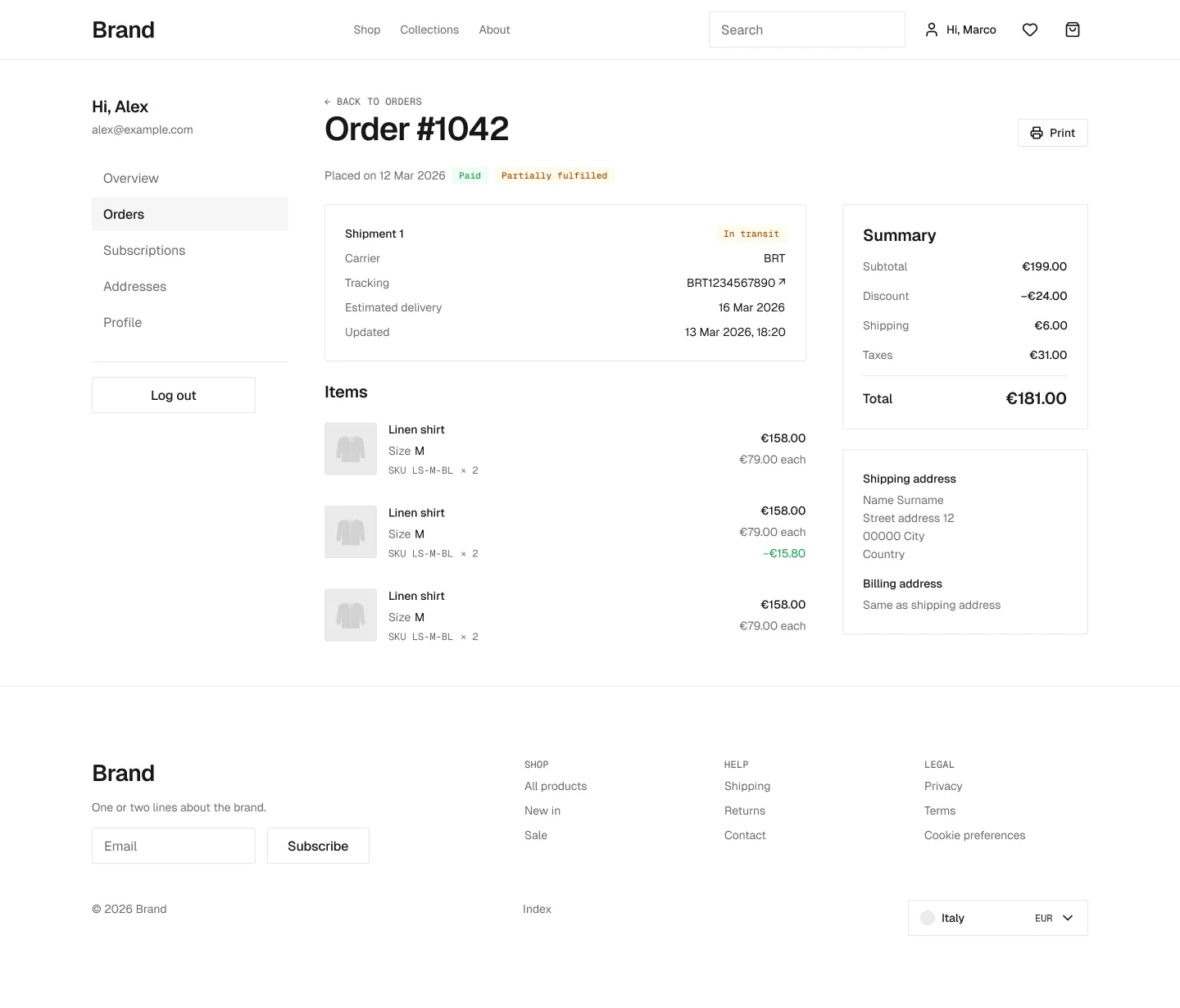
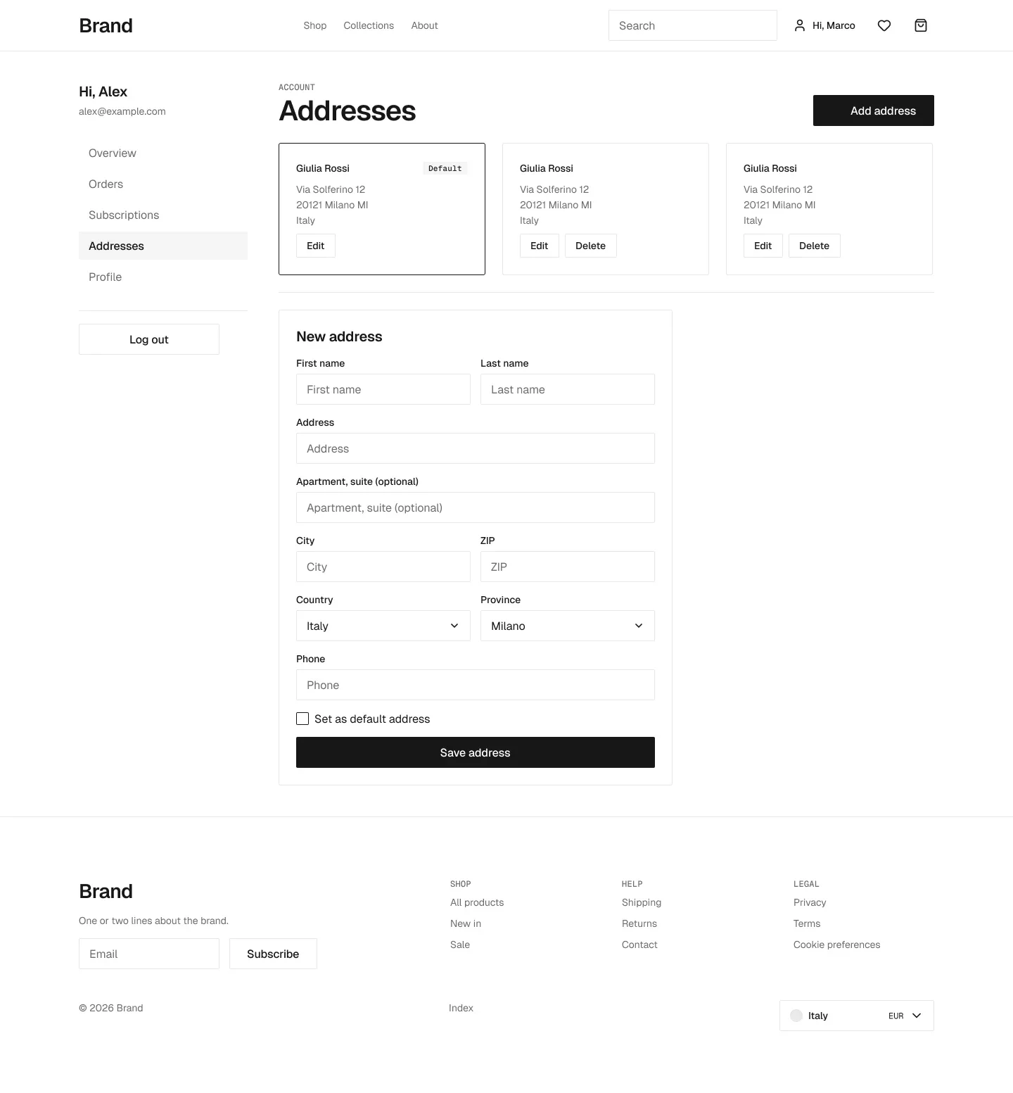
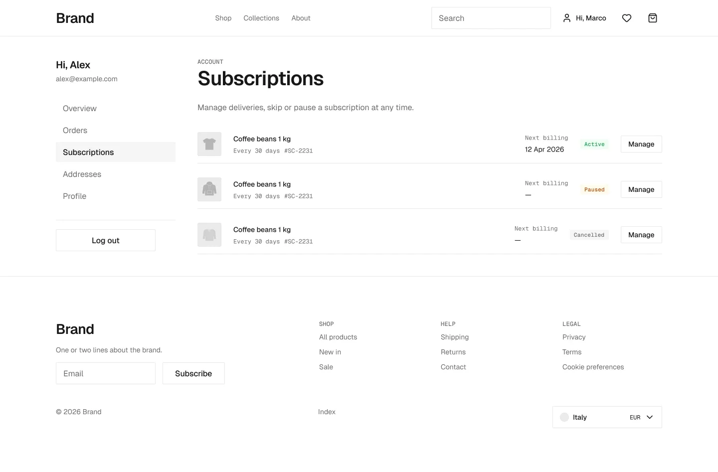
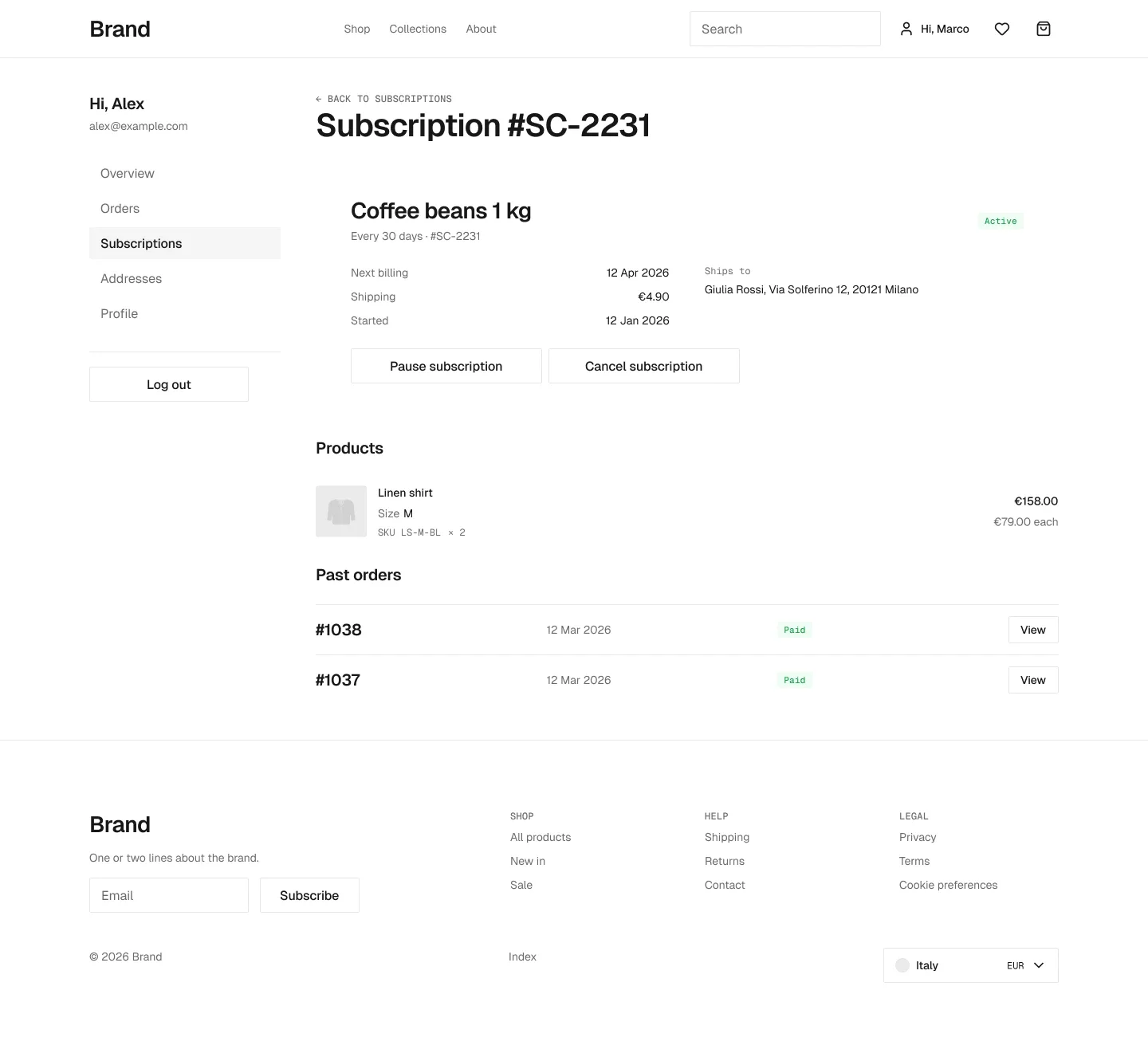
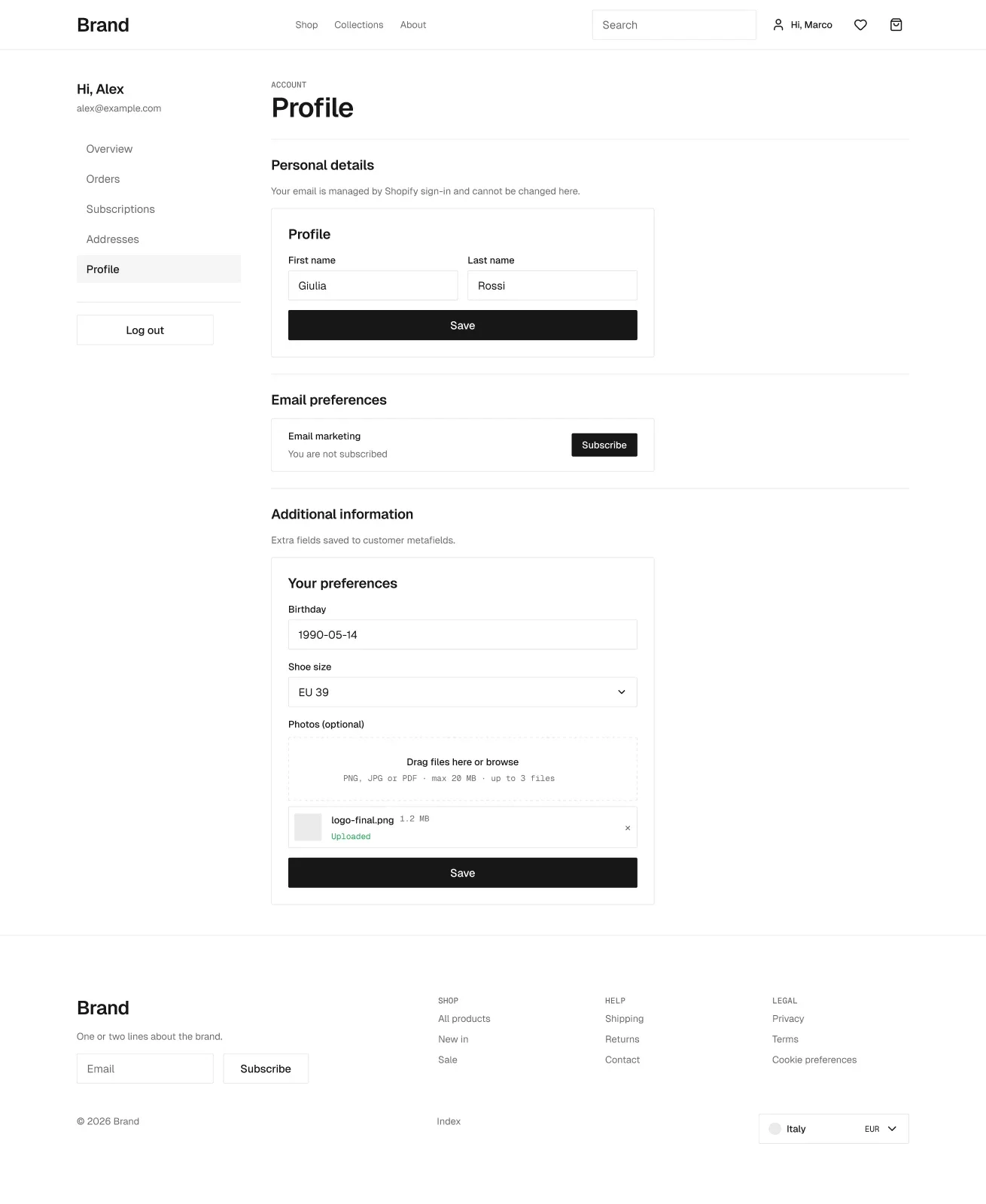
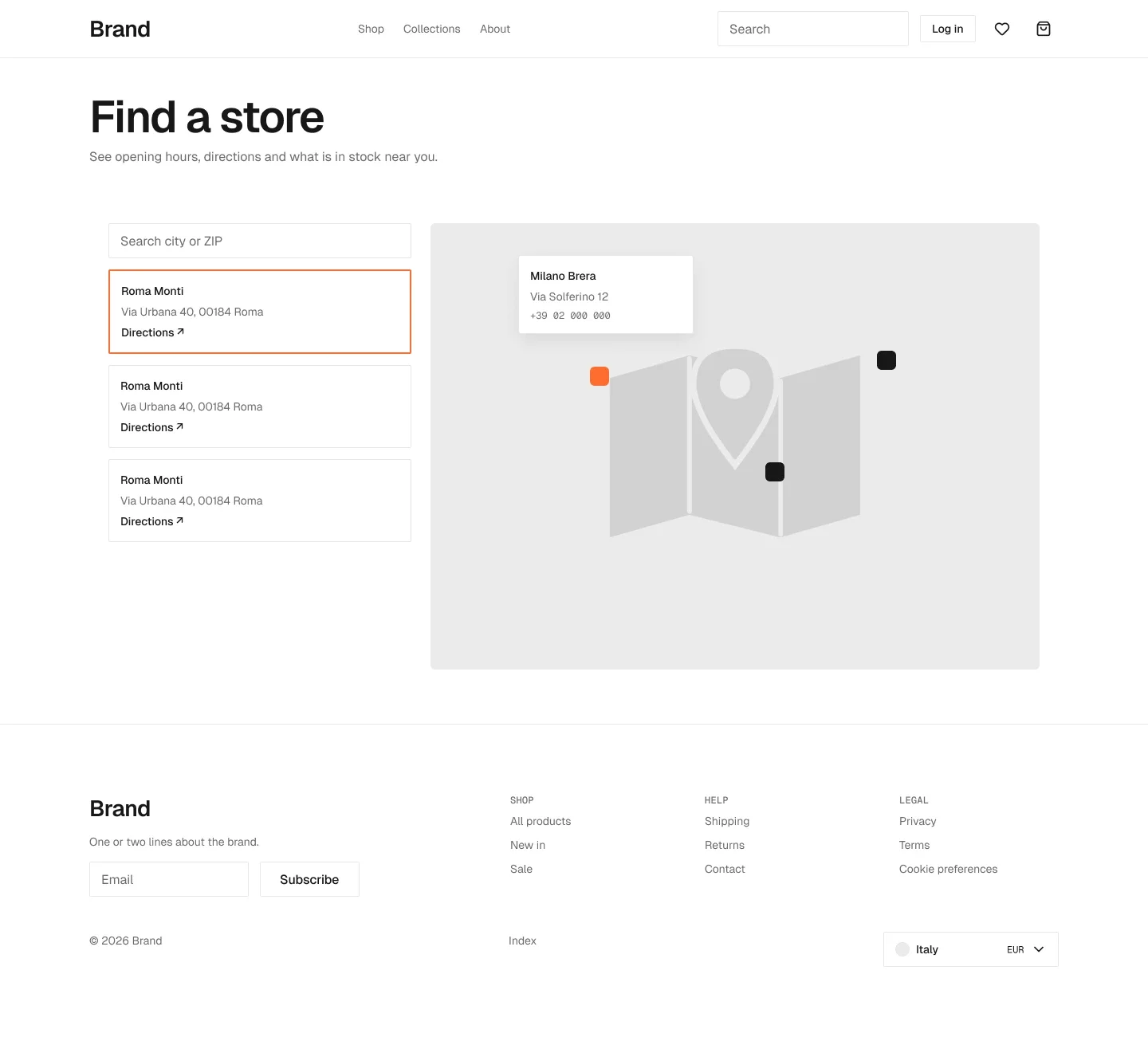
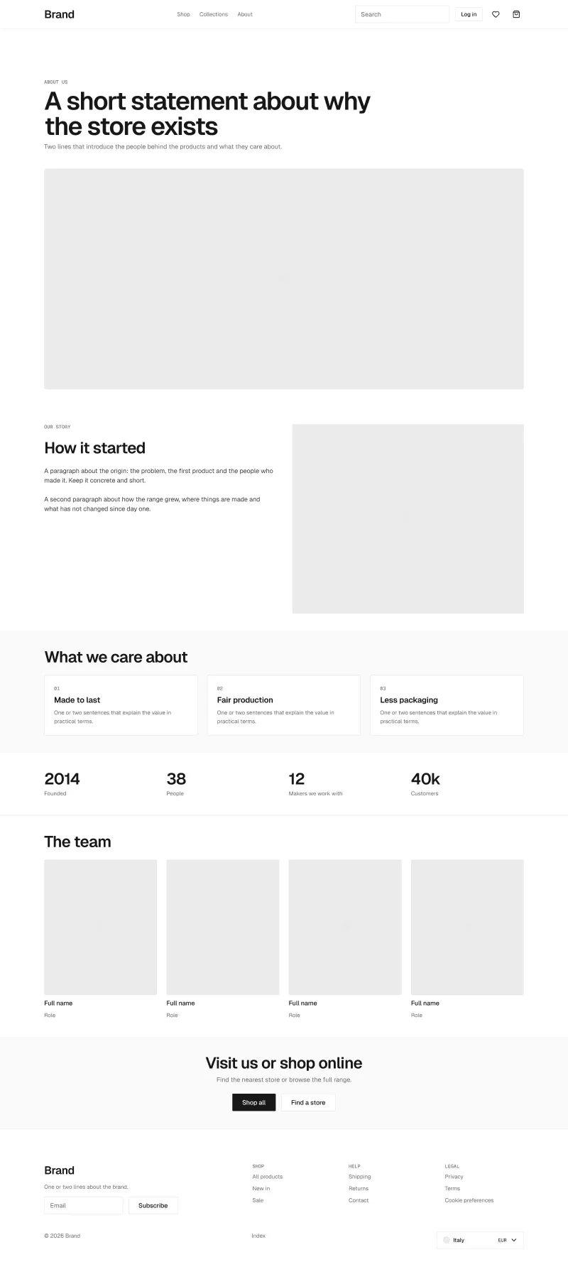
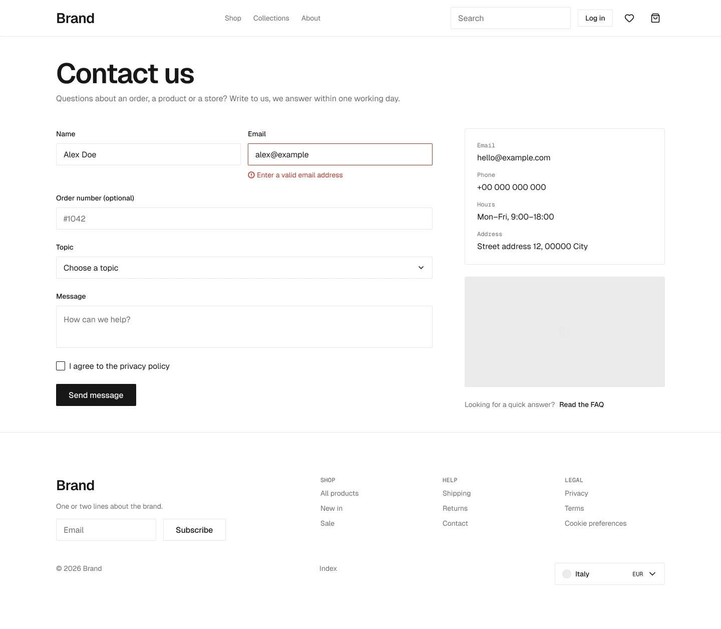
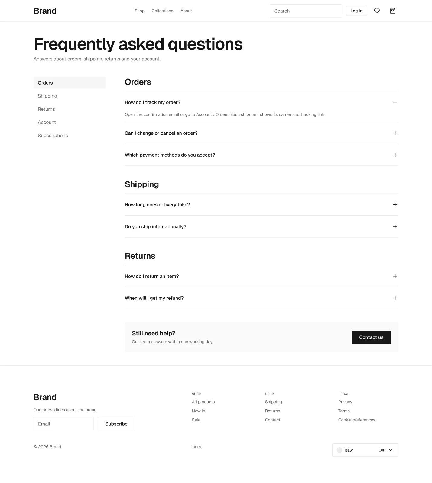
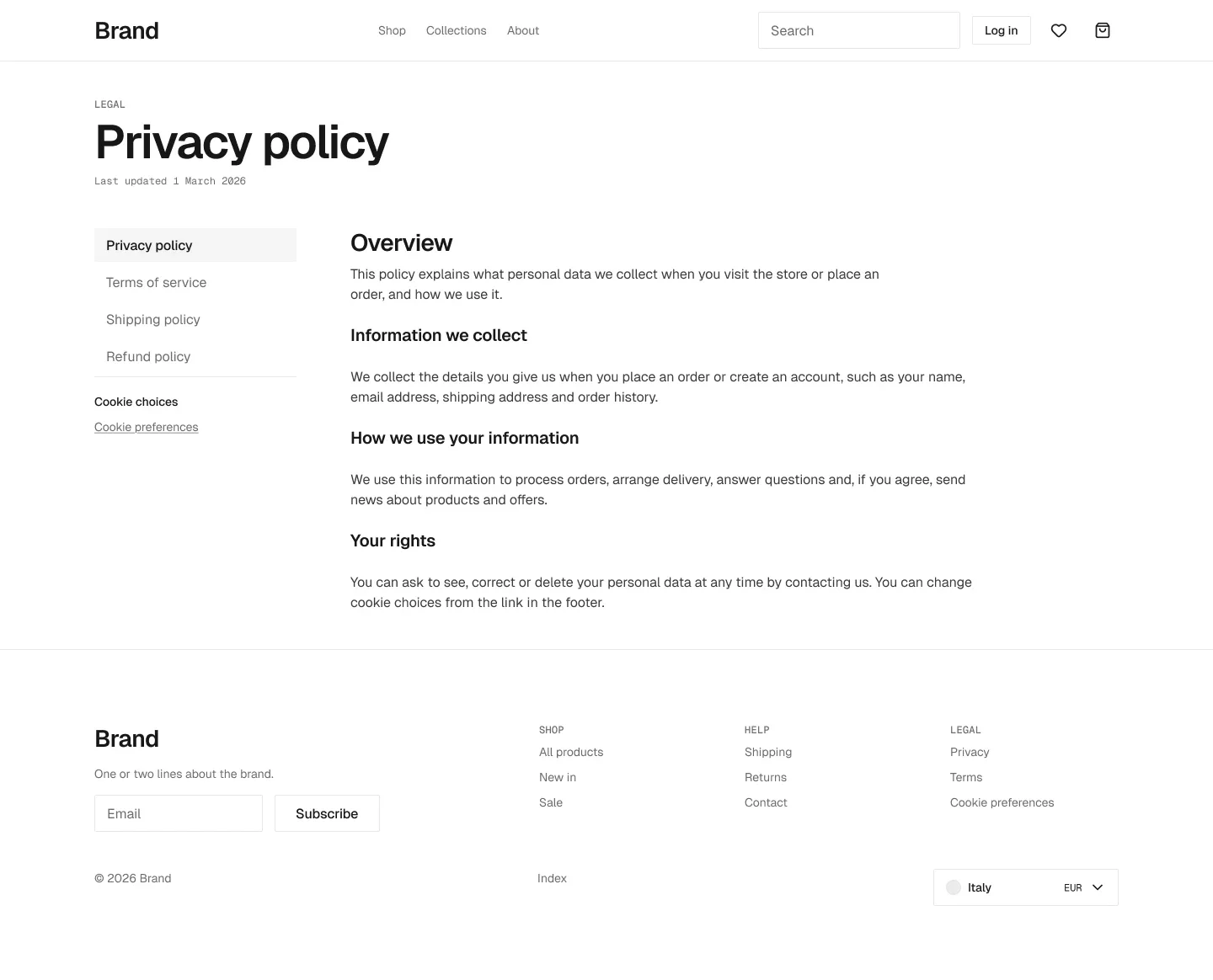
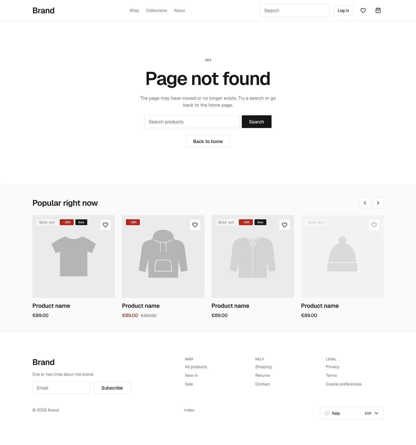
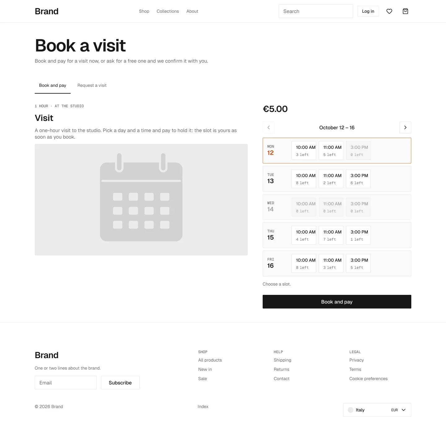
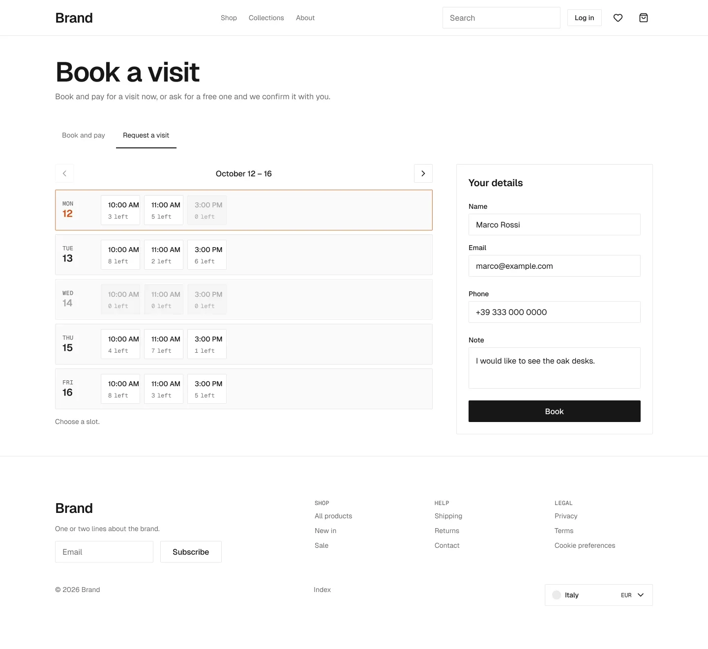
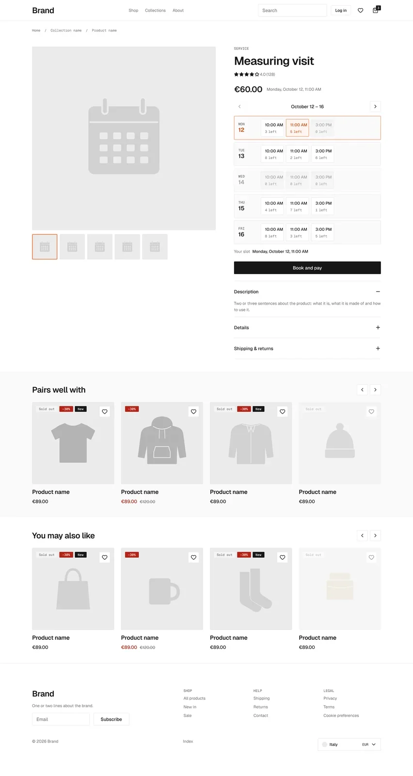
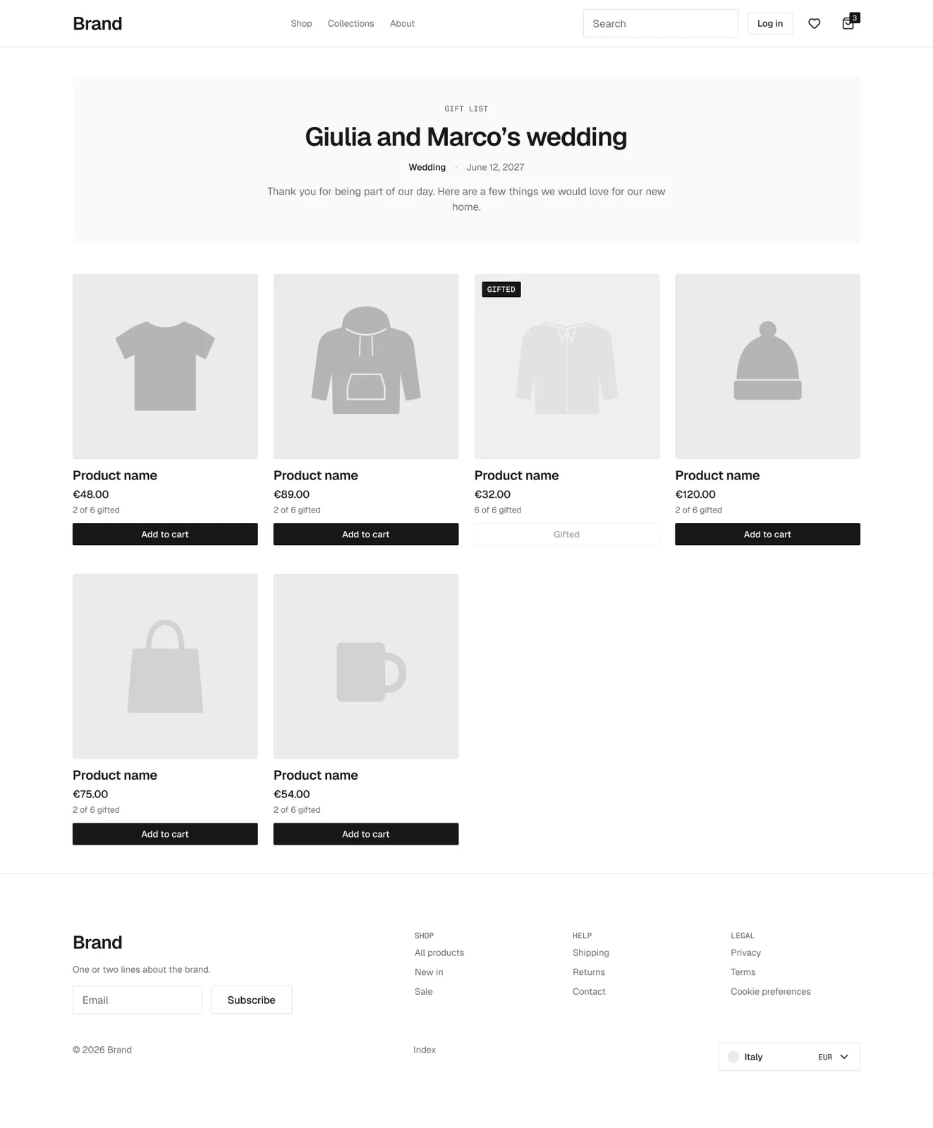
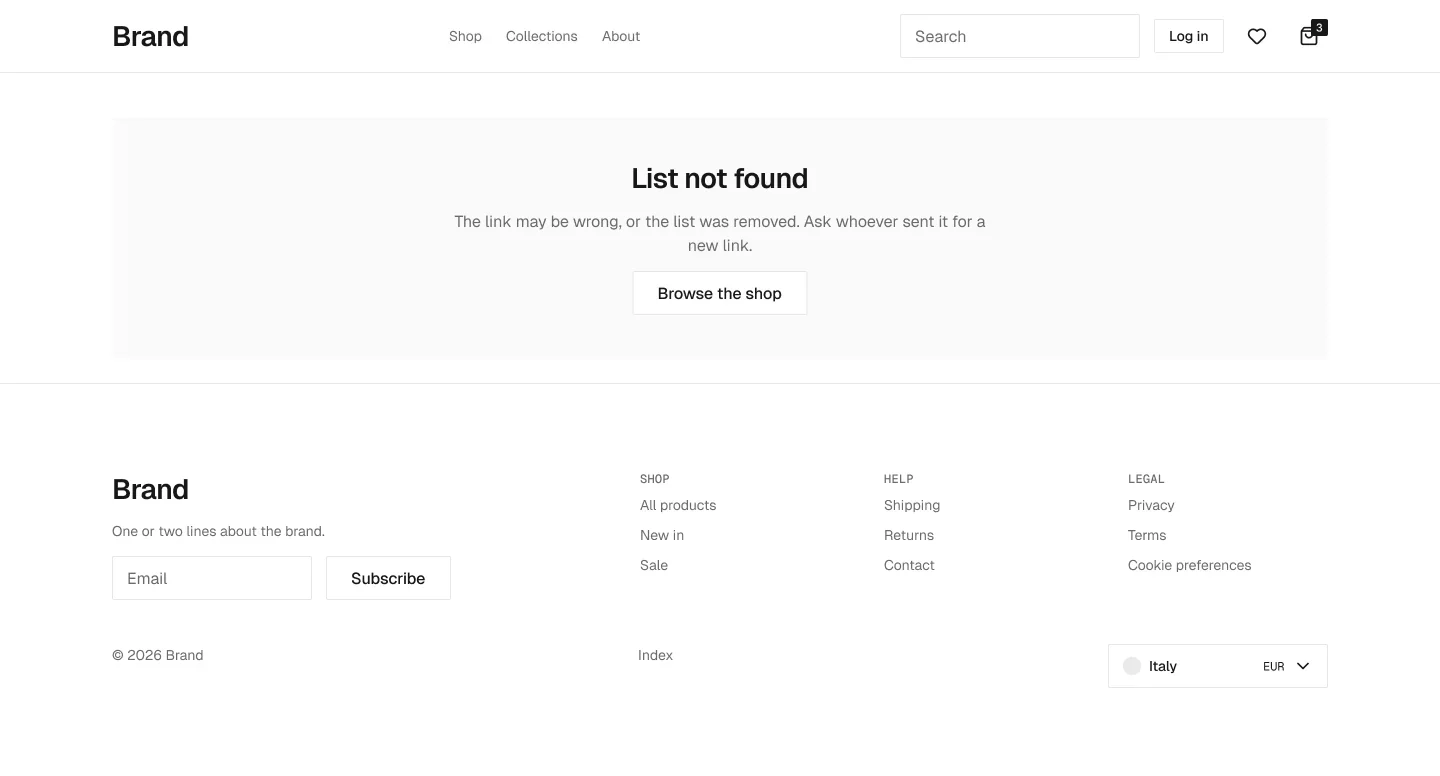
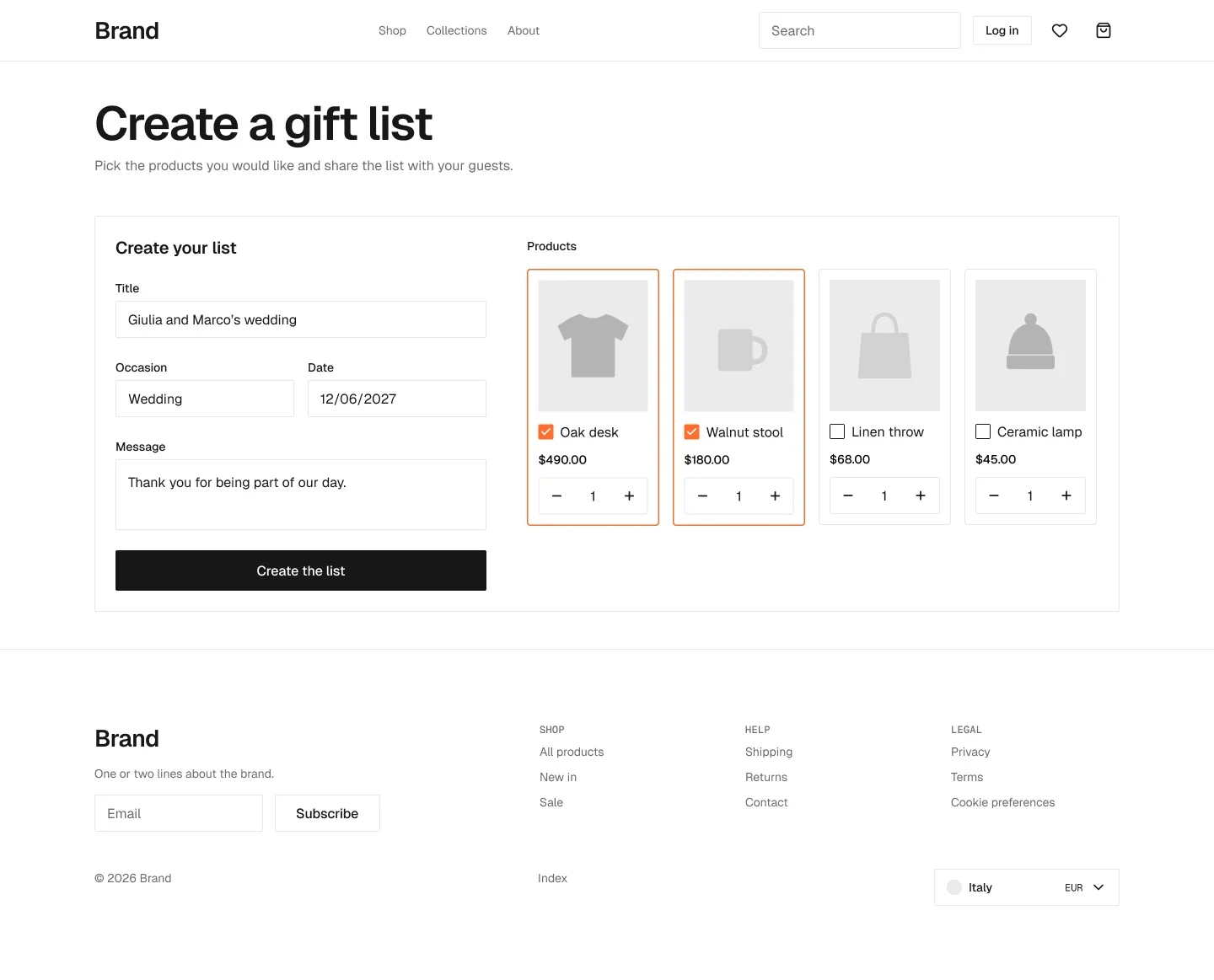
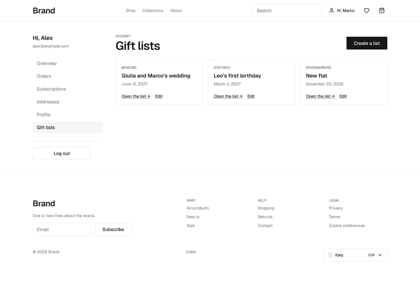
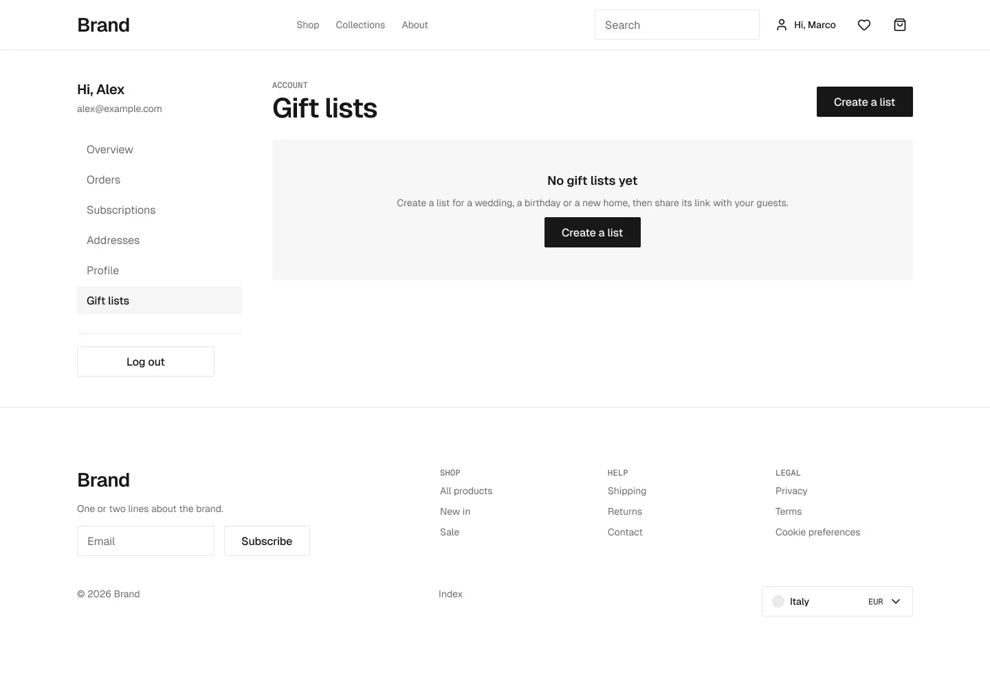
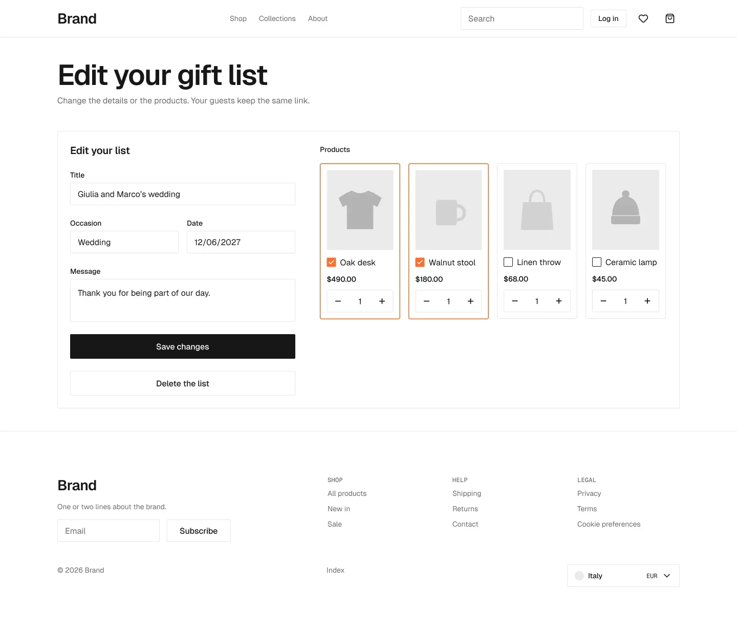
Grouped the way the file is: one Figma page per part of the store. Each card is the component as it is in the kit.
The components every store needs: collection, product page, cart, navbar, account, search.
Components for what a store switches on: add-ons, subscriptions, markets, B2B, magic box, server features.
Pure Webflow pieces (navbar, mobile menu, footer), drawn so every page in the file is complete.
The primitives every component is built from: buttons, fields, dropdowns, popovers, empty states.
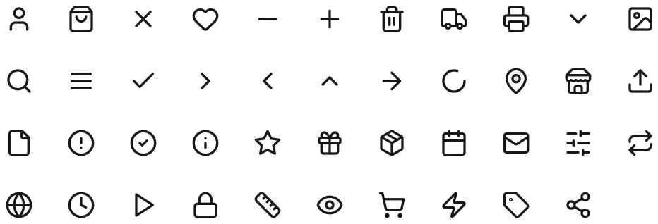
Lucide icons, 20×20, colour bound to the text token.
43 icons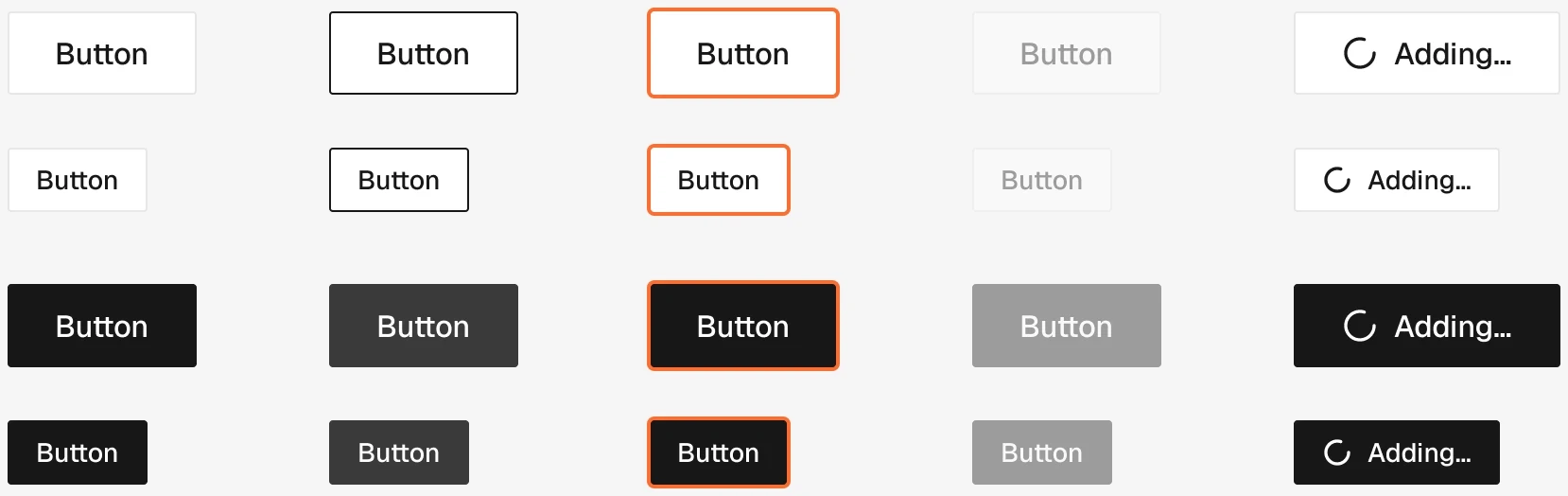
Primary and secondary, two sizes, with the loading state.
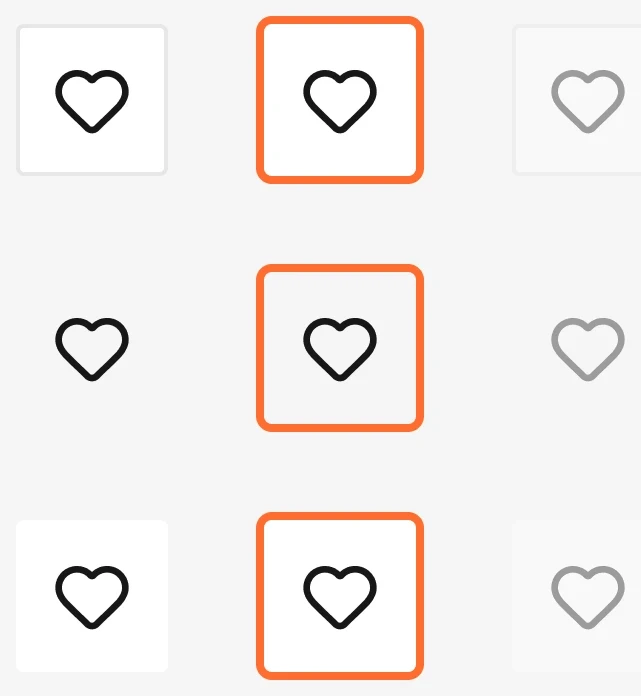
Icon-only button: close, wishlist, arrows.

Icon with an optional counter, for the cart and the wishlist.
2 variants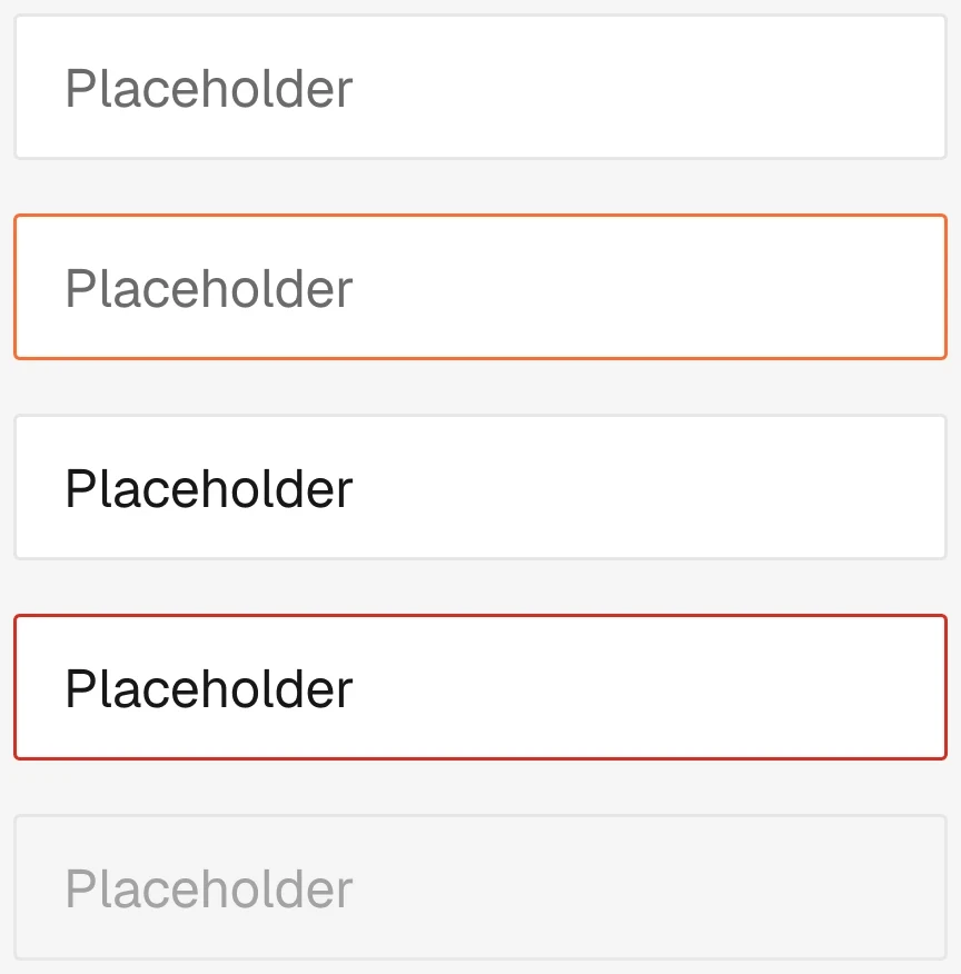
The text input used in every form.
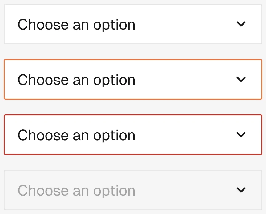
Native select.

Order notes and messages.

Webflow checkbox.

Webflow radio.
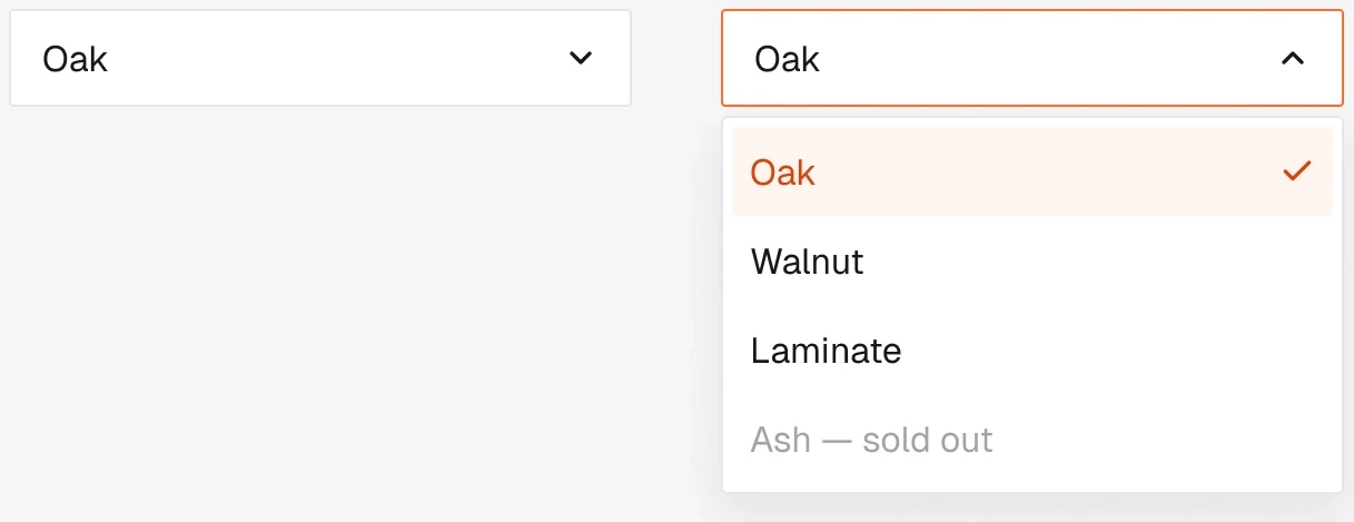
Webflow dropdown.
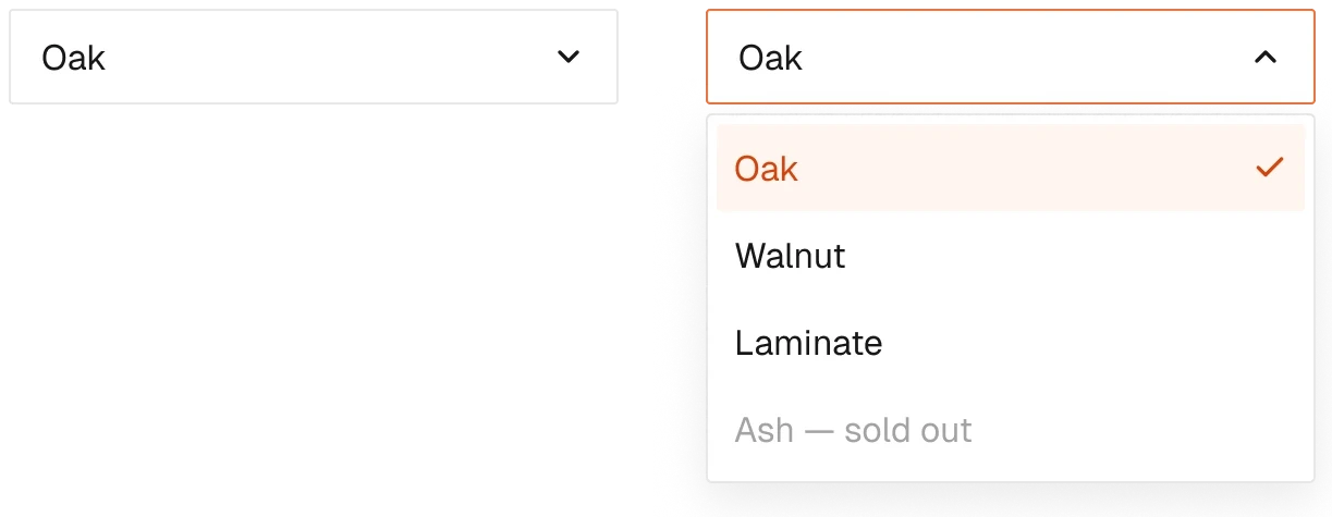
Webflow popover.

Webflow tab link.

Grey image placeholder.
1 variant
Backdrop behind drawers and dialogs.

Prints a quote or an order.
1 variant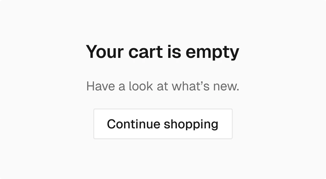
The empty block for every list in the store.
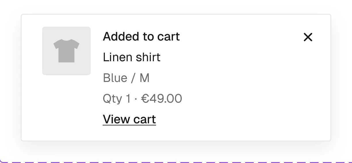
The short messages Smootify shows after an action, one template per event.
Cards, prices, badges, filters, sorting and pagination: everything around a product grid.
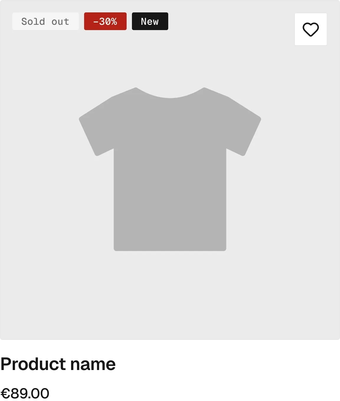
Three layouts, each plain, with a form or with quick view.

Single price, price range and compare-at price.
Shown only when its condition is true.

Stars from Judge.me or from a metafield.
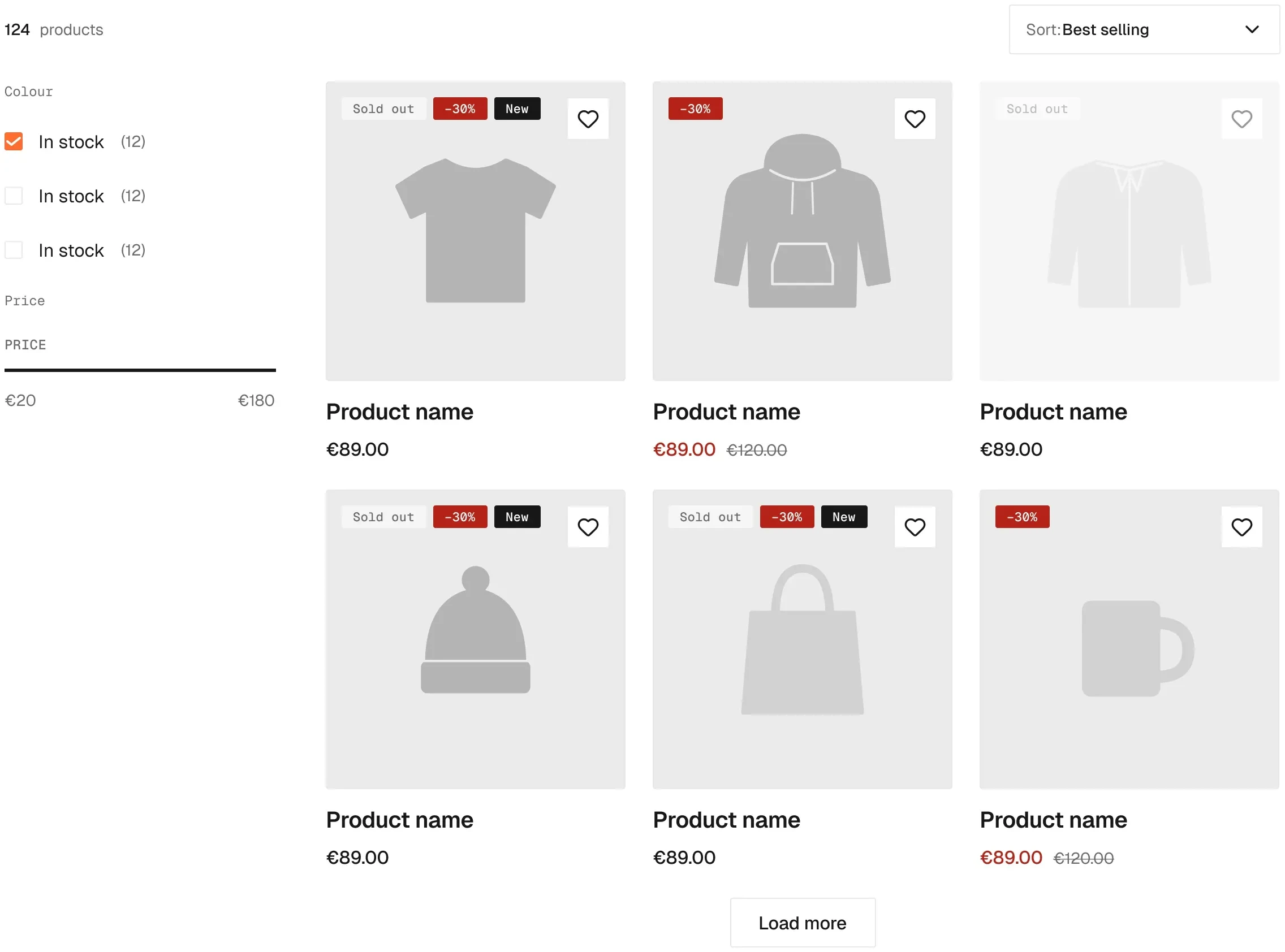
The grid, with its result count and empty state.
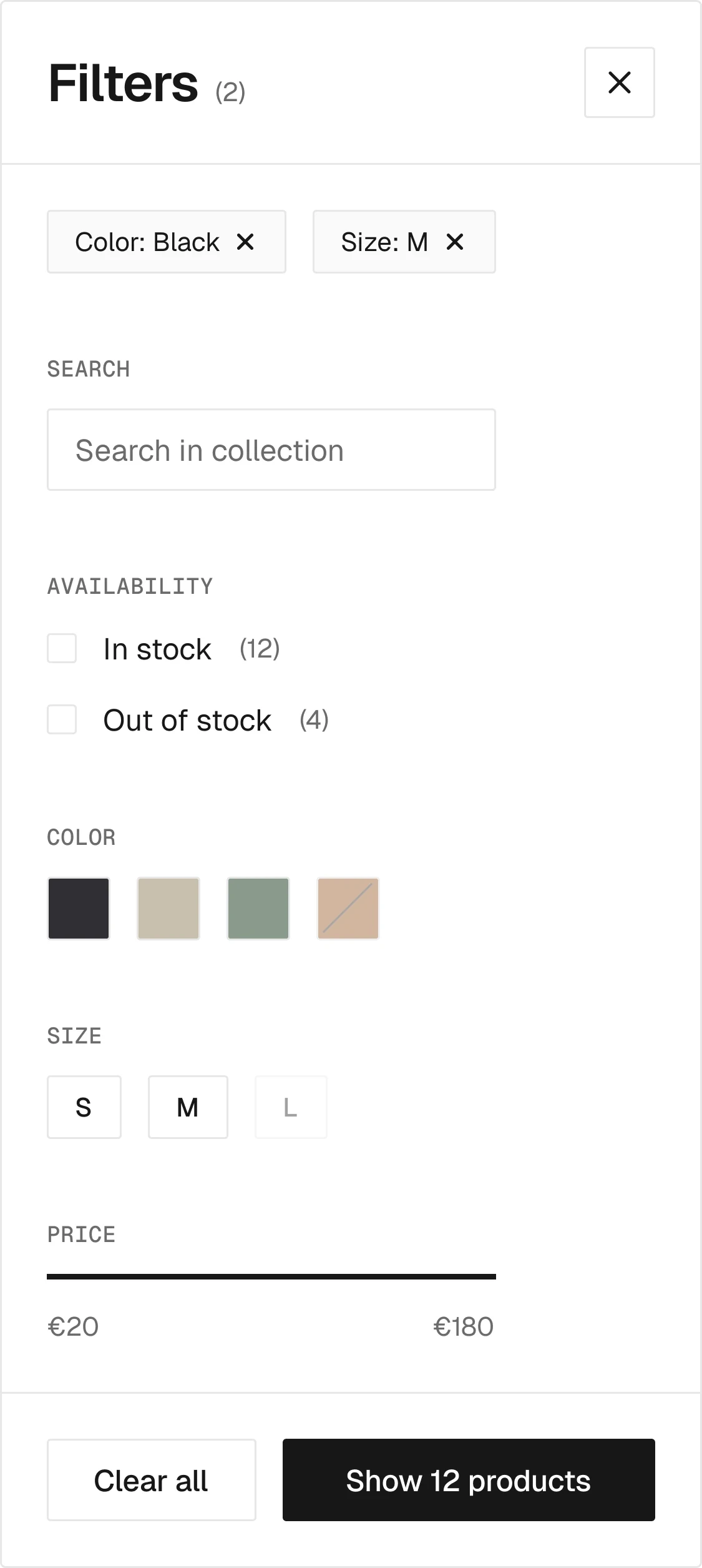
The filter panel as a drawer, a sidebar or a popover.

Checkbox filter.
2 variants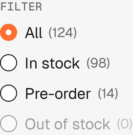
Radio filter.
2 variants
Select filter.
2 variants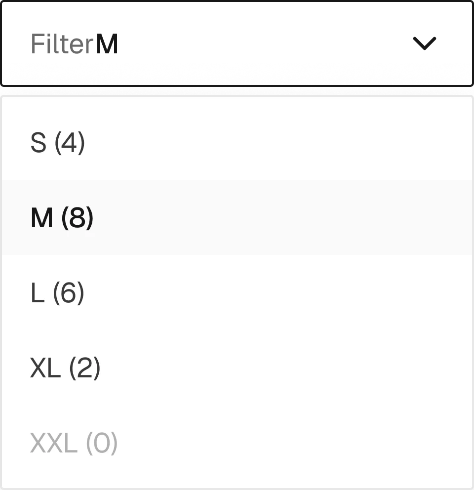
Dropdown filter.
2 variants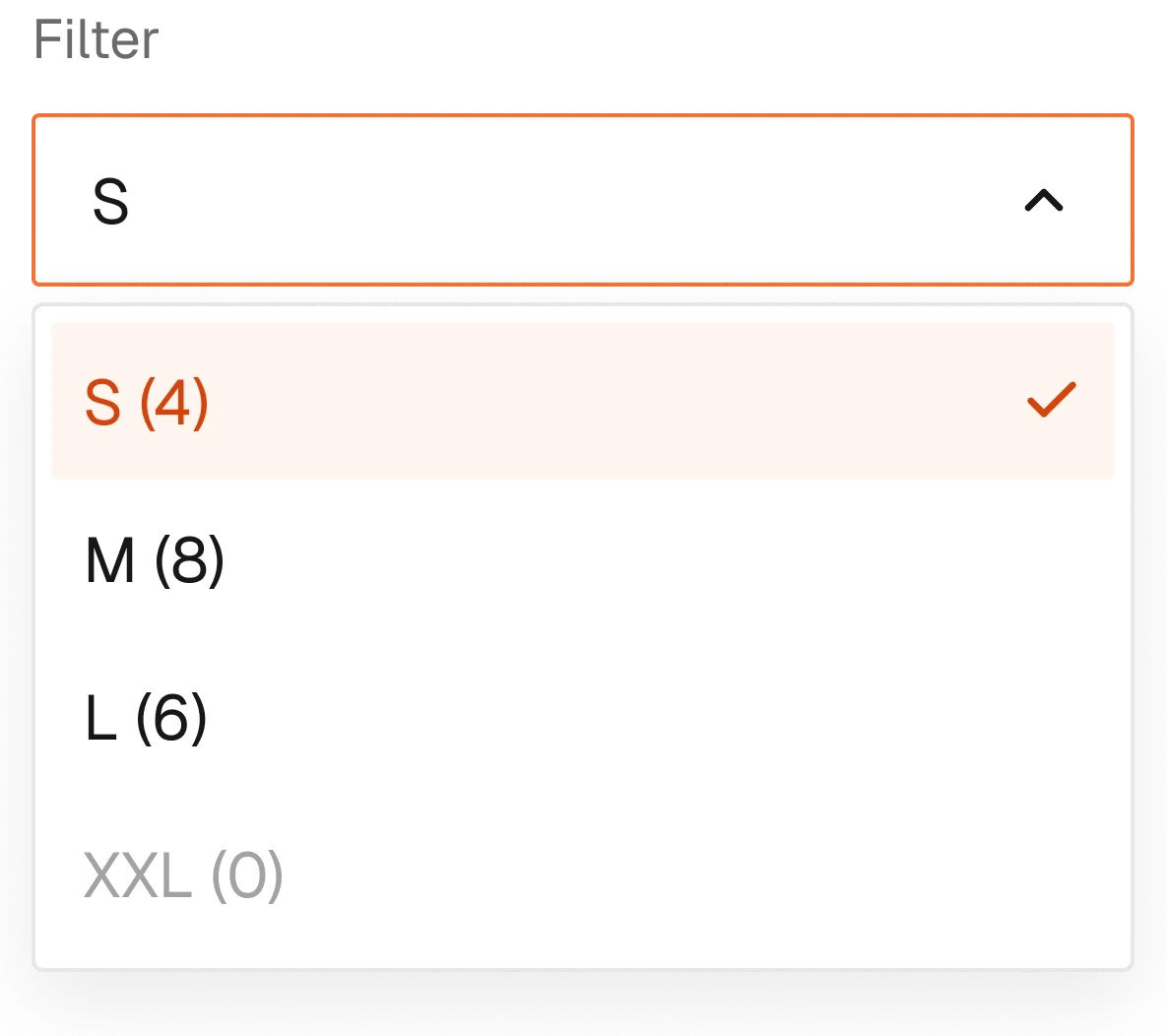
Popover filter.
2 variants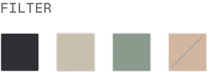
Colour swatch filter.
2 variants
Search inside the filters.
2 variants
Price range filter.
2 variants
A filter group and its values.

Active filters above the grid, removable.
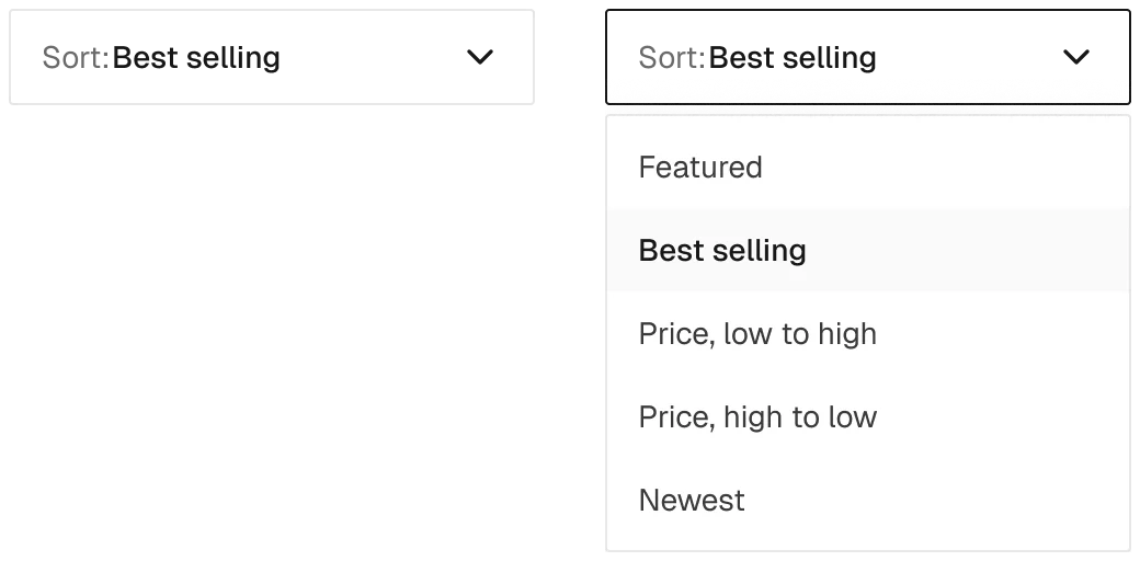
Sorting in four forms.

Previous and next, load more, or infinite scroll.

The single buttons pagination is built from.
Gallery, variants, add to cart and everything that sits around it on a product page.
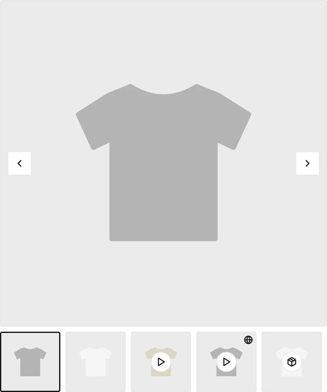
Sliders, thumbnails, lightbox and zoom, with video and 3D thumbnails.
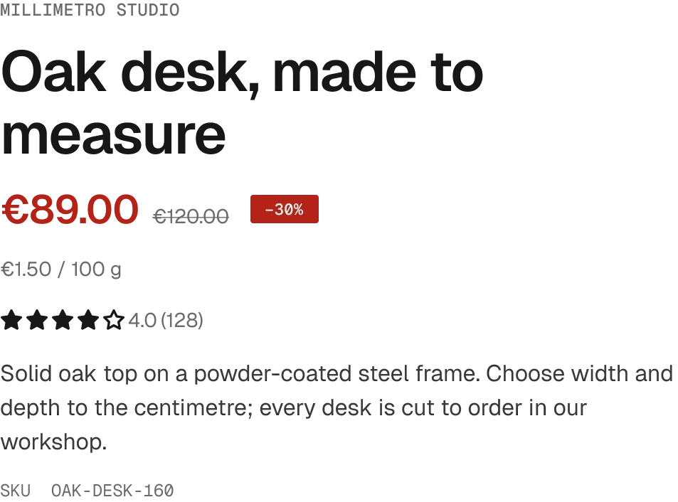
Title, vendor, price, description: a toggle for every field.
1 variant
The stock message for each condition.
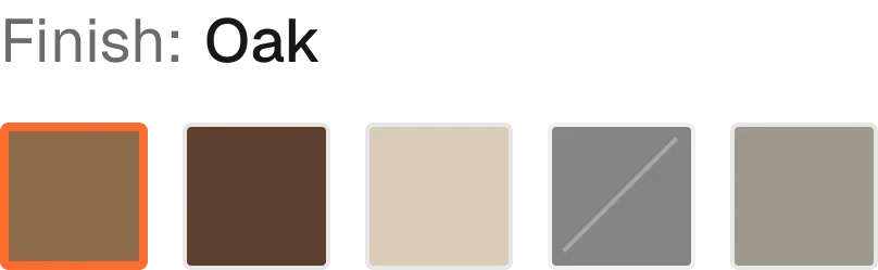
Colour, image and text swatches, inline or in a popover.

A single value, with unavailable still clickable.

Variant pickers instead of swatches.

Quantity stepper with its limits.
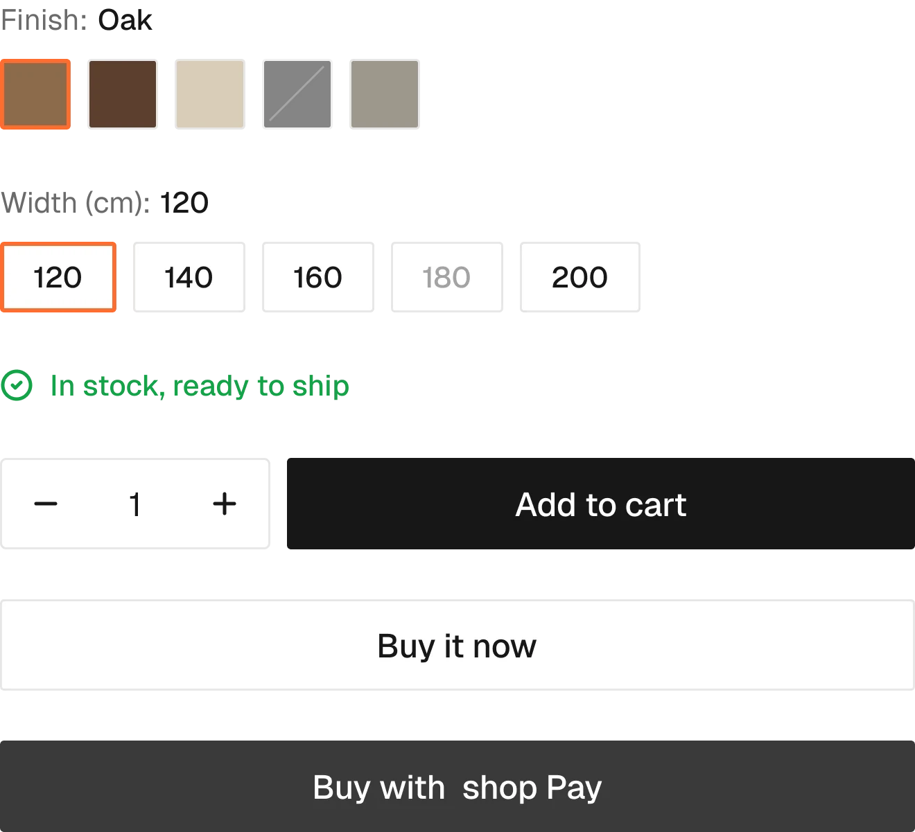
The add to cart form, with every state drawn inside.

Reserves the space Shopify fills with Shop Pay.
1 variant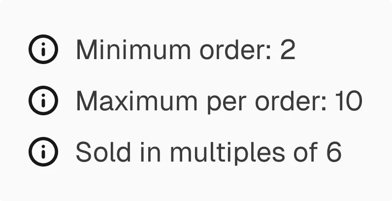
Minimum, maximum and increments, often for B2B.
1 variant
Pickup availability by store.
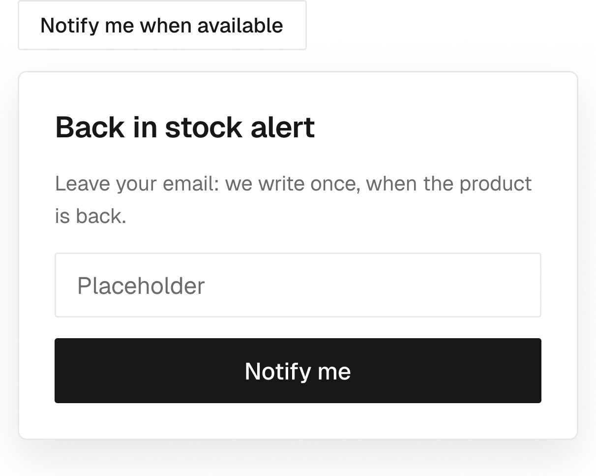
Sign-up for a sold-out variant.

The wishlist button.
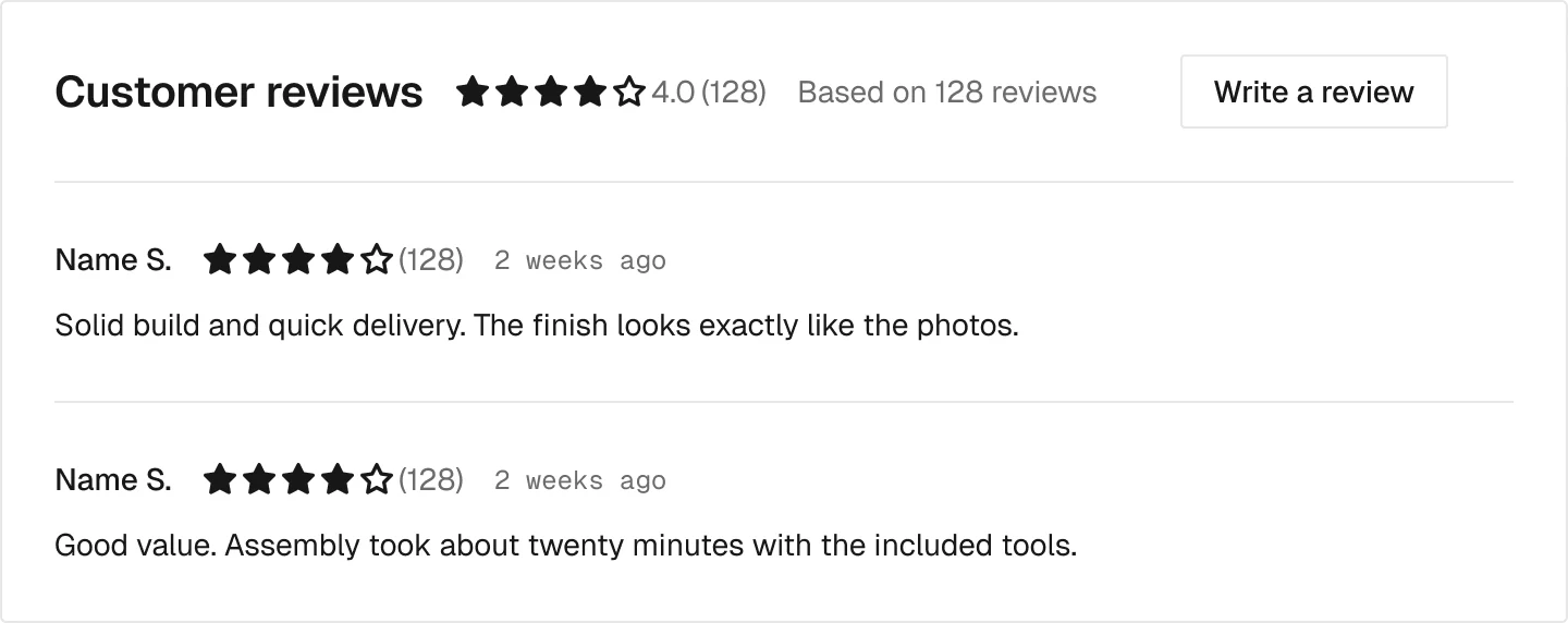
Reserves the space for the Judge.me widget.
1 variant
Metafields as text, lists, tabs or accordions.
8 variants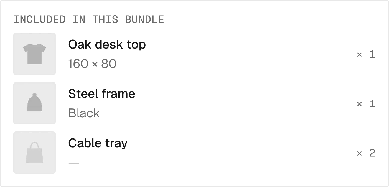
What is inside a Shopify bundle.
1 variant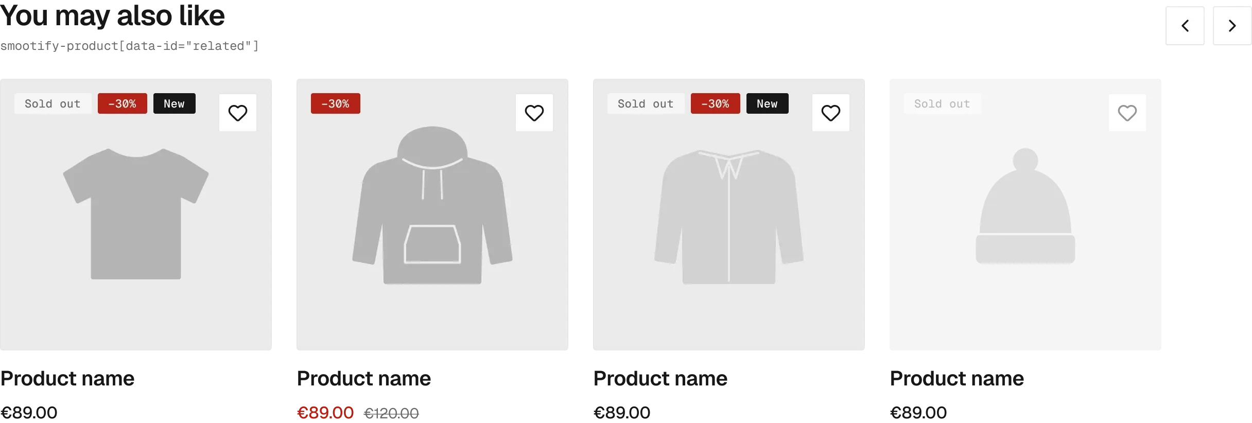
Related, complementary and recently viewed products.

How far the customer is from free shipping.
One cart, drawn once and mounted as page, drawer, dropdown or popover, with quote mode for B2B.
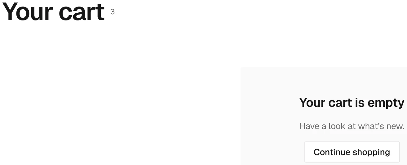
The cart itself, in every mount.

A line, full or compact.
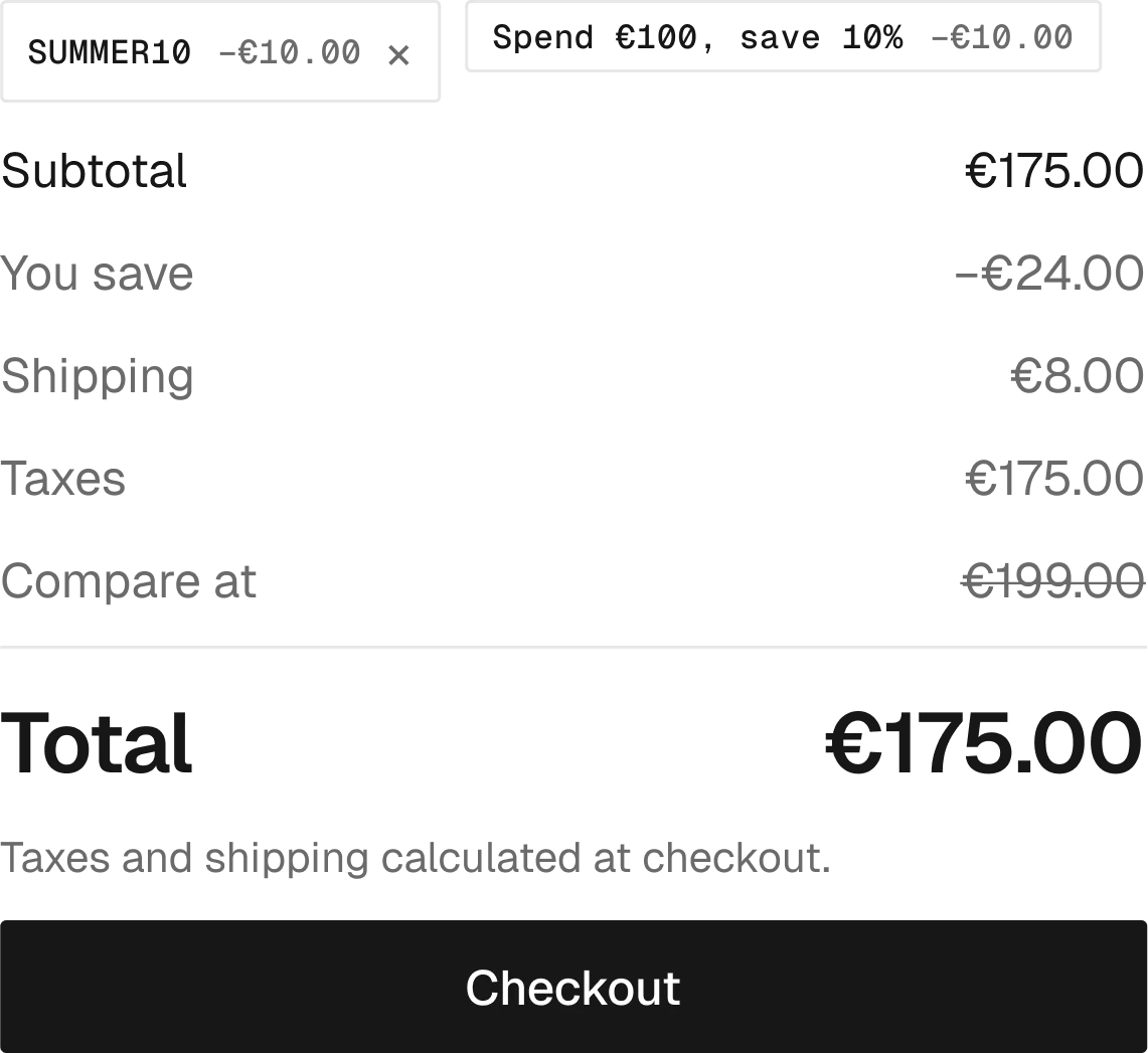
Subtotal, discounts, shipping and total.

Discount codes and gift cards.

Order note and custom fields.
7 variants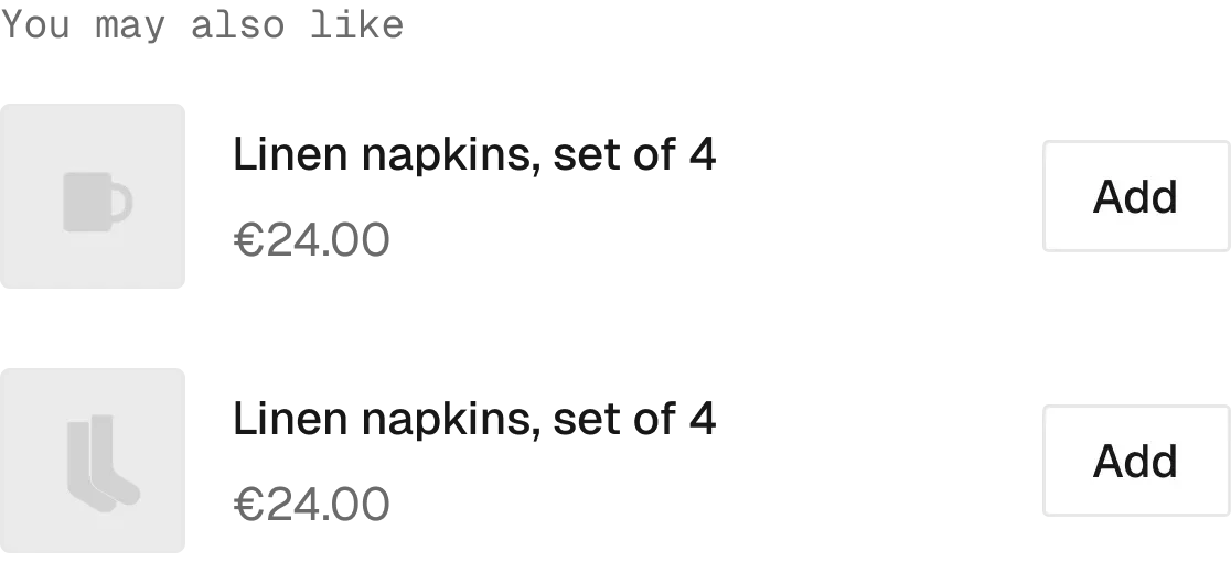
Upsell cards: the only place for a direct-add button.

“Cart reserved for 14:59”.
1 variant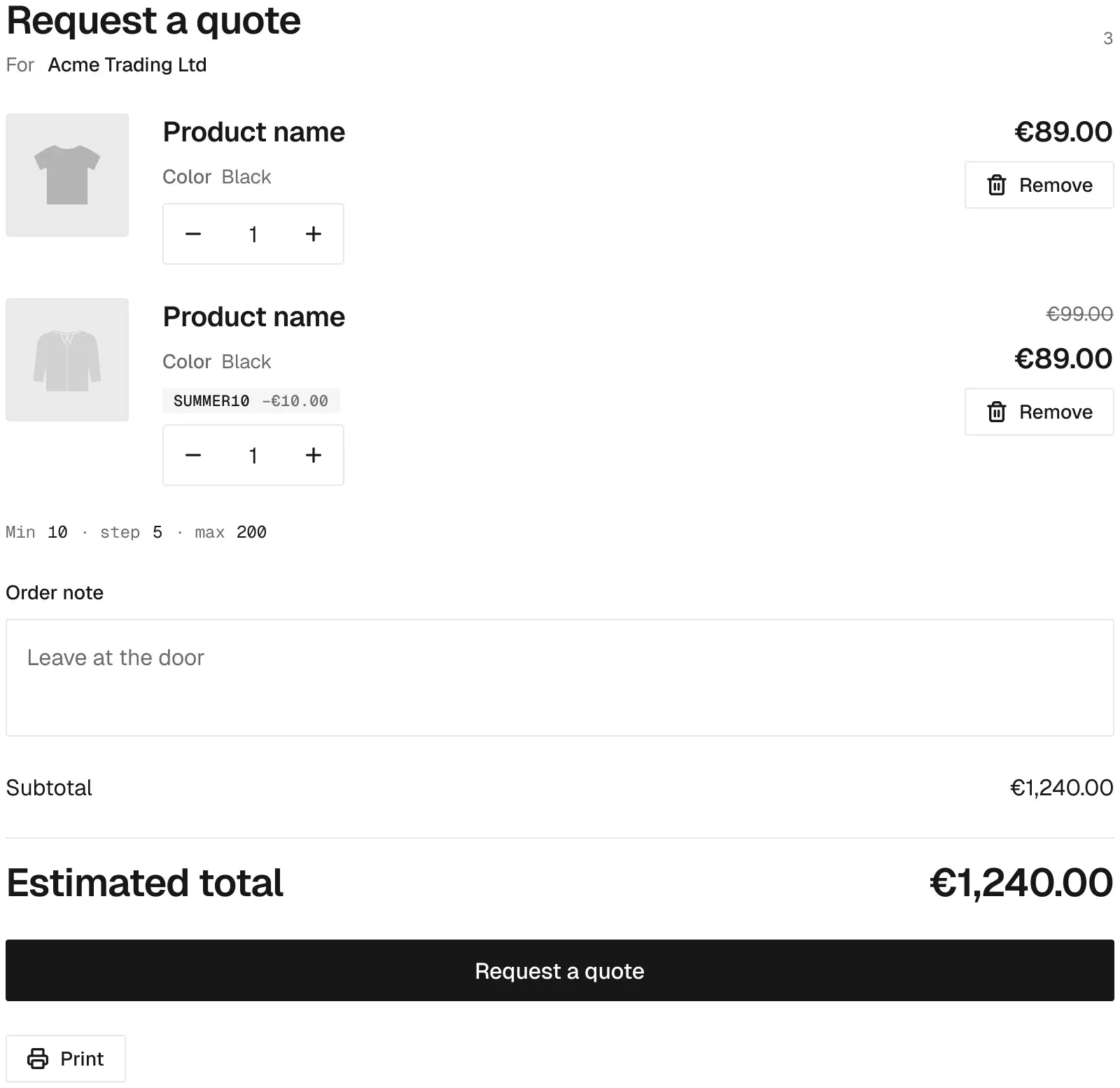
The cart in quote mode, sent as a draft order.
The Smootify pieces that live in the navbar: cart icon, predictive search, sign in.

Cart icon with the item count.
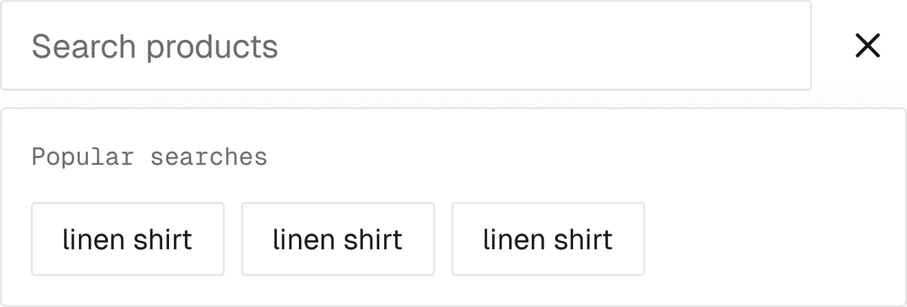
Search as you type, with results and suggestions.

Sign-in link: Shopify hosts the login.
Orders, order detail, addresses and profile, with every status Shopify can return.
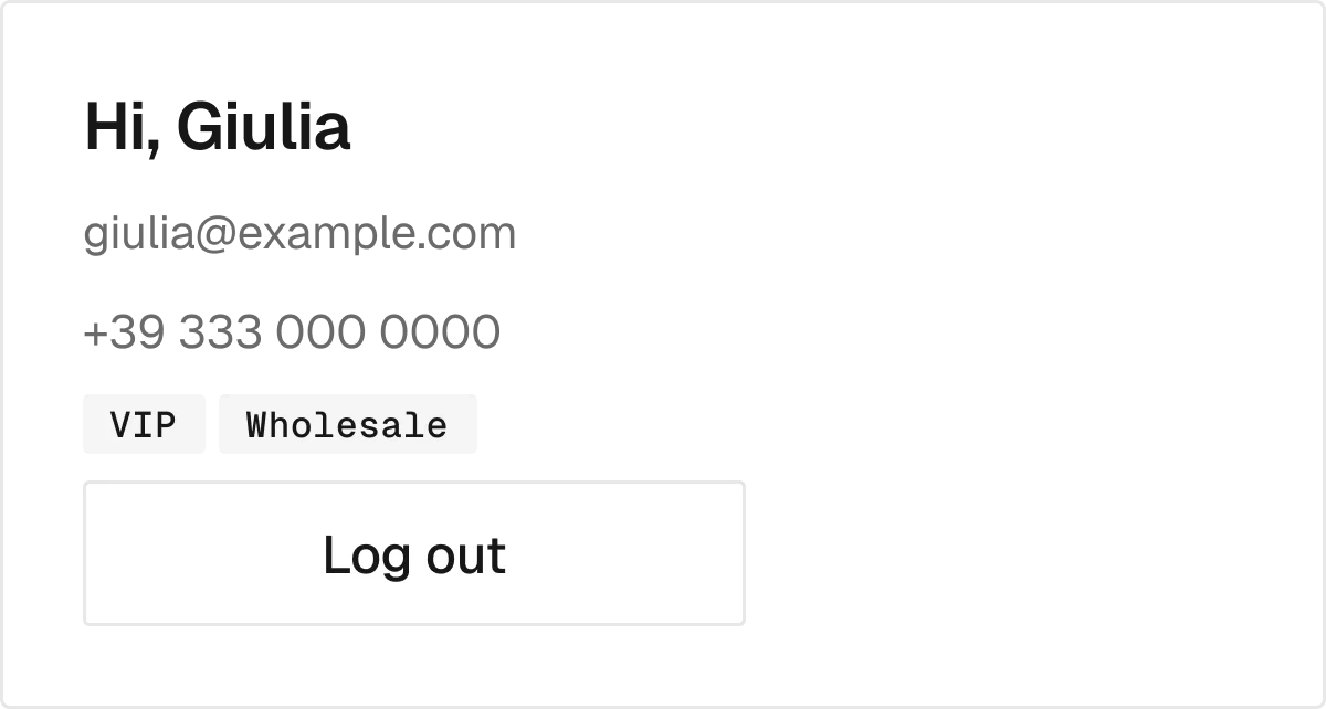
The header on every account page.

Order list with payment and fulfilment badges.
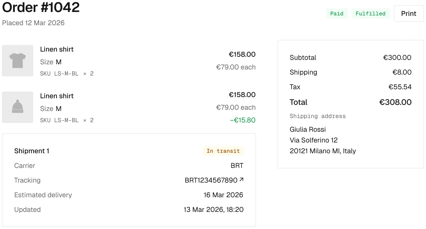
Order detail with shipments and tracking.

Address book with create, edit and delete.
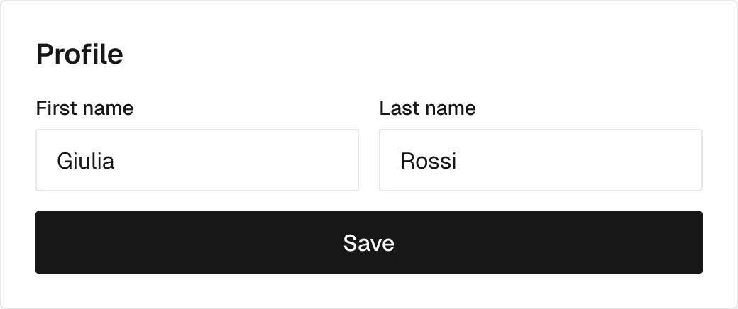
Profile and newsletter preference.
The search results page and the policy page.
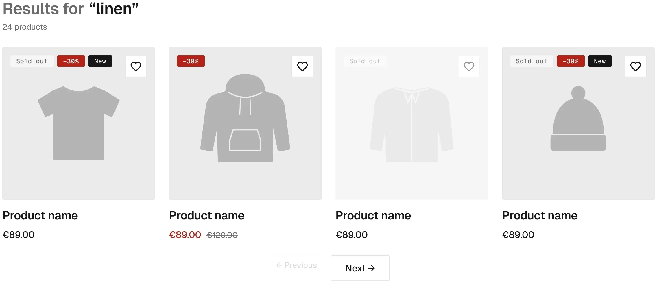
Search results, with the empty state.

Every Shopify policy on one template.
Components for the add-ons and features a store switches on: subscriptions, markets, B2B, magic box and more.

Paid extras on the product, in five forms.
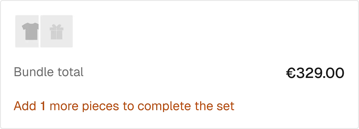
The product and its extras, summed up.
3 variants
Line item properties the customer fills in.
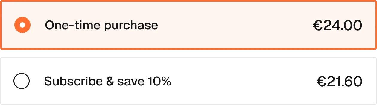
One-time or subscribe, with the plans.
3 variants
Subscriptions in the account: pause, cancel, resume.
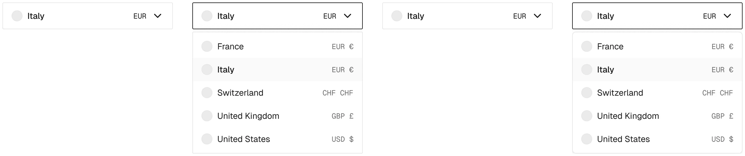
Country and currency switcher.
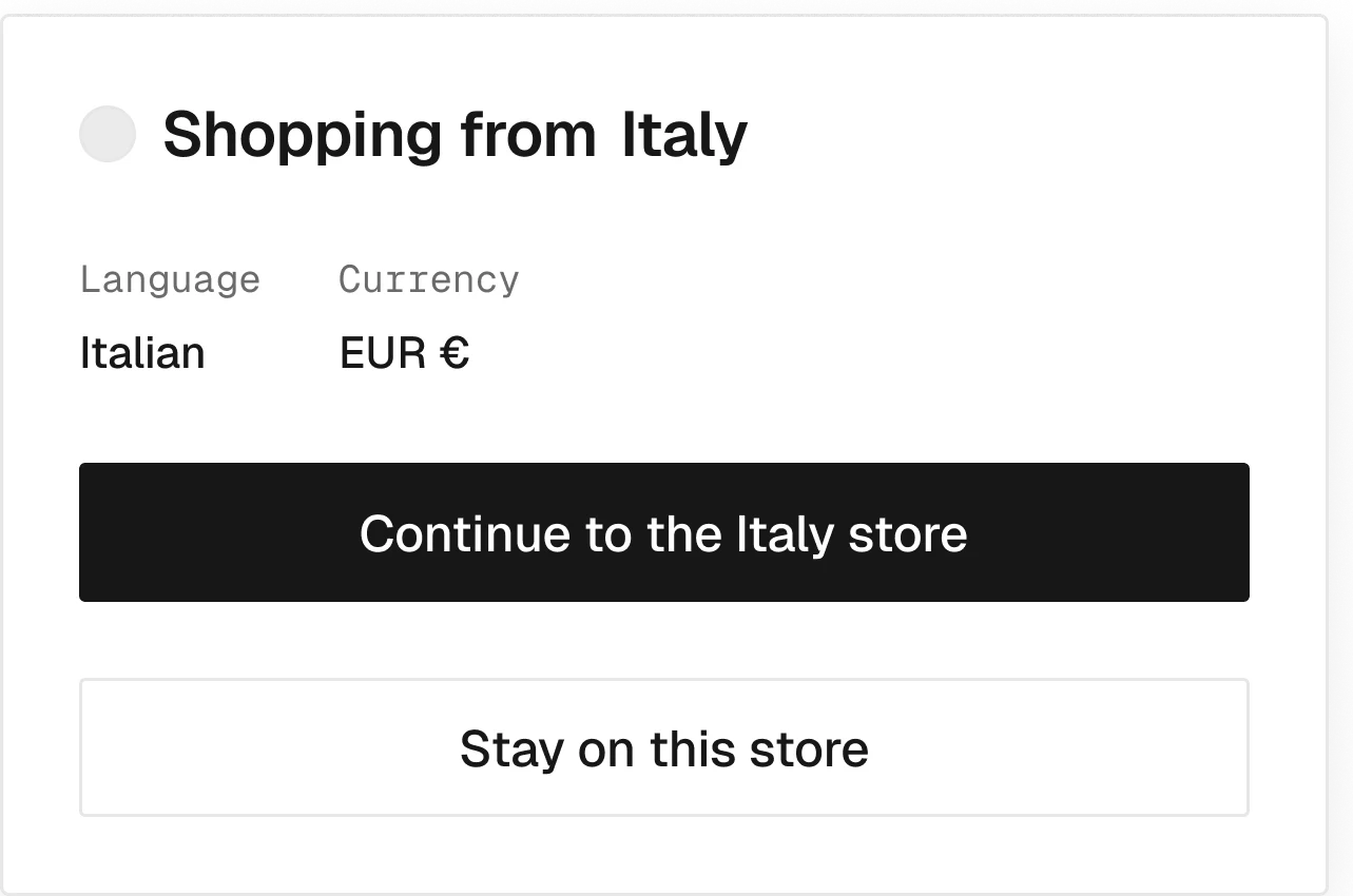
“Shopping from Italy? Prices in EUR.”
1 variant
Pickup location chooser.
4 variants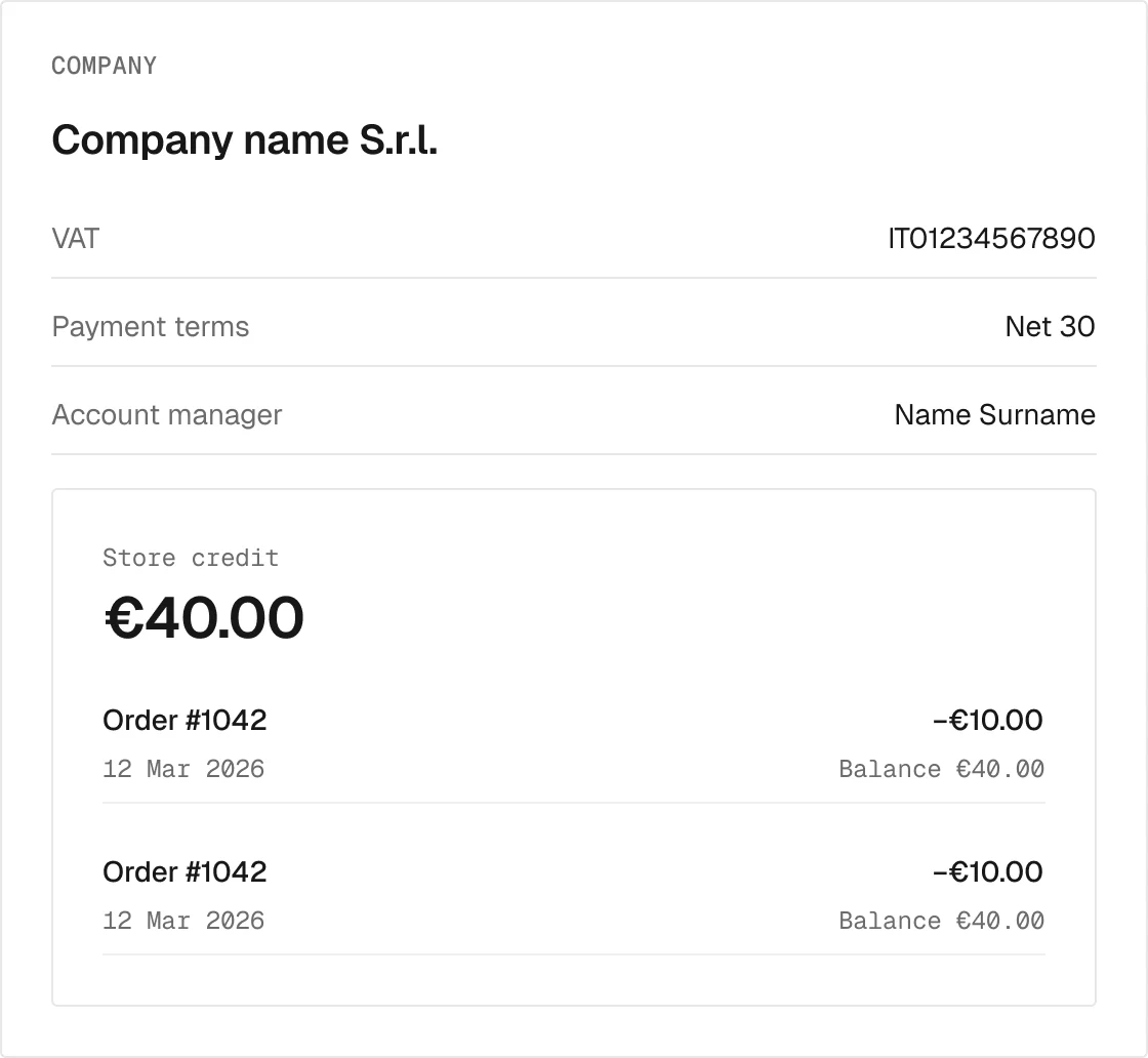
B2B company, store credit and transactions.
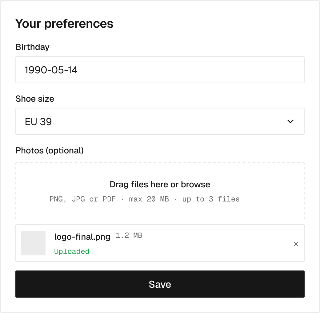
Custom customer fields, saved to Shopify.
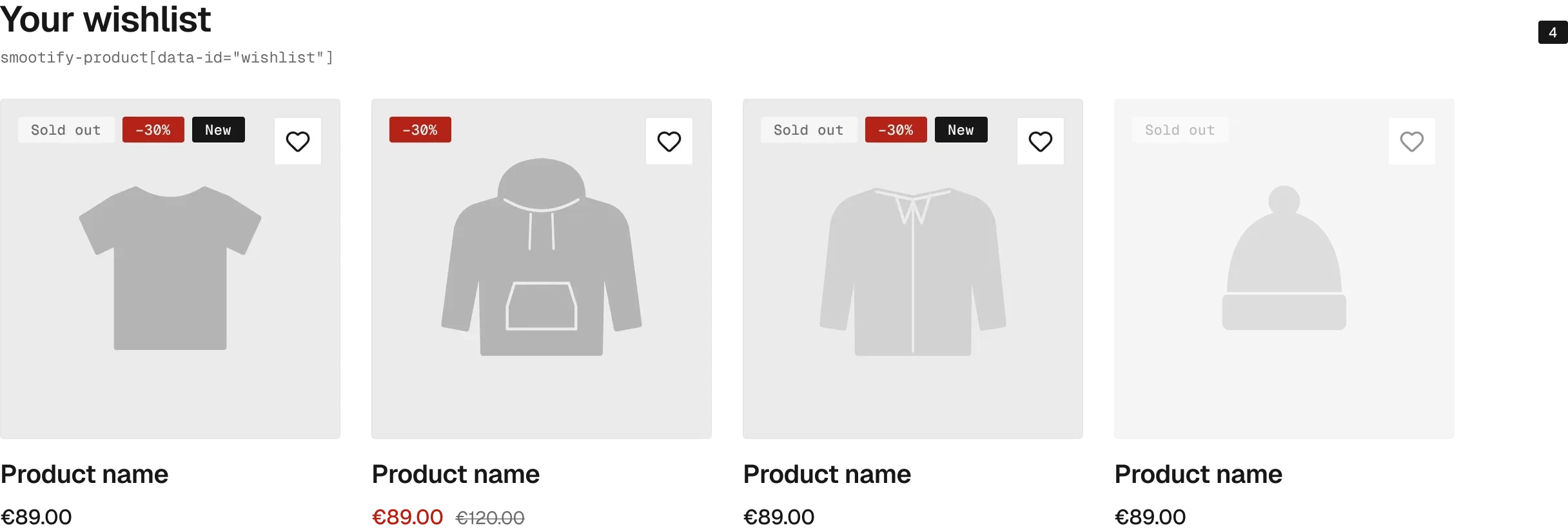
The wishlist page.

A link to the wishlist that opens without an account.
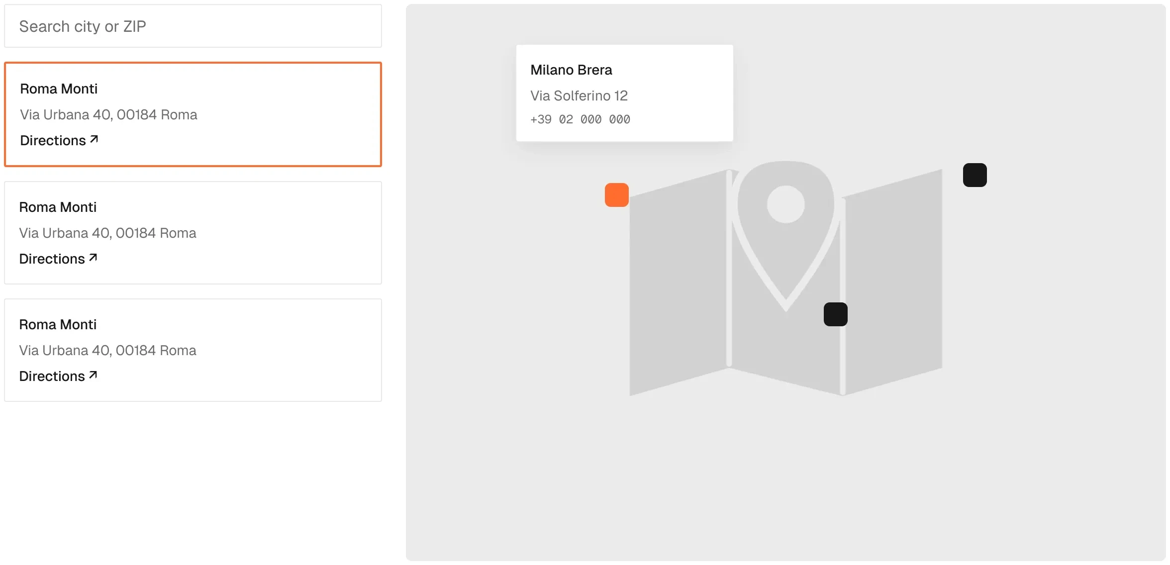
Map, search and store list, with the store row it shares with store availability.
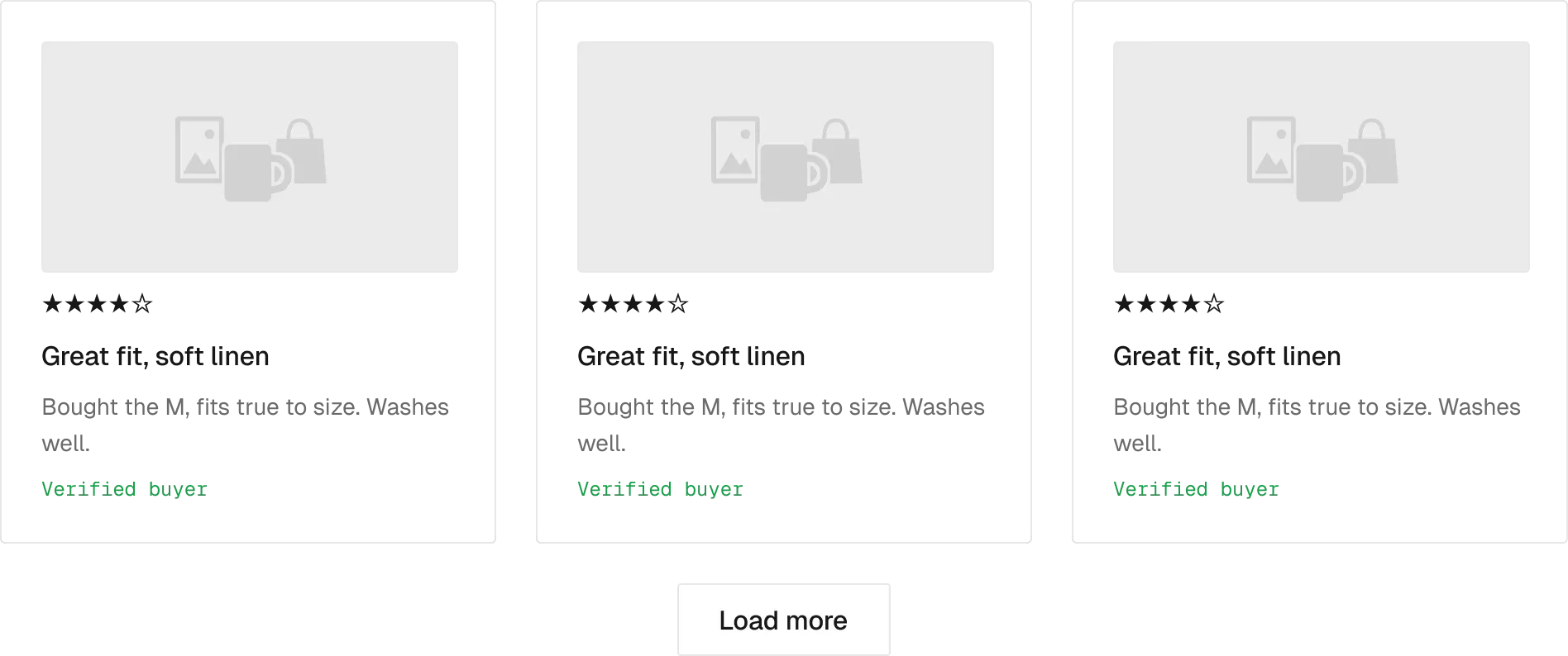
Blog posts or any metaobject list.

The list named in the link, or the not found block.
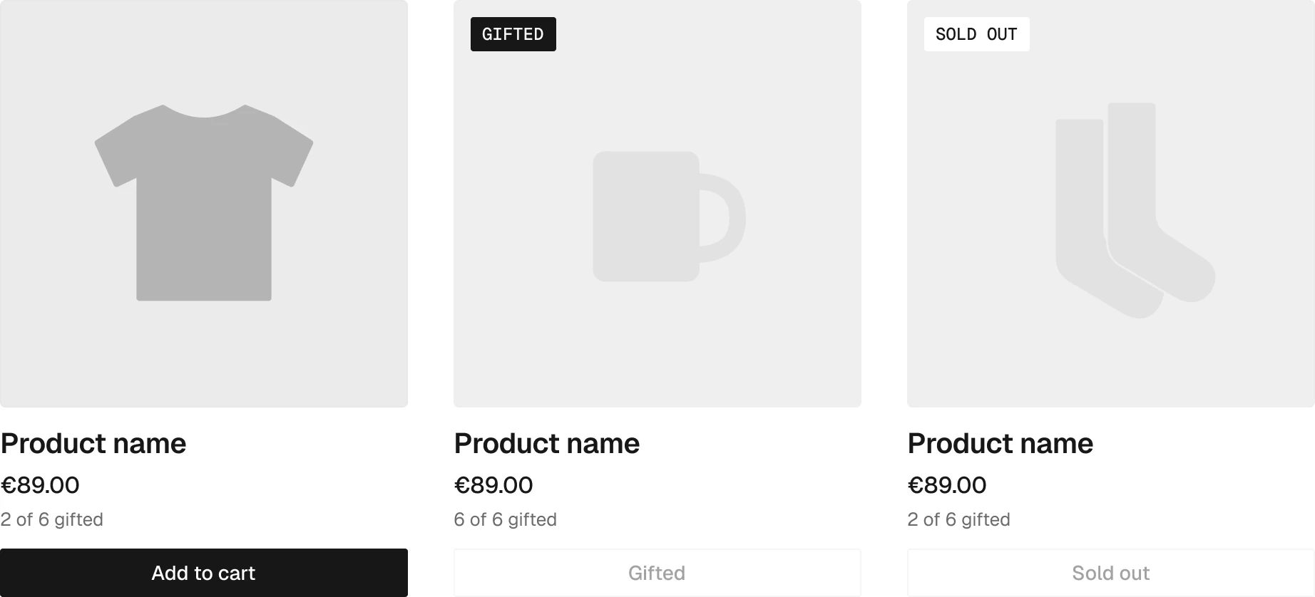
A product in a gift list: how many are gifted, and its add to cart.

Cookie banner wired to Shopify’s consent.
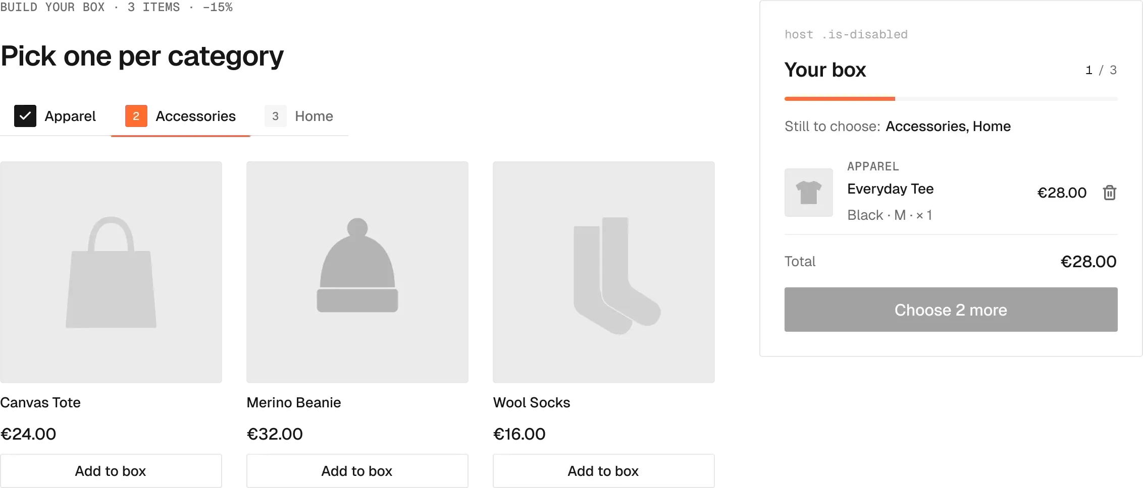
Build-your-own box with progress and discount.
Components for the add-ons that run on our server.

Newsletter sign-up.

Files attached to the order.

Options that set the price through a formula.

A link that reopens the same configuration at the same price.
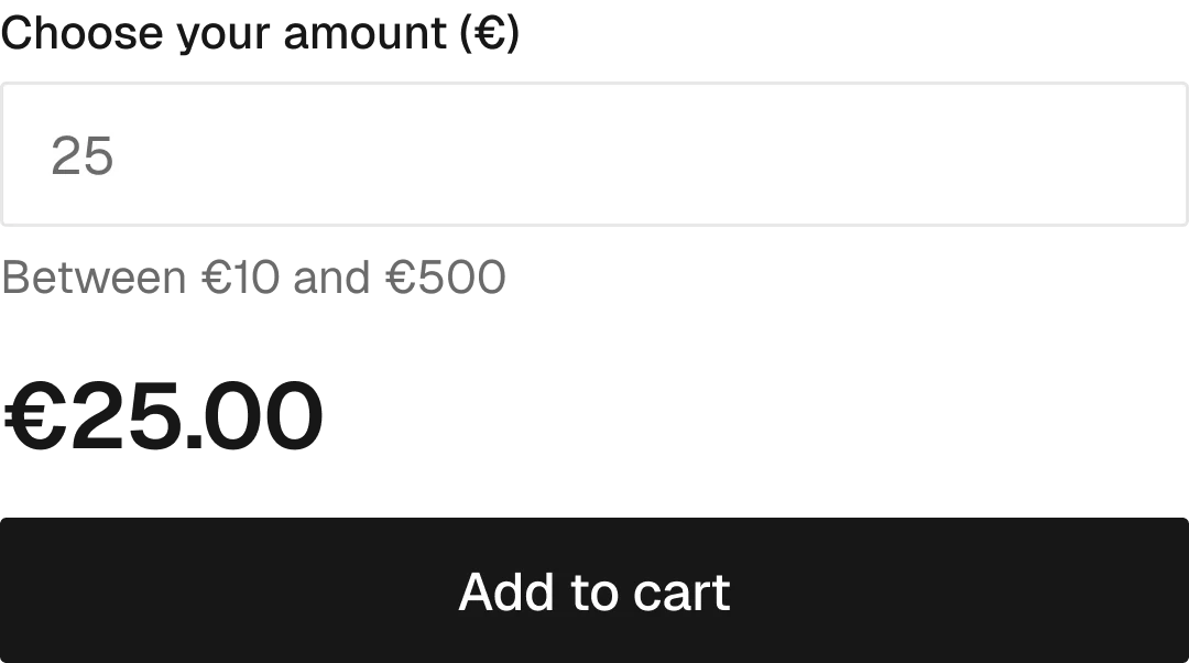
The customer sets the amount.
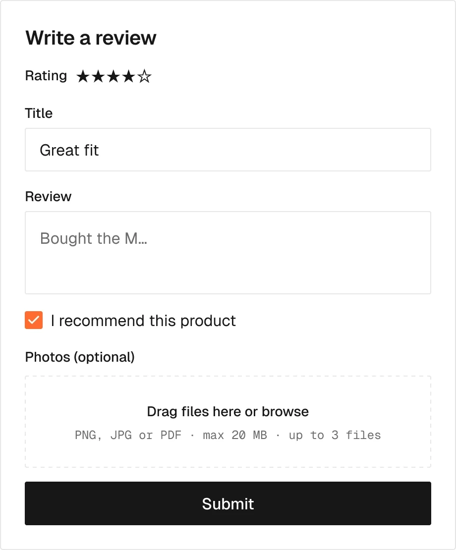
Forms that write metaobjects to Shopify.
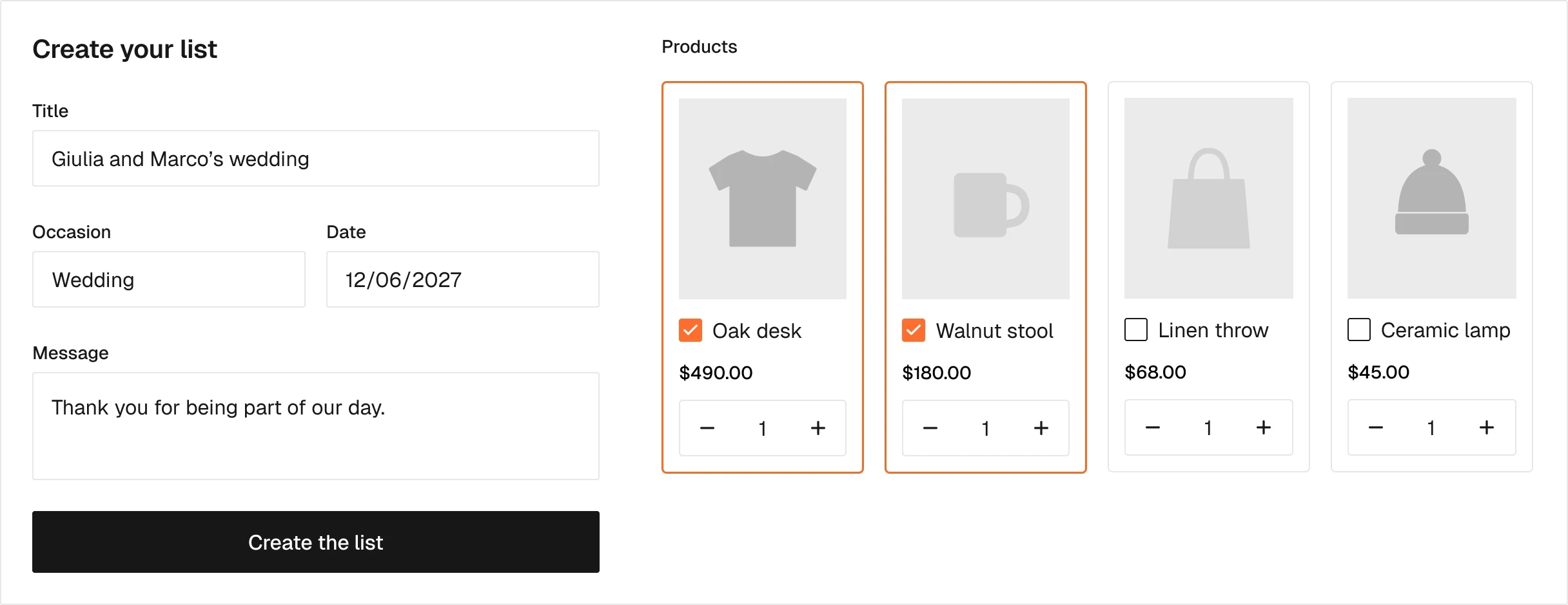
Creates a gift list: title, occasion, date, message, products.
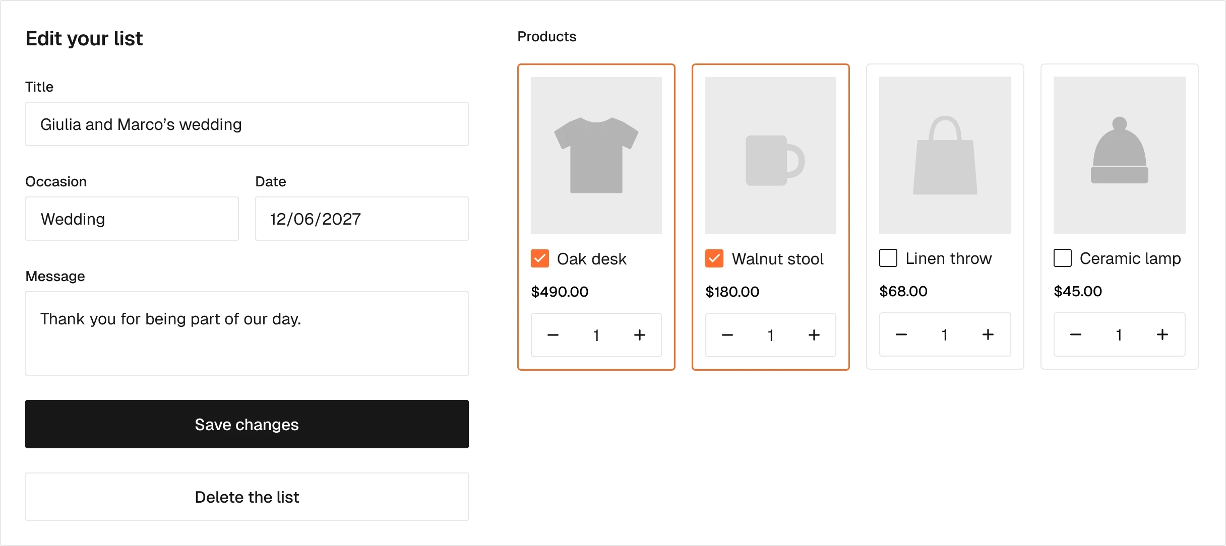
Edits or deletes a gift list. Only its owner sees it.
Slot booking on the server plan: appointments, paid services and pickup or delivery windows.

One slot with the places left. Drawn once, repeated by Smootify.
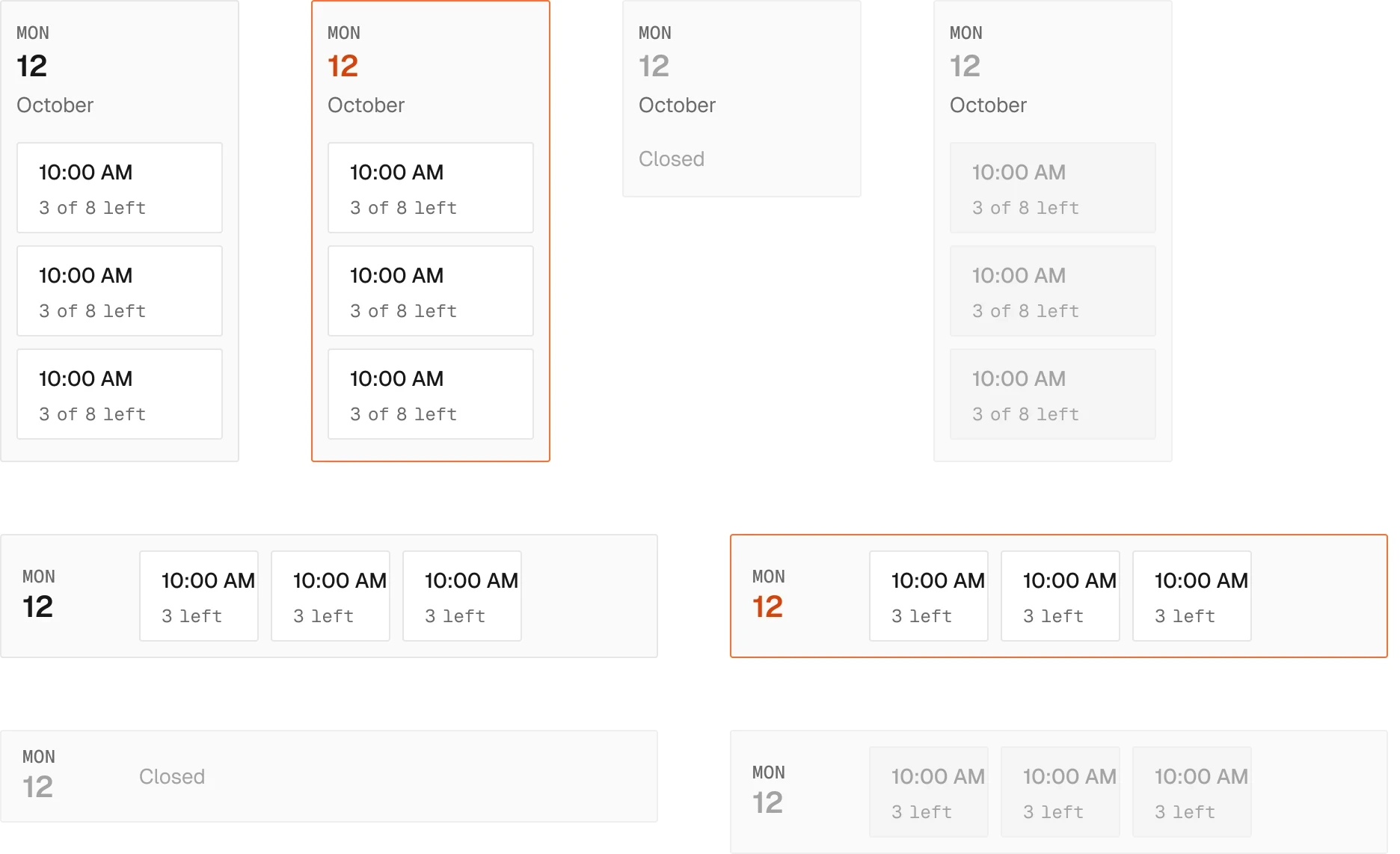
One day and its slots, as a column or a row.
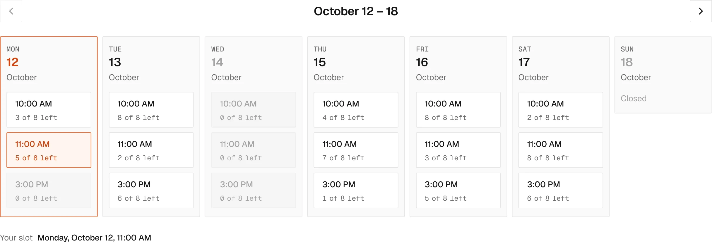
The free slots for a number of days, with the range arrows.
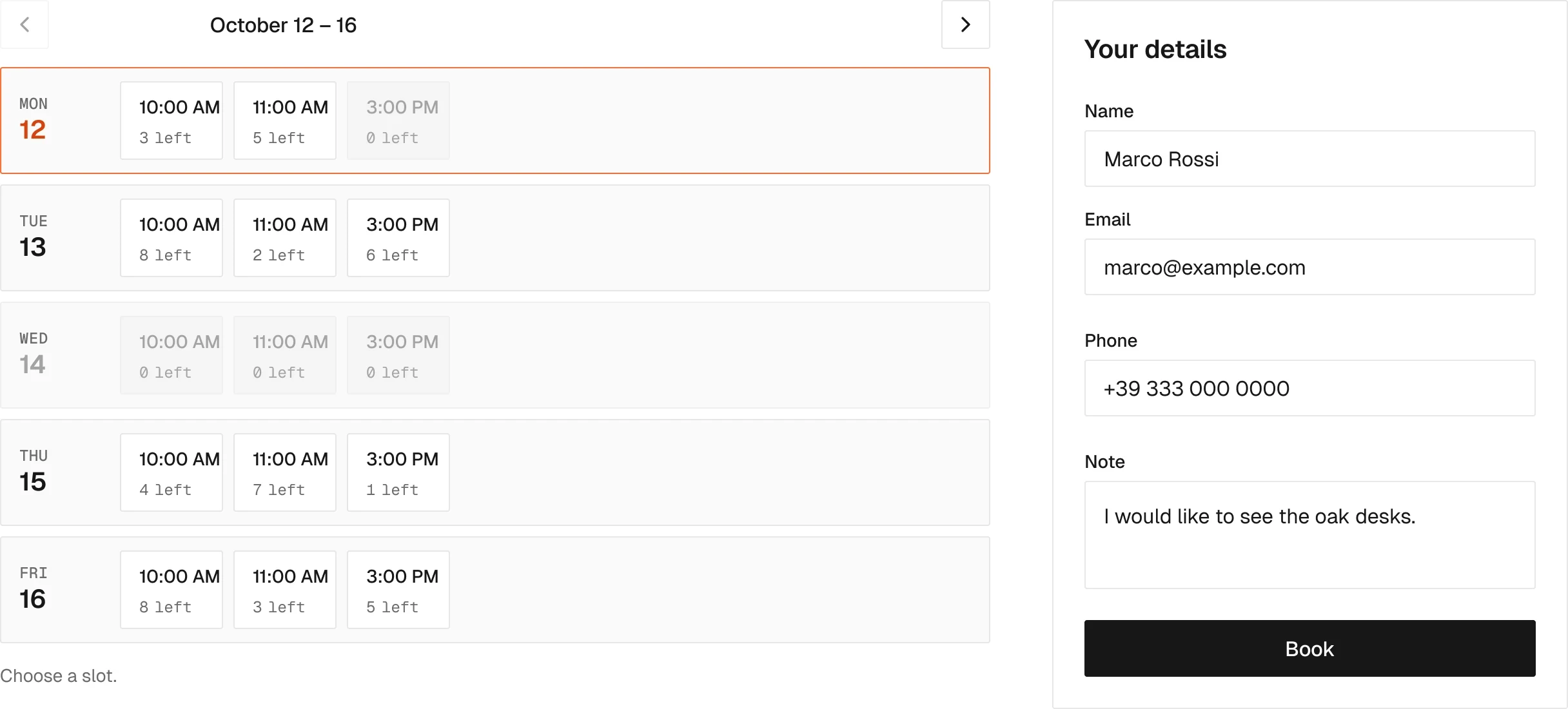
An appointment without payment: the slot and a Webflow form.
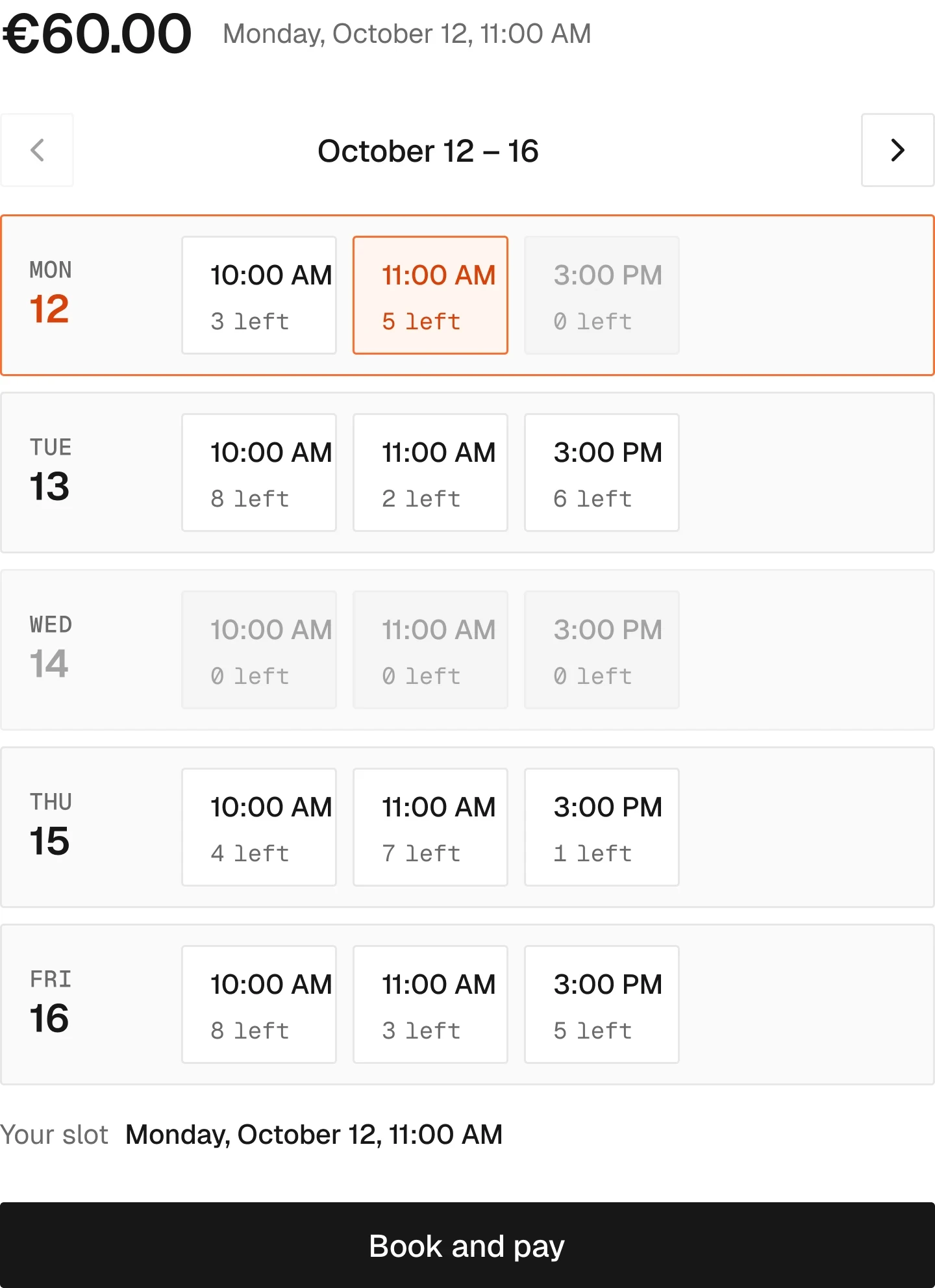
A paid appointment: the calendar inside the add to cart.
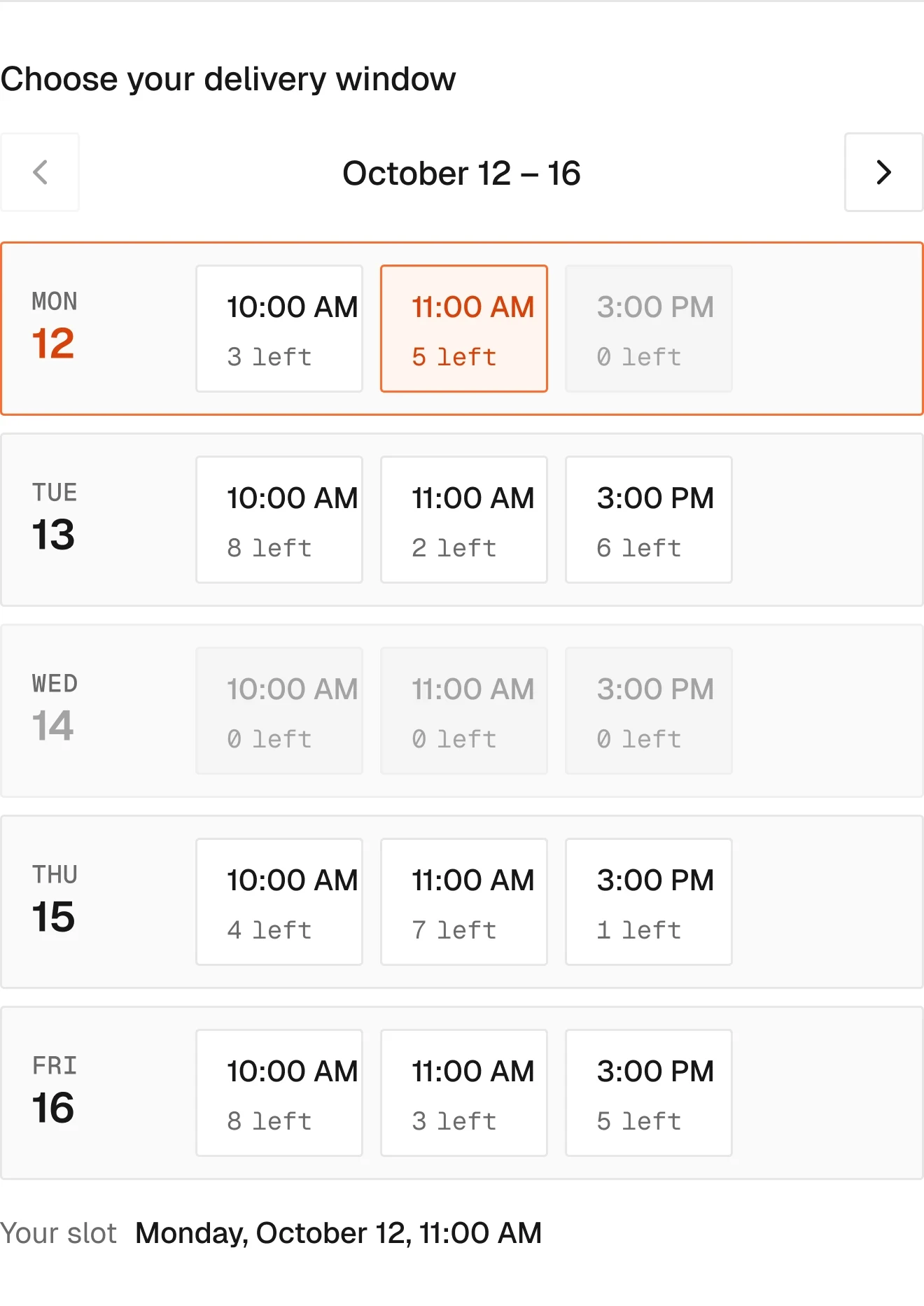
A pickup or delivery window picked in the cart.
Pure Webflow pieces, drawn so the pages are complete: navbar, mobile menu, footer.

The navbar, with the Smootify pieces nested.
12 variants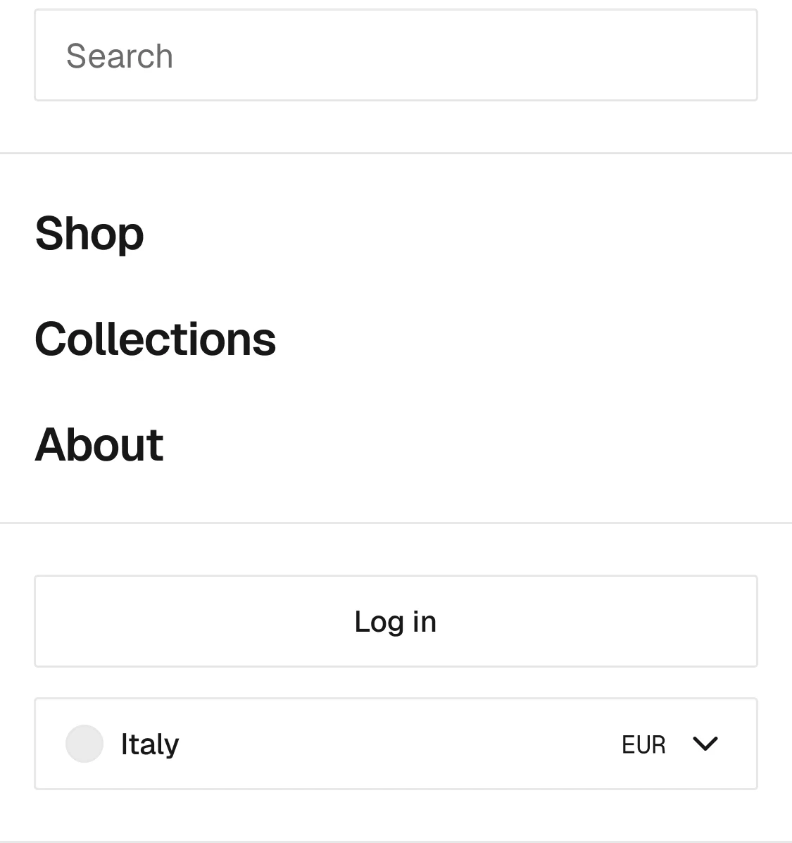
The open mobile menu.
2 variants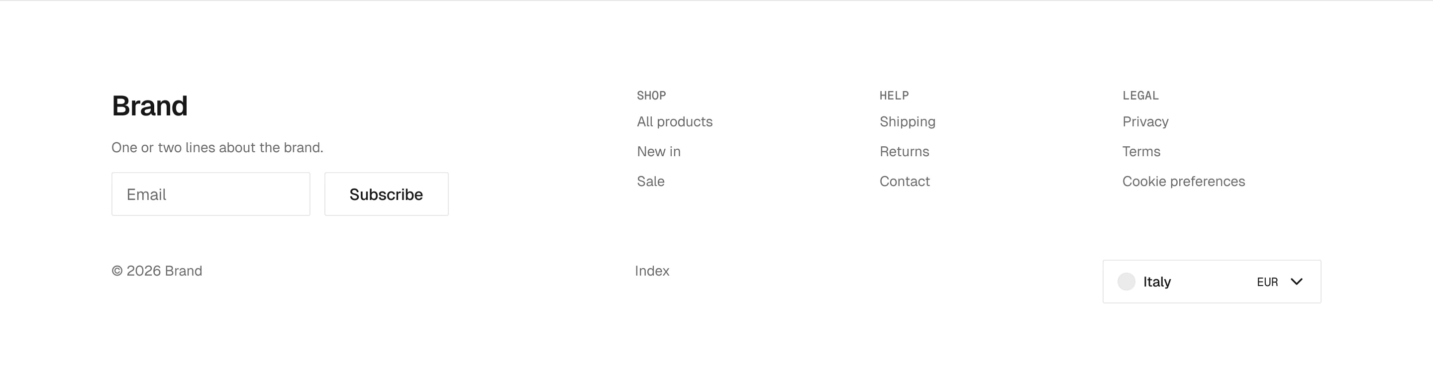
The footer, with markets, newsletter and consent.
3 variants
Breadcrumb from CMS links.
1 variant
Account navigation link.

Account summary tile.
Each layer carries the name of the element it becomes. The agent reads the frame and knows what to write; you read the build and know where it came from.
Product / Configurator
  ├─ Option group / Wood
  │   └─ Option chip
  ├─ Price / Live
  └─ Button / Add to cart
<smootify-product handle="stool-01">
  <smootify-option-group name="Wood">
  <smootify-price live />
  <smootify-add-to-cart />
</smootify-product>
Illustrative. The exact syntax lives in the markup contract.
Free to build, pay only when you go live. One Shopify app instead of ten, billed on the store’s Shopify invoice.