The component library lives in the Designer.
In 2.0 every Smootify component, attribute and condition is in the Webflow app, not on a website to copy from. Open it in the Designer, select an element, and the app shows what works there.
Free to install, on every plan.
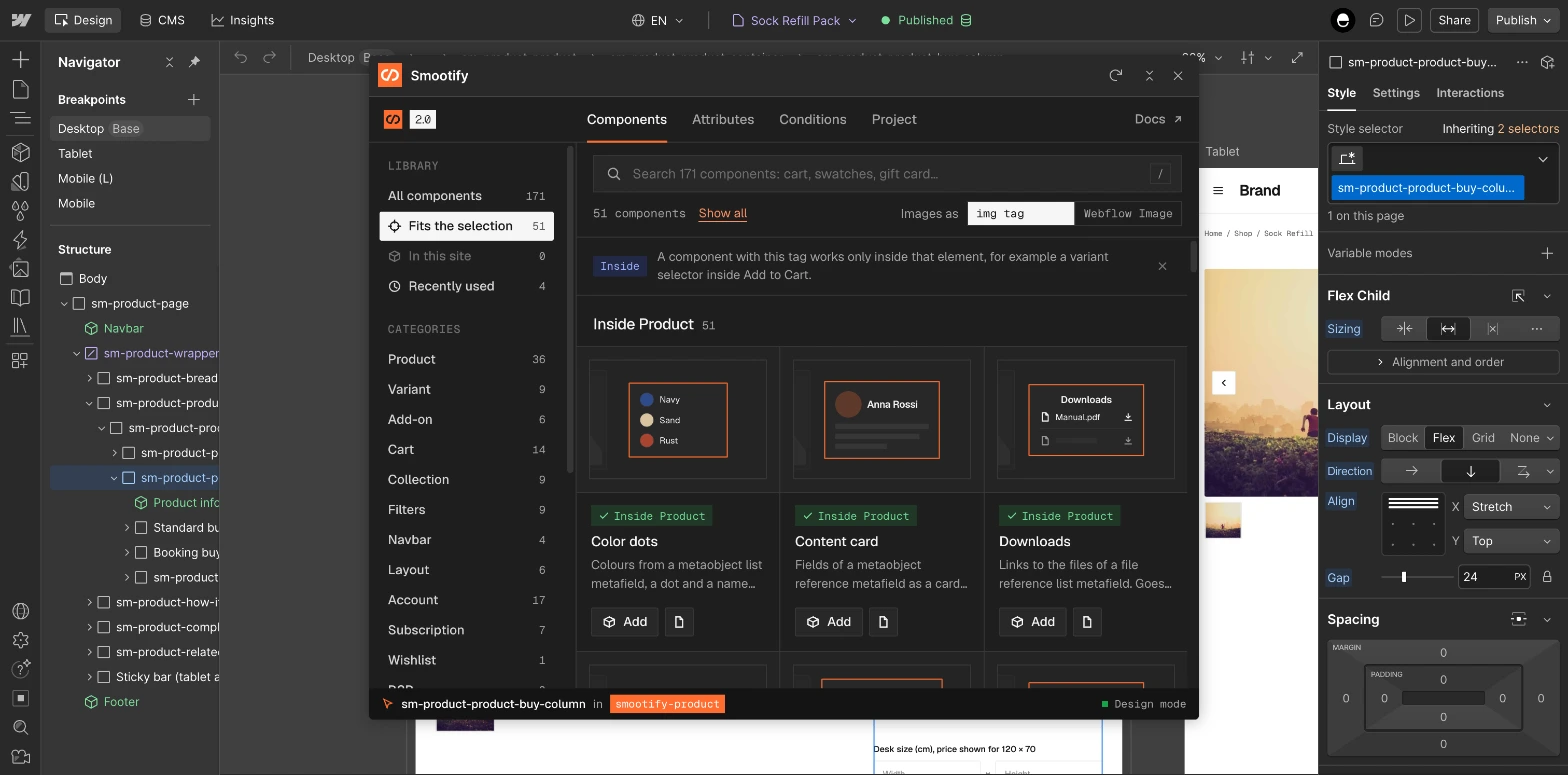
- ComponentsThe whole library, to search and place.
- AttributesWhat the selected element can show.
- ConditionsWhen the selected element shows.
- ProjectPlan, domain, store and setup.
How the Webflow app works
Native Webflow components
What you place is plain Webflow: elements, classes and component props. Style it in the Style panel like anything else on the site. Nothing is exported or converted.
It reads your selection
The bar at the bottom always says what you selected and which Smootify element it sits in. Every tab follows it: what fits, what doesn’t, and why.
Same list as the Figma kit
The components are the ones in the Figma wireframe kit, area by area. What you design in Figma has a component waiting in Webflow.
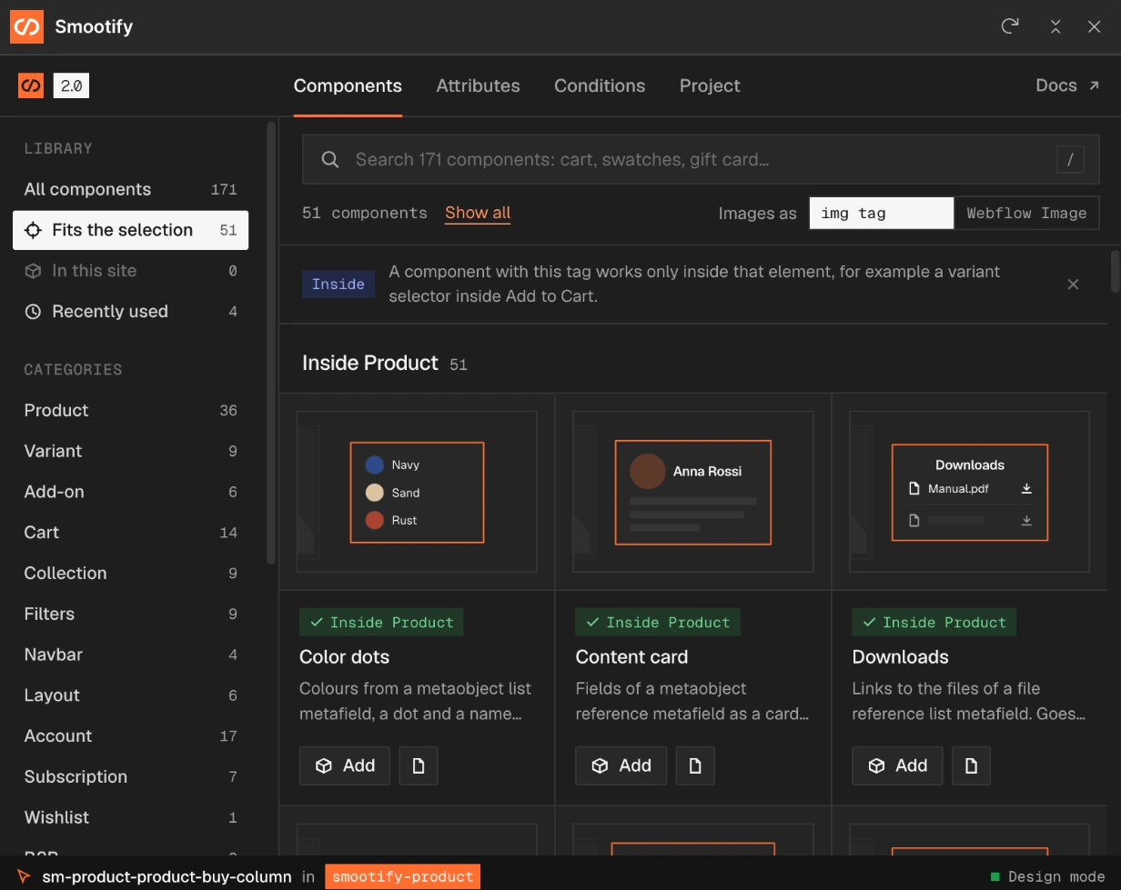
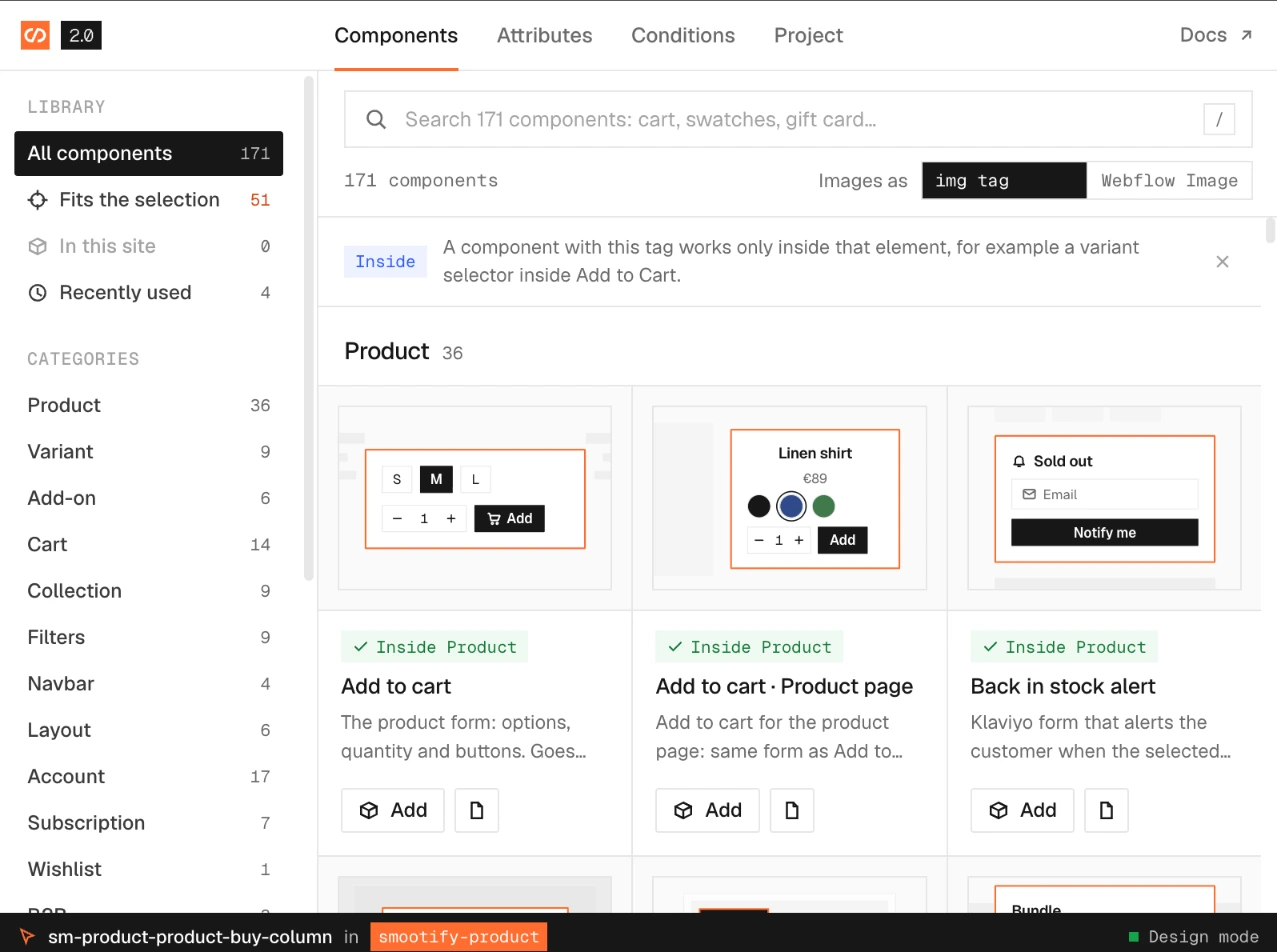
171 components. The app shows the ones that fit.
A Smootify component often works only inside another one: a variant picker inside an add to cart, a price inside a product. Select an element in the Designer and the library narrows to what works there.
- Fits the selection. With a block inside a product selected, the library shows the 51 components that work inside a product. Each card says where it goes, with an Inside tag, so nothing lands where it can’t work.
- Search and categories. Search all 171 by name or job (cart, swatches, gift card), or browse by area: product, variant, add-on, cart, collection, filters, navbar, layout, account, subscription, wishlist, B2B and more.
- In this site and Recently used. The components the site already has, and the ones you just placed, one click away.
- Images your way. Choose once whether product images come in as an
imgtag, bound to the Image URL field that keeps the picture on Shopify’s CDN, or as a Webflow Image.
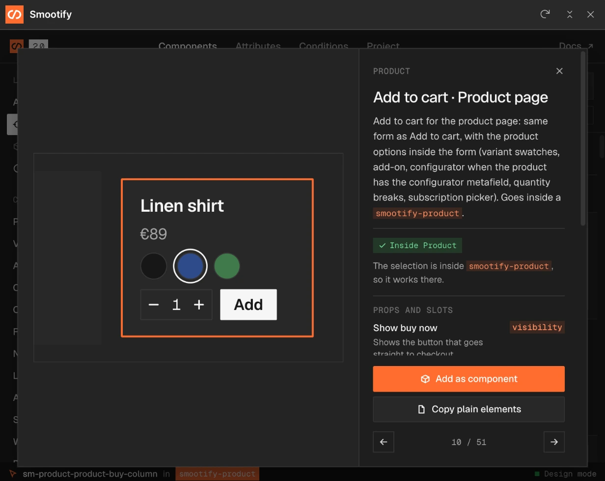
Every component explains itself.
What it is and what it needs
A preview, what the component contains and where it goes, for example Add to cart · Product page with the variant swatches, add-ons, configurator, quantity breaks and subscription picker inside the form.
A check on your selection
“The selection is inside smootify-product, so it works there.” When it isn’t, the app says so before you add anything.
Props and slots
What you can change once it is placed, such as Show buy now, and what each prop drives.
As a component, or as plain elements
Add it as a Webflow component with its props, or copy plain elements to restyle freely. The arrows step through the list without closing the detail.
The markup, without typing it.
Select any element in your own design and the app lists the Smootify attributes and conditions that work there, grouped by the element they need around them. Add puts the attribute on the element, with its value.
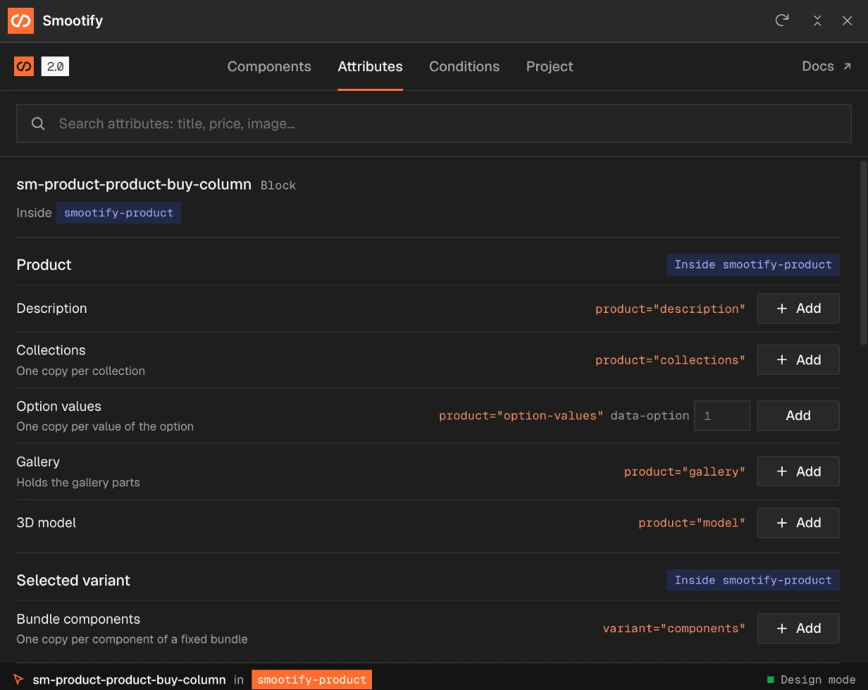
Attributes
What the element shows: the description, the collections (one copy each), the values of an option, the gallery, the 3D model, the components of a bundle. Values the attribute needs, like the option number, are typed right there.
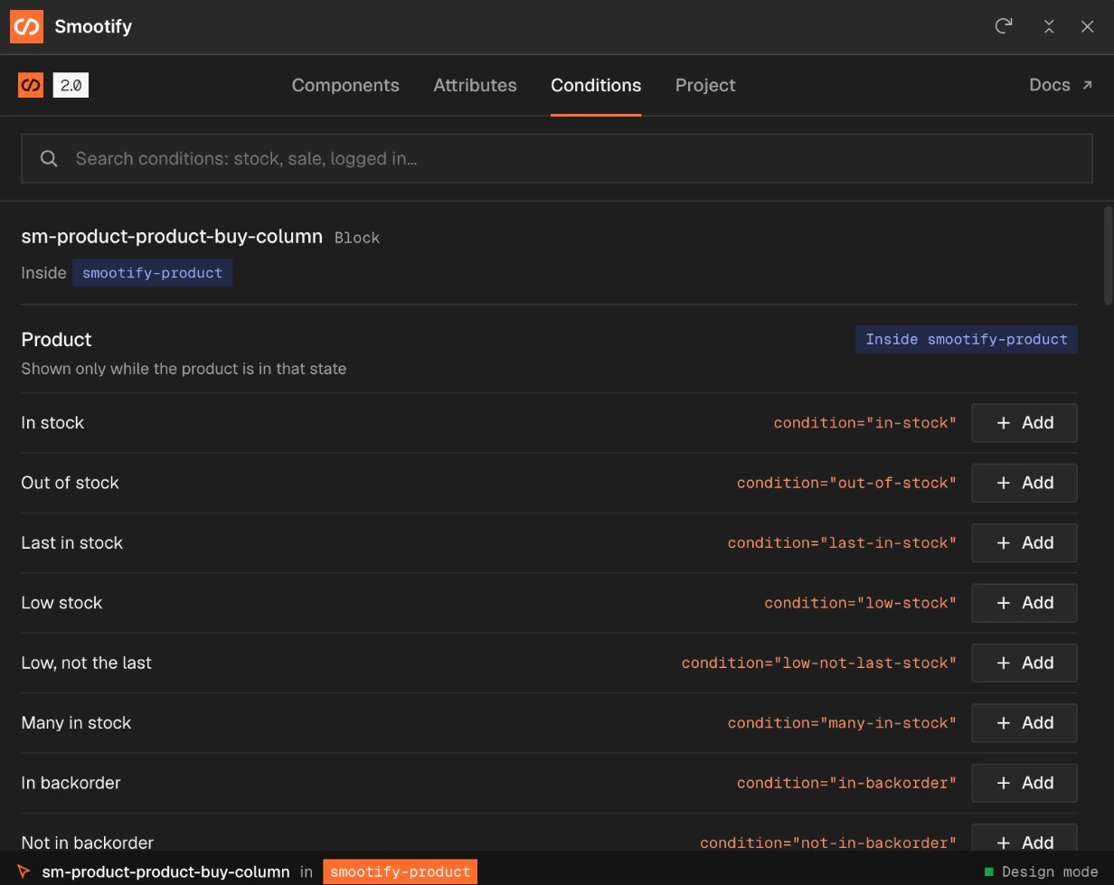
Conditions
When the element shows: in stock, out of stock, the last one, low stock, in backorder, on sale, logged in, and the rest. Each one is a line with its exact name, so a message for “only one left” takes one click.
Your project, without leaving the Designer.
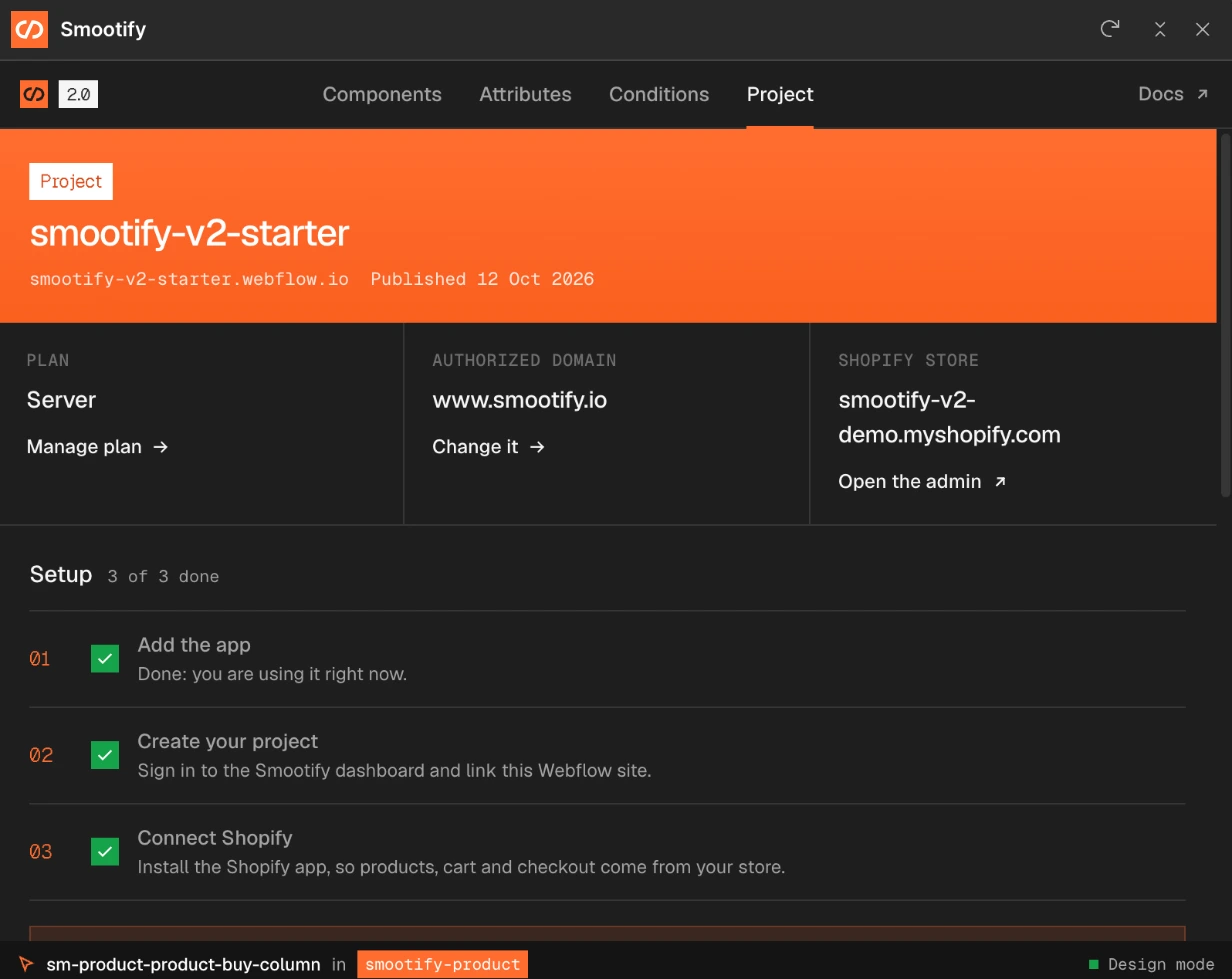
Plan, domain and store
The Smootify plan of the site, the domain it is authorized on and the Shopify store it reads, each with a link to change it or open the admin.
Setup, ticked as you go
The three steps below, each ticked in the tab once it is done.
- Add the app. Install it from the Webflow Marketplace, or from the Apps panel inside the Designer.
- Link your project. Sign in to the Smootify dashboard and link the Webflow project you are working on.
- Connect Shopify. Install the Shopify app on your store, so products, cart and checkout come from Shopify.
You can design and review the whole store on the free plan before connecting a domain.
Everything a store page needs, grouped the way you build.
171 components cover every page of a store. The modules come in only when the store needs them.
- CollectionProduct card, price, badges, filters, sort, pagination
- Product pageGallery, swatches, add to cart, store availability, carousels
- CartDrawer or popover, line items, summary, discount code, upsells
- NavbarCart icon, predictive search, sign in
- AccountOrders, order detail, addresses, profile
- SearchThe search page and its results
- Add-ons and bundles
- Custom properties
- Subscriptions
- Markets
- B2B
- Wishlist
- Store locator
- Metaobjects
- Cookie consent
- Magic box
- Server plan: configurator, file upload, name your price
Light or dark
The app comes in both themes, so it sits well next to the Designer however you set it up.
Place them yourself, or let your agent do it.
The components carry the same names and props the Figma → Webflow skill reads. Annotate the Figma file, and your agent builds the pages from these components through the Webflow MCP.
Open the library
in the Designer.
Free to install. One Shopify app instead of ten, billed on the store’s Shopify invoice when you go live.
- One app on the Shopify bill, not ten
- Free to build, pay only when you go live
- Works on Basic, Grow and Advanced
- Your 1.x store keeps working
- Every element stays yours to change
- Docs indexed in llms.txt