Picture a food crate shop whose mini cart is a Webflow Dropdown. A customer is sending a crate to a friend. The mini cart has a field for the card, “Gift message”, so she adds the crate, starts typing “For Sara, for the new flat”, changes the quantity of the jam, and the cart closes under her fingers. She opens it again, the message is half there, she types the rest. Nobody reports it. They just decide the site is fragile.
That is how a mini cart built from a Webflow Dropdown can behave, in 1.x and still in 2.0: a Dropdown may close while the visitor types in the cart’s fields. The panels Smootify opened or closed came in a few shapes: a Dropdown, a dialog, a details element, or your own interaction. In 2.0 there is one more shape, and it fixes this: every panel Smootify opens or closes can be a popover that you design. The browser opens it, closes it with Escape or a click outside, and moves the focus. Smootify fills it with data. Sunday Crate, our food crate demo store, builds its cart that way: a drawer that is a popover, opens after each add to cart and has the same Gift message field.
You do not need a special element
The word “popover” makes many Webflow designers think of Webflow’s Popover element, and if their site does not have it, they stop reading. You do not need it. A popover is part of HTML, supported in Safari 17, Chrome 114, Firefox 125 and later. Two custom attributes make one on any site:
- the panel is a Div block with
popover="auto"and an ID, such asmini-cart; - the trigger is a Custom element with the tag
buttonandpopovertarget="mini-cart".
Where your site has Webflow’s Popover element, use it: Smootify works the same with both. Millimetro, our furniture demo store, uses it for its menus. In Astro the same two attributes go on your own elements: see Popovers for Astro. And nothing forces you to move. The Dropdowns, dialogs and details elements you already built keep working in 2.0. The popover is one more way, not a migration.
The mini cart that stays open
Put a popover inside smootify-cart and add data-open="on-add":
The panel has the ID mini-cart in its element settings. After each add to cart the panel opens. While the customer types in the cart’s fields or in the note, and while the lines redraw after a quantity change, it stays open. Escape or a click outside closes it. For a drawer that covers the page, data-overflow-body on the panel stops the page behind it from scrolling.
Smootify adds no animation of its own. To animate Webflow’s Popover element, select it in the Designer and click Animate open/close in its settings: Webflow adds an open and close animation that you can change in the Interactions panel, which runs on GSAP. The animation plays whoever opens the panel: your trigger, Smootify after an add to cart, Escape or a click outside. In Astro, the guide does it with CSS transitions.
One rule for every picker
Smootify 2.0 has five new pickers built on a popover: variant-popover for a product option, addon-popover for the variant of an add-on, filter-popover and sort-popover on collection pages, and configurator-popover for the Product Configurator. country-switcher, location-switcher and the Dropdown type of dynamic-property accept a popover too. They all follow the same three rules:
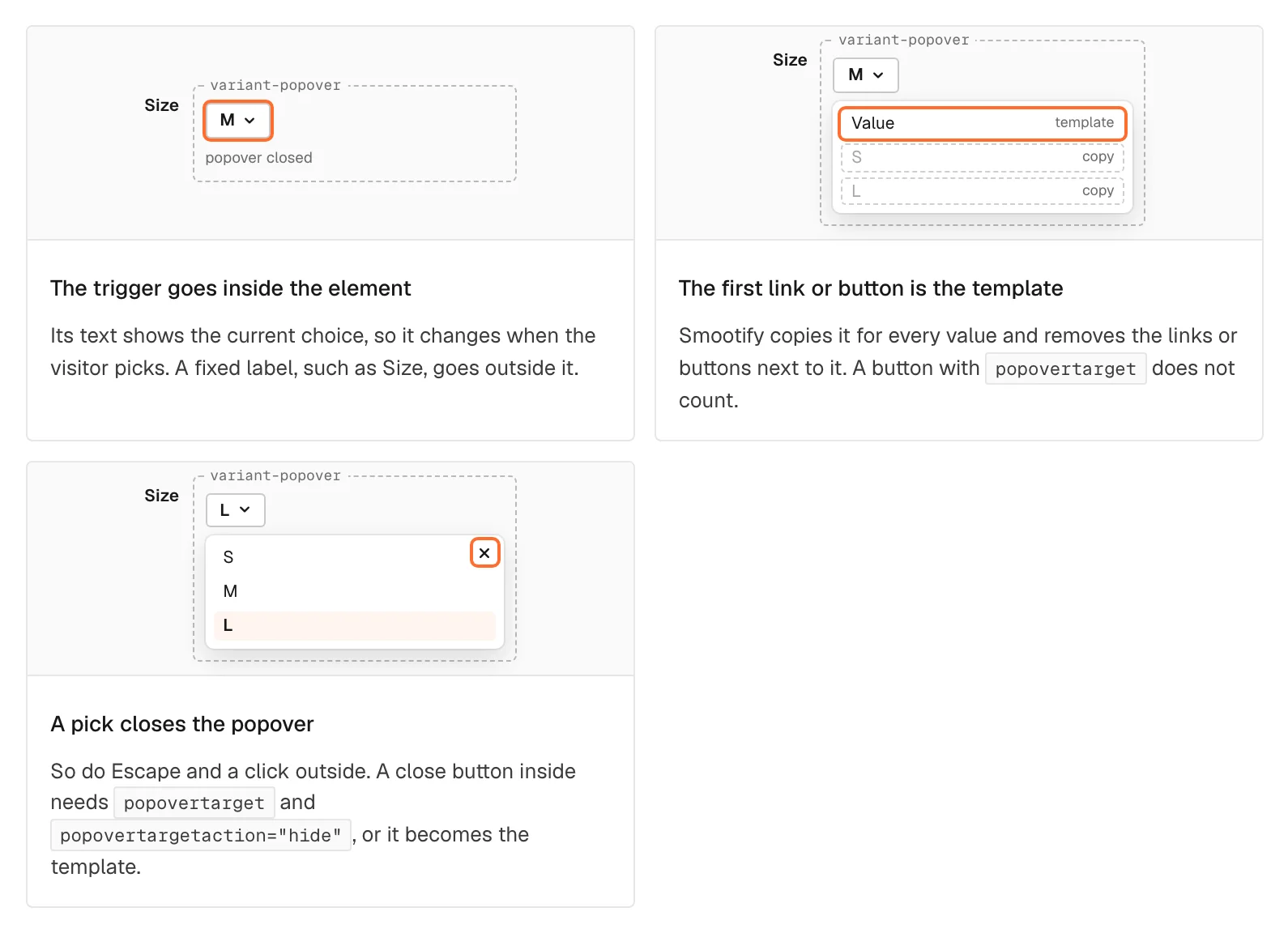
- The trigger shows the current choice. Its text changes when the customer picks.
- The first link or button inside the popover is the template of every value. Smootify copies it and removes the ones next to it.
- A pick closes the popover.
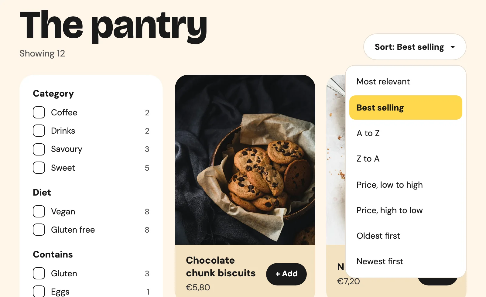
On Sunday Crate’s pantry, the sort menu is a sort-popover. The trigger reads “Sort: Best selling ▾”, and the list under it is the popover.
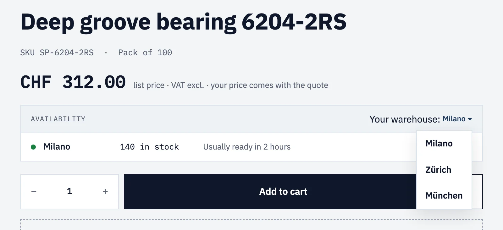
On Spannbach, our industrial parts demo store, the warehouse picker on a product page is a location-switcher in a popover. The trigger reads “Your warehouse: Milano ▾”. The label and the arrow carry data-prop="label", so Smootify leaves them alone and writes only the warehouse name.
The same panel in every row
A popover can sit in a block Smootify repeats: an address in the account, an order, a product card. Each copy gets its own ID and its trigger follows it, so each trigger opens its own panel. With one ID per element, every copy would have opened the first.
There is one exception, and the guide says it plainly: inside a mini cart, keep other popovers out of the lines unless the cart itself is a dialog or a details element. A popover anywhere in smootify-cart makes Smootify open the whole cart as a popover.
The market suggestion
Spannbach opens in Swiss francs, its primary market, and also sells to Italy, Germany and Austria in euros. A buyer who lands from Milan sees, a few seconds after the page loads, a small panel: Browsing from Italy? Switch to see prices in EUR and delivery to Italy. That is the market suggestion, a popover with data-is="market-dialog". Smootify opens it by itself, once per browser, after the delay you set (3 seconds by default), and only when the store sells in more than one country. If the cookie banner is showing, it waits until the banner closes, so the visitor never gets two panels on top of each other.
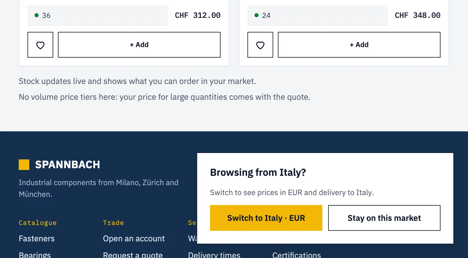
It changes market only when the visitor presses button[data-action="continue"]. Escape, a click outside or a “Stay on this market” button keep the current one. On Spannbach, Switch to Italy · EUR turned CHF 312.00 into €343.67 without a reload, and the panel did not come back on the next page. With a country-switcher inside the suggestion, the switcher does the change and Continue only closes.
On Webflow hosting, Smootify reads the visitor’s country from the site’s own domain, which sits behind Cloudflare, so the visitor’s IP address is not sent to another service. Only where that answer is missing, on a site hosted elsewhere, does it ask the geolocation service country.is.
Where it fails without a word
- The trigger submits the form. A button inside a form, such as the add-to-cart form, needs
type="button". Without it, it adds to cart instead of opening the panel. - A close button became an option. It was the first button in the popover, so it became the template. Close with
popovertargetandpopovertargetaction="hide", or leave it to Escape. - The label on the trigger is replaced. “Length: 800 mm” in one text becomes “3000 mm”. Put the fixed label outside the trigger.
- The choice never shows. The trigger is outside the picker element.
- The picker disappears. It has no popover, or nothing clickable inside it.
- The panel sits in the middle of the window. That is where the browser puts a popover with no position of its own. Place it with your styles, or with the position settings of Webflow’s Popover element.
The full list of parts that accept a popover, with a link to each one’s guide, is on one page: Popovers.