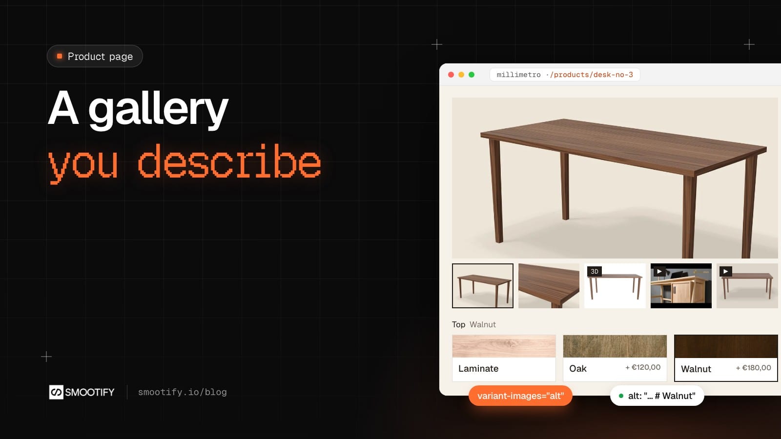
You are building the product page for a client. The design has a big picture, a strip of thumbnails under it, a zoom icon in the corner, and the client wants the pictures to change when the customer picks a different wood. In Smootify 1.x, that brief started with a question that had nothing to do with the design: [product="images"] or [product="media"]? In other words, will there ever be a video? Then came the choice between six library components that look alike (Images Slider, Images Lightboxes, Images Gallery, and the same three for Media), thumbnails made from Lightbox links that Smootify turned into slider dots, and the variant behaviour switched on in the custom code, for every gallery on the site at once.
In 2.0 you describe the gallery instead of assembling it, and the same description works whether the store is built in Webflow or in Astro.
One element, four parts
Put a Div block with product="gallery" inside smootify-product, and inside it the parts the design uses:
| Part | Goes on | What it does |
|---|---|---|
gallery="slider" | a Webflow Slider | one slide per picture, copies of the first slide |
gallery="thumbnails" | an Image, a Link block or a Div block | repeated once per picture; a click moves the slider |
gallery="lightbox" | a Lightbox link | opens every picture, keeps what you designed in it (the zoom icon) |
gallery="lightboxes" | a Lightbox link | repeated once per picture, all in one group |
The parts keep each other in step. A click on a thumbnail moves the slider. When the visitor moves the slider with its arrows, its dots or a swipe, the matching thumbnail becomes the current one and gets is-active. When the visitor picks a variant that has an image, the slider goes to it. The opposite is not true: clicking a picture never changes the variant.
You design one slide and one thumbnail. Smootify copies the first slide once per picture and removes the other slides, and it repeats the thumbnail in place, once per picture.
That is the Webflow version. In Astro the parts are the same, on plain markup: gallery="slider" goes on an element that holds a [slider-track], the lightboxes on a[lightbox-item] links, and the Astro gallery guide has the markup.
Following the variant, two ways
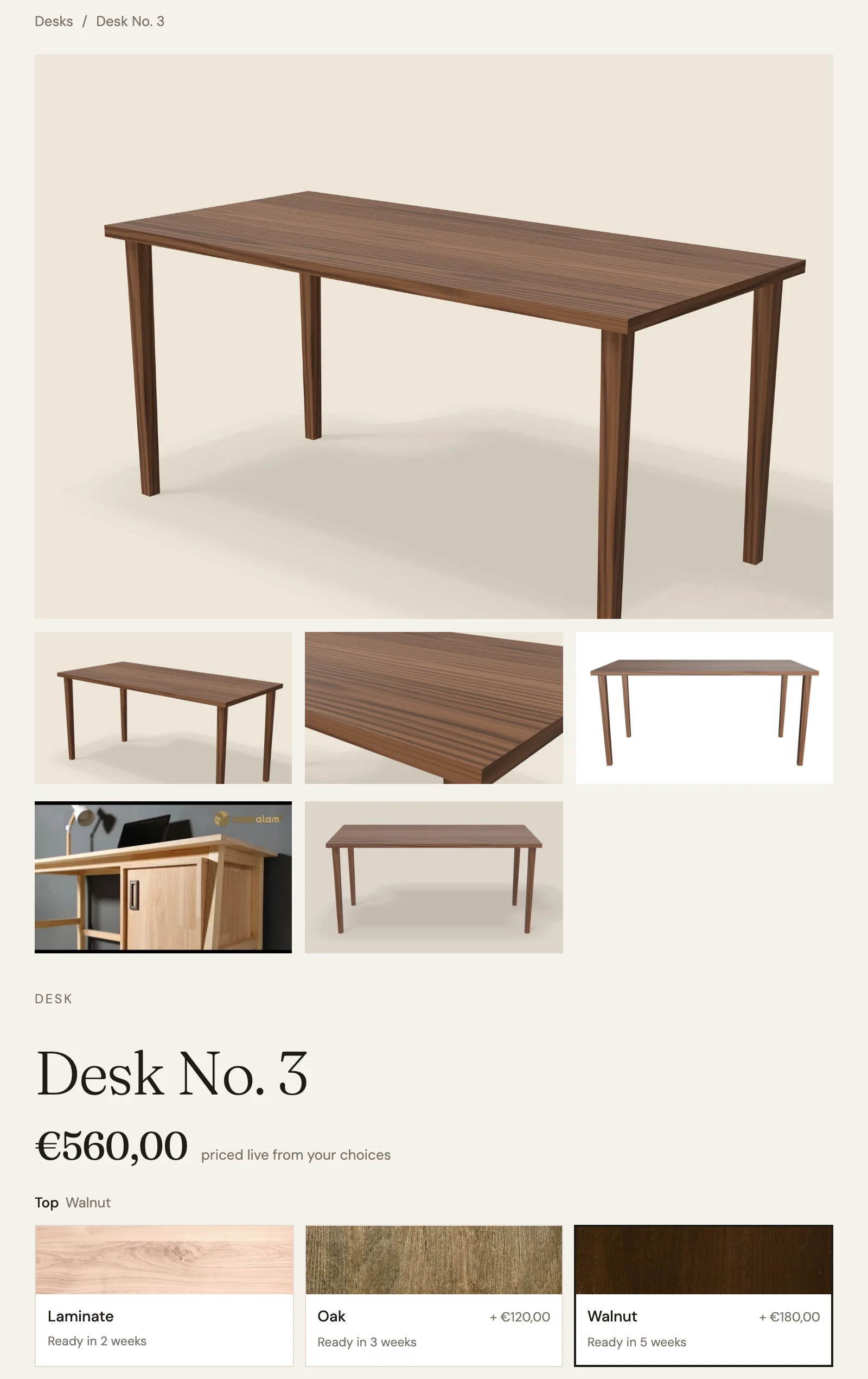
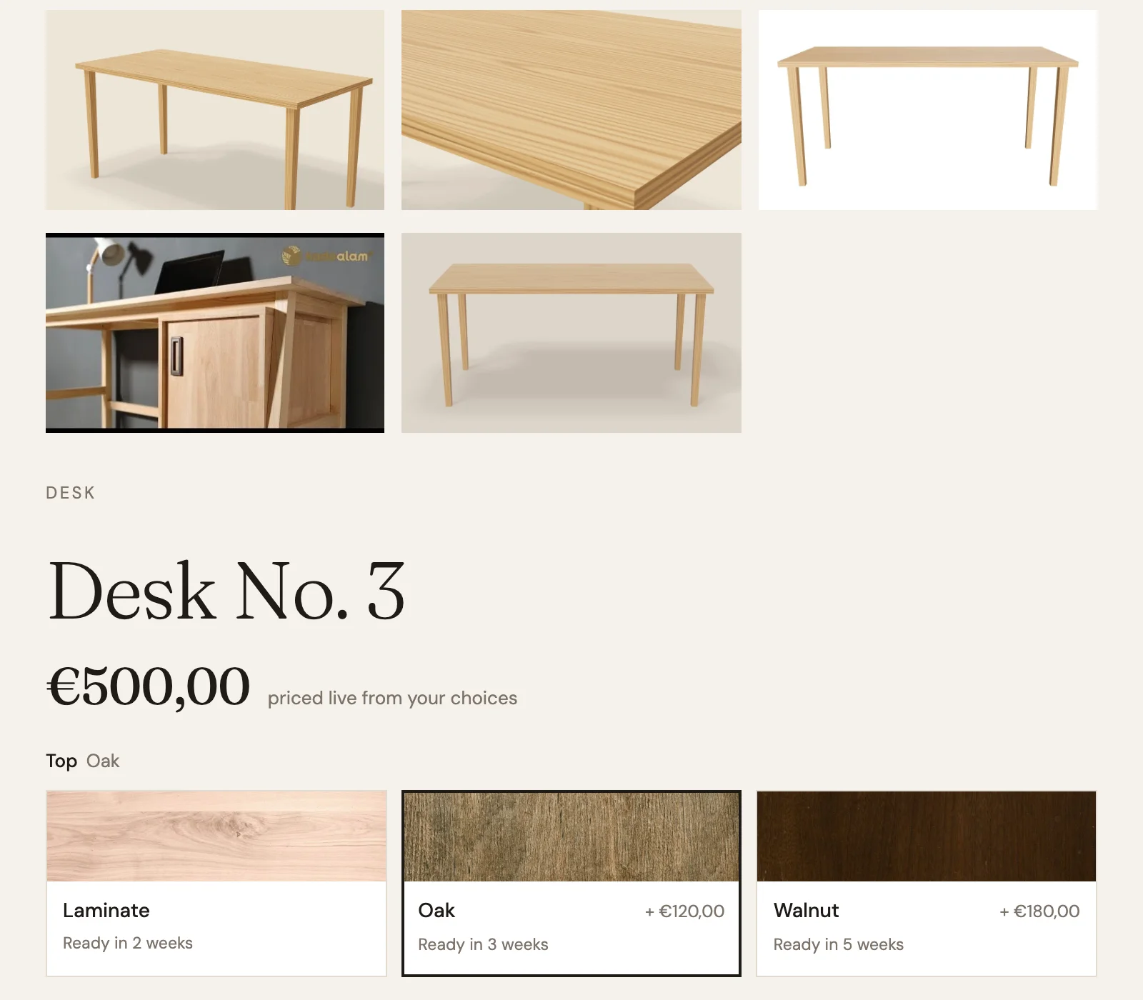
Millimetro’s Desk No. 3 comes with a Laminate, Oak or Walnut top. In Shopify, each top has a render of the whole desk (linked to its variant), a close-up of the top, a 3D model and a short turntable video. A YouTube video of a desk build belongs to all three. Every alt text ends with its top: “Desk No. 3 with a solid oak top and oak legs # Oak”.
Add variant-images to the gallery element and it shows only the chosen variant’s media. How it groups them depends on the value.
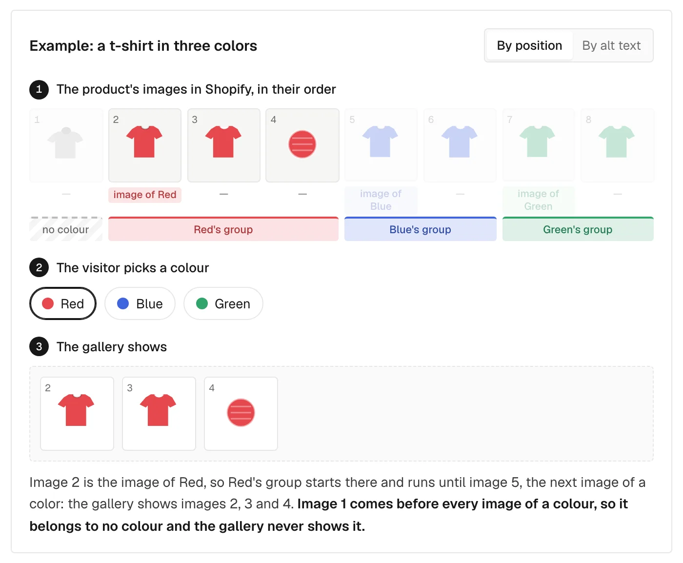
By position (variant-images, no value), each image linked to a variant starts a group that runs until the next linked image. On Desk No. 3 the media are in this order: the six pictures, then the three models, then the videos. Pick Laminate and you get its render and close-up. Oak, the same. Pick Walnut and you get its two pictures, all three 3D models, the YouTube video and all three turntable videos, because they all come after the last linked image. And if the shop had put a photo of the desk in a room first, nobody would ever see it once a top is chosen: the media before the first linked image belong to no group.
By alt text (variant-images="alt", the setting on the published page), each media goes with the variants its alt names after the last #, and media without a tag go with every variant. Pick Oak and the gallery shows five things: the Oak render, the Oak close-up, the Oak 3D model, the YouTube video and the Oak turntable video. Switch to Walnut and the Walnut set replaces it, the YouTube video stays.
The tag is the value (# Oak), or several values separated by a slash with a space on each side (# Oak / Steel) for a product with two options. Capital letters do not matter. The 1.x format, #Top_Oak, still works.
The alt text is public, tag included. Screen readers read it and so does Google. Write a sentence that still makes sense with ”# Oak” at the end.
Both are options on the gallery, not on the site. The product gallery can follow the variant while a “see every finish” grid lower on the same page shows everything.
Videos and 3D in the same slider
Without options the gallery shows images only. Add include-media and it shows, in the order of the product’s media in Shopify, the images, the videos uploaded to the product, YouTube and Vimeo videos, and 3D models. A video plays muted, on a loop, by itself; data-controls on the slide gives it the player’s controls. A 3D model shows its preview image until its slide is on screen, and only then does the viewer download. On Desk No. 3 the model viewer is not in the page until you click the model’s thumbnail. In thumbnails and lightboxes a model is always its preview image. In the slider it becomes a viewer only when its file in Shopify is a GLB or glTF file.
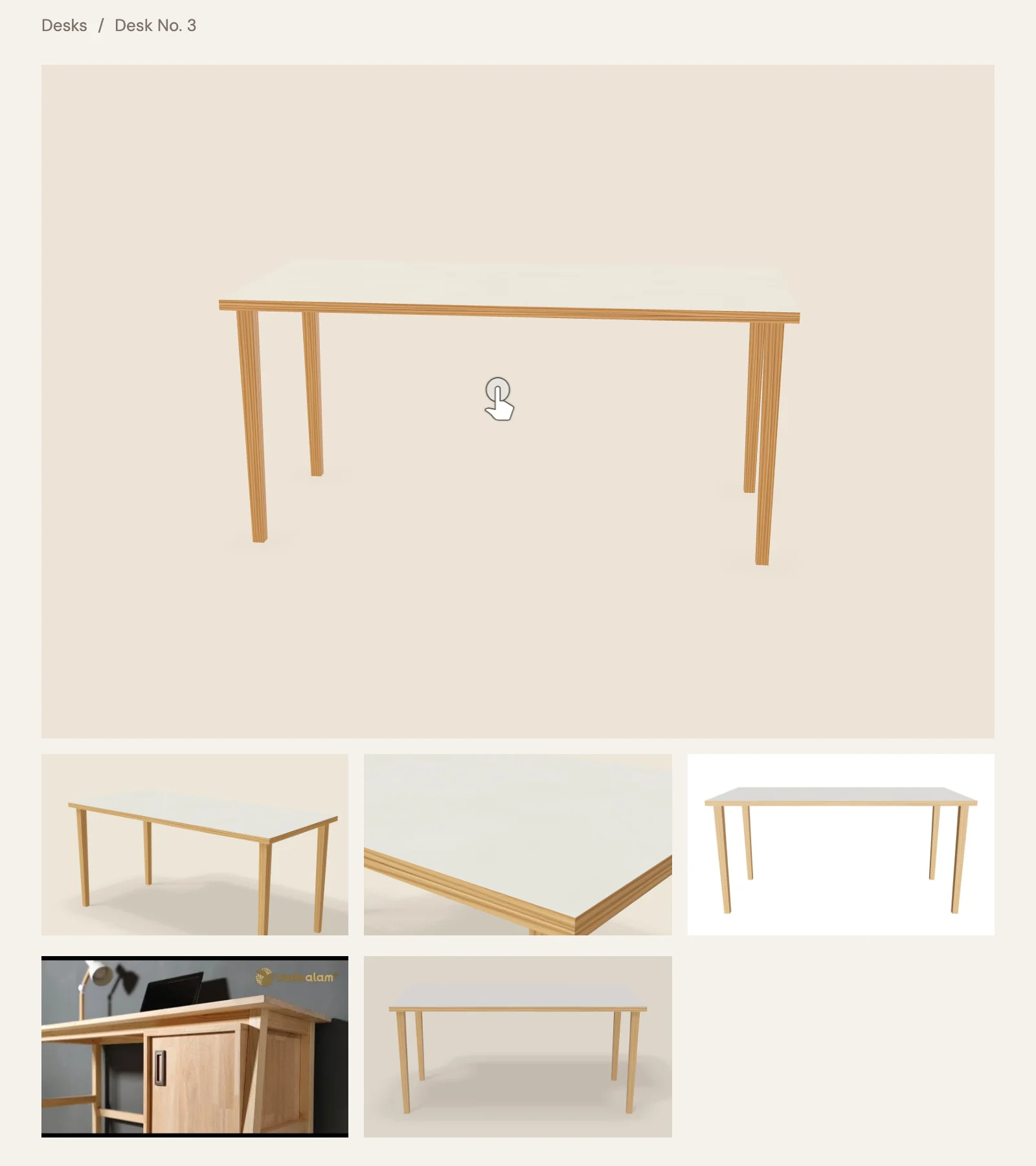
Every slide, thumbnail and repeated lightbox gets data-media-type: image, video, external-video or model. A play icon on video thumbnails or a “3D” badge on the model’s is a CSS selector, without an interaction.
Videos can also live outside the gallery. product="videos" on a Lightbox link or a Background Video, and product="external-videos" on a Div block, make one copy of the element per video, while product="video" and product="external-video" show the first one.
Coming from 1.x
The 1.x pieces still work, and the debugger on your .webflow.io address points them out.
| 1.x | 2.0 |
|---|---|
product="images" on a Slider | gallery="slider" inside product="gallery" |
product="media" on a Slider | the same, with include-media |
| Lightbox links that became slider dots | gallery="thumbnails" |
product="images" on a Lightbox link | gallery="lightboxes" |
showOnlyActiveImages: true | variant-images |
activeImagesMode: "alt" | variant-images="alt" |
offset | none: remove the picture from the product’s media, or use variant-images |
One thing to watch when you migrate: the gallery reads only its own attributes. A site with showOnlyActiveImages: true that switches to product="gallery" shows every picture until variant-images is on the element.
Where it goes quiet
Most gallery problems show no error. In Webflow, gallery="slider" on anything other than a Webflow Slider does nothing. Videos missing from the slider mean include-media is missing. Size attributes such as max-width do nothing on a slide: they go on the Slider for the slides, and on the part itself for thumbnails and lightboxes. A YouTube or Vimeo player inside a slide takes the size your CSS gives it, so give it one: on Desk No. 3 a rule makes it fill the slide.
The full setup, with the markup for each layout, is in Product gallery and media.